EXPERIMENTAL STUDIES WITH MINERALS
advertisement
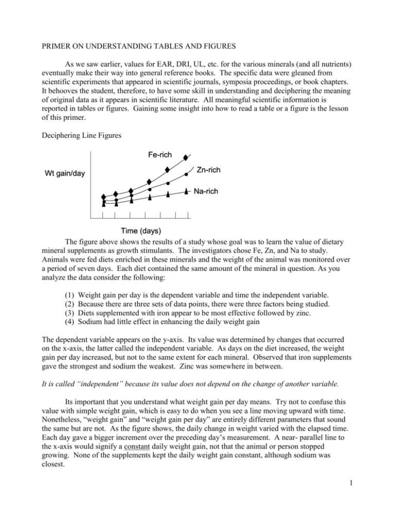
PRIMER ON UNDERSTANDING TABLES AND FIGURES As we saw earlier, values for EAR, DRI, UL, etc. for the various minerals (and all nutrients) eventually make their way into general reference books. The specific data were gleaned from scientific experiments that appeared in scientific journals, symposia proceedings, or book chapters. It behooves the student, therefore, to have some skill in understanding and deciphering the meaning of original data as it appears in scientific literature. All meaningful scientific information is reported in tables or figures. Gaining some insight into how to read a table or a figure is the lesson of this primer. Deciphering Line Figures Fe-rich Wt gain/day Zn-rich Na-rich Time (days) The figure above shows the results of a study whose goal was to learn the value of dietary mineral supplements as growth stimulants. The investigators chose Fe, Zn, and Na to study. Animals were fed diets enriched in these minerals and the weight of the animal was monitored over a period of seven days. Each diet contained the same amount of the mineral in question. As you analyze the data consider the following: (1) (2) (3) (4) Weight gain per day is the dependent variable and time the independent variable. Because there are three sets of data points, there were three factors being studied. Diets supplemented with iron appear to be most effective followed by zinc. Sodium had little effect in enhancing the daily weight gain The dependent variable appears on the y-axis. Its value was determined by changes that occurred on the x-axis, the latter called the independent variable. As days on the diet increased, the weight gain per day increased, but not to the same extent for each mineral. Observed that iron supplements gave the strongest and sodium the weakest. Zinc was somewhere in between. It is called “independent” because its value does not depend on the change of another variable. Its important that you understand what weight gain per day means. Try not to confuse this value with simple weight gain, which is easy to do when you see a line moving upward with time. Nonetheless, “weight gain” and “weight gain per day” are entirely different parameters that sound the same but are not. As the figure shows, the daily change in weight varied with the elapsed time. Each day gave a bigger increment over the preceding day’s measurement. A near- parallel line to the x-axis would signify a constant daily weight gain, not that the animal or person stopped growing. None of the supplements kept the daily weight gain constant, although sodium was closest. 1 Dependent and Independent Variables In the figure both “time” and “type of mineral” were factors that determined the value of the dependent variable. Minerals were further divided into three types. Experimental variables change either by design or by circumstance. Independent are by design, dependent are by circumstance. In a mathematical sense, we can think of the independent variable as x, and the dependent variable as y and liken the value of y at any time to some condition imposed on x. This interplay is captured in the figure. Typical independent variables are “time”, “temperature”, weight, i.e., some It could be argued that the format of scientific experimentation is based on linking data with mathematical terms. Hence, y is a function of x, written y = f(x) literally says that what happens to y depends on what x does. quantifiable term that the experimenter controls. In the present graph, elapsed time is the factor One further caveat is for the student to realize that these definitions do not relate to absolute values, but rather to changes in value. that correlates with daily weight gain getting bigger. Had we used some ingredient in the diet as the variable, we could have correlated weight gain with that factor. In essence, adding more x to the reaction results in a greater value for y. It is easy to see that the terms are more easily judged by considering a dynamic state relationship between x and y, one based on cause-effect. Deciphering Bar Graphs Sometimes referred to as histograms, bar graphs also impart information in a visual form that is easy to grasp. Suppose we wanted to represent the results of the above experiment as a bar graph instead of a line graph. Immediately we see a problem. If we chose time as our independent variable, we would need six different bar graphs to show the changes at each time period. If we chose only one time point, we would lose the perspective of time-dependency for the changes. Immediately you see that how we want to present the data is a major factor in the type of graph we choose. There is a way out of the dilemma, however. If instead of showing six individual times, we use the slope of the line through the last three. Its at these times in the experiment that changes become more noticeable. The figure drawn as a bar graph would look like this: Weight gain/day Fe Zn Na Supplement Added You will notice that the bar graph gives basically the same conclusions but with less detail. There is still no mistaking iron as the most effective and sodium the least effective mineral in daily weight 2 gain. Compared to the line drawing of the same data, the bar graph representation highlights the different minerals as variables and not time. Interpreting Tables As the word “table” implies, tables report data in a tabular form. Tables, therefore, take precedence over figures in the amount of data that can be incorporated in a capsular form. A second advantage is that tables report absolute numbers generally with values for standard deviation or standard error of the mean (SEM). The reader therefore does not have “guess” or “estimate” the value as would be required in a figure where the actual value for points is not given and requires more than simple inspection. A disadvantage of tables, however, is the need for careful study to determine how the data are being reported. Units that define the numbers in the columns or rows must be carefully noted to know precisely what each value means. Lastly, a table does not give a clear indication of the dependent or independent variables. These must be determined by the reader. Suppose we reported the results of the above experiment in a table. They could appear as the following. Table 1. Results of Seven-day Feeding Trial for Mineral Supplements1 ________________________________________________________ Conc. Daily Wt. Gain Mineral Tested (g/kg diet) N (g/day) ________________________________________________________ Iron 10 6 4.32 0.21a Zinc 10 6 3.19 0.05 Sodium 10 6 1.06 0.23 ________________________________________________________ 1 Values were taken on the sixth day of the diet and are expressed as means SEM. Lower case superscript letters in a column differ by p<0.05. Its clear that a table allows more precise information to be recorded. For example, the amount of mineral is listed, the number of animals, the mean the standard error or standard deviation, and the statistical significance are all clearly tabulated. You should note the following essentials: (a) A title, summarizing the meaning of the table. (b) Columns headed by a subtitle and when appropriate, units or measurement relative to how the data are expressed (c) Rows that work with the columns in defining what each number refers to (d) Data expressed as means standard error of the means; N = number if subjects (e) A legend summarizing the protocol and meaning of the numbers (f) Subscripts and superscripts giving precise definitions and statistical significance With this primer you should now have some skill in attacking a journal paper. That is an opportunity to build on what you learned so far. Attached to this e-mail is a journal article taken from the American Journal of Clinical Nutrition. Below are 10 questions pertaining to the article. Read them carefully and use your skills in interpreting the data reported in the tables and figures to answer most, not all of the questions. Your must work alone and use your own words, not those of 3 the authors, in answering the questions. First, observe the format that is used to properly reference this article. Xia, Y, Hill, KE, Byrne, DW, Xu, J and Burk, RF. Effectiveness of selenium supplements in a lowselenium area of China. Am. J. Clin. Nutr. 2005;81:829-34. QUESTIONS 1. What was the author’s purpose in performing the study? 2. By what means were they going to determine the selenium status of the subjects? 3. What is the hypothesis that is guiding the work? 4. What is a “placebo”? What does it consist of? What purpose does it serve in the experiments? 5. Offer an opinion on why they used plasma for their measurements? What led to that decision? 6. Where would values reported in Table 2 appear in Figure 1. Do the table and figure values jive? 7. Are the variables in Figure 3 the same as in Figure 1. If not, explain how they differ. 8. With glutathione peroxidase activity as a marker, two figures attempt to answer the question how much selenium as selenomethionine would achieve optimal selenium status? One figure uses selenoprotein P to answer this question? What is the range of values all figures seem to be pointing to as optimal. 9. Suppose you wanted to determine the DRI for selenium using data in this article. Recall, first you must determine an EAR. Are there figures in this paper that allow you to estimate an EAR. If so, what values based on the data would you propose as an EAR for selenium in a human? 10. With regard to your answer to question 8, do the values in Figure 2 (left panel) agree or disagree with what is shown in Figure 1. Defend your answer citing specific numbers reported in the figures. (Hint: this question will require careful study on your part with special attention given to the time and level of supplement). 4
