USING EXCEL TO CREATE FIGURES
advertisement

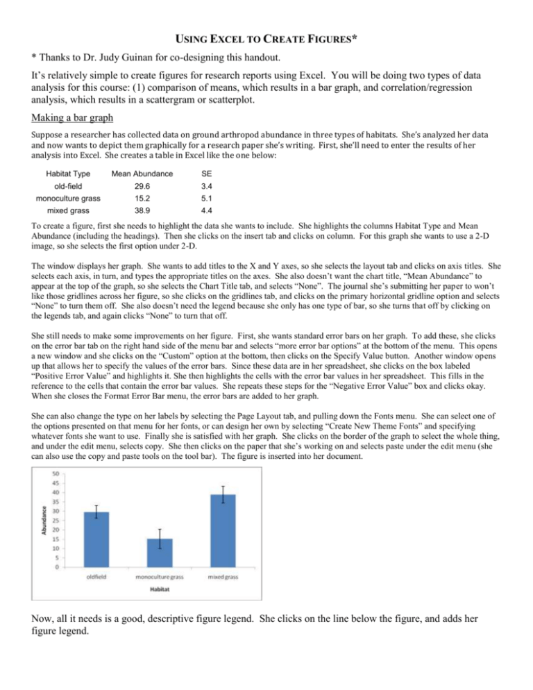
USING EXCEL TO CREATE FIGURES* * Thanks to Dr. Judy Guinan for co-designing this handout. It’s relatively simple to create figures for research reports using Excel. You will be doing two types of data analysis for this course: (1) comparison of means, which results in a bar graph, and correlation/regression analysis, which results in a scattergram or scatterplot. Making a bar graph Suppose a researcher has collected data on ground arthropod abundance in three types of habitats. She’s analyzed her data and now wants to depict them graphically for a research paper she’s writing. First, she’ll need to enter the results of her analysis into Excel. She creates a table in Excel like the one below: Habitat Type Mean Abundance SE old-field 29.6 3.4 monoculture grass 15.2 5.1 mixed grass 38.9 4.4 To create a figure, first she needs to highlight the data she wants to include. She highlights the columns Habitat Type and Mean Abundance (including the headings). Then she clicks on the insert tab and clicks on column. For this graph she wants to use a 2-D image, so she selects the first option under 2-D. The window displays her graph. She wants to add titles to the X and Y axes, so she selects the layout tab and clicks on axis titles. She selects each axis, in turn, and types the appropriate titles on the axes. She also doesn’t want the chart title, “Mean Abundance” to appear at the top of the graph, so she selects the Chart Title tab, and selects “None”. The journal she’s submitting her paper to won’t like those gridlines across her figure, so she clicks on the gridlines tab, and clicks on the primary horizontal gridline option and selects “None” to turn them off. She also doesn’t need the legend because she only has one type of bar, so she turns that off by clicking on the legends tab, and again clicks “None” to turn that off. She still needs to make some improvements on her figure. First, she wants standard error bars on her graph. To add these, she clicks on the error bar tab on the right hand side of the menu bar and selects “more error bar options” at the bottom of the menu. This opens a new window and she clicks on the “Custom” option at the bottom, then clicks on the Specify Value button. Another window opens up that allows her to specify the values of the error bars. Since these data are in her spreadsheet, she clicks on the box labeled “Positive Error Value” and highlights it. She then highlights the cells with the error bar values in her spreadsheet. This fills in the reference to the cells that contain the error bar values. She repeats these steps for the “Negative Error Value” box and clicks okay. When she closes the Format Error Bar menu, the error bars are added to her graph. She can also change the type on her labels by selecting the Page Layout tab, and pulling down the Fonts menu. She can select one of the options presented on that menu for her fonts, or can design her own by selecting “Create New Theme Fonts” and specifying whatever fonts she want to use. Finally she is satisfied with her graph. She clicks on the border of the graph to select the whole thing, and under the edit menu, selects copy. She then clicks on the paper that she’s working on and selects paste under the edit menu (she can also use the copy and paste tools on the tool bar). The figure is inserted into her document. Now, all it needs is a good, descriptive figure legend. She clicks on the line below the figure, and adds her figure legend. Figure 1. Comparison of mean abundance (+ SE) of ground arthropods in three habitat types. Scatterplots Let’s imagine you are searching for a correlation between phosphate levels and Chlamydomonas abundance in a series of ponds. You measure these two variables in seven different ponds. The results follow: Phosphate (mg/L) 0 2 5 12 14 29 41 Chlamydomonas (per 50 ul) 1.2 5 12 44.7 39.2 77 57.5 Your analysis in JMP gives an R2 value of 0.754 and a P-value of 0.011, indicating a strong positive correlation. But you can’t copy a nice scatterplot into your Microsoft Word file using the jmp graph, so you will do this, instead, in Excel. The instructions are very similar to making bar graph. Highlight your Excel data file, click on the Insert tab, and click on Scatter, then click on the “Scatter with only markers” icon. This will give you a graph with no axis labels. To fix this, click on the Layout tab, click on Axis Title, and enter the appropriate labels for your horizontal and vertical axes. Since you only have one dependent variable, you can get rid of your “legend” by going to Legend, and clicking none. Do the same for Chart Title. Copy and paste the graph into Microsoft Word, type your figure legend below it, and your final result will look like this. Figure 2. Effect of phosphate levels (mg/L) on the mean number of Chlamydomonas in a 50 ug sample.


