Bivariate Correlation, SPSS
advertisement
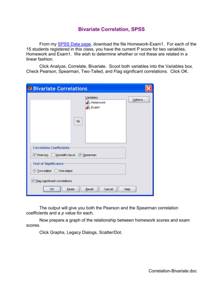
Bivariate Correlation, SPSS From my SPSS Data page, download the file Homework-Exam1. For each of the 15 students registered in this class, you have the current P score for two variables, Homework and Exam1. We wish to determine whether or not these are related in a linear fashion. Click Analyze, Correlate, Bivariate. Scoot both variables into the Variables box. Check Pearson, Spearman, Two-Tailed, and Flag significant correlations. Click OK. The output will give you both the Pearson and the Spearman correlation coefficients and a p value for each. Now prepare a graph of the relationship between homework scores and exam scores. Click Graphs, Legacy Dialogs, Scatter/Dot. Correlation-Bivariate.doc 2 Select Simple Scatter and then click Define. Scoot Exam1 into the Y Axis Box and Homework into the X Axis box. Click OK. In the output plot, notice the outlier in the extreme lower left corner. Outliers like this can have a great influence on the value of the correlation coefficient. More on that later. Double click on the graph to bring it into the Chart Editor. Click Elements, Fit Line at Total. The properties box should indicate that you want a linear fit and no confidence intervals, the defaults. Click on the Lines tab. Here you can change the color, weight, and style of the line. Just for fun, change it to purple, 1.5. Click Apply to apply that change and then close the Properties box. Now double-click on one of the plotted data points. This should select all of them and bring up another Properties box. Here you can change properties of the markers. 3 Just for fun, change the markers to pentagons with orange fill and green borders. Click Apply. Click Apply and then close the box. Now close the chart editor. Notice that the plot includes the r2 for the relationship between the two variables. Return to the data view and select case number 15 (the outlier). 4 Hit the delete key to remove that case and then re-compute the correlation coefficients and the plot. Notice the dramatic effect of removing that outlier. Put a confidence interval on the value of the correlation using the program at http://glass.ed.asu.edu/stats/analysis/rci.html . Point Biserial Correlation Next we shall look at the correlation between a dichotomous variable and a continuous variable. Such a correlation is called a point biserial correlation. Download the Howell data file from my SPSS data page and bring it into SPSS. Close the Homework-Exam1 file. Find the Pearson correlation coefficient for the relationship between the gender and GPA, and then prepare a scatter plot, with linear fit line, for predicting GPA (the vertical, Y axis) from gender (the horizontal, X axis). You will find that this line runs from the one group mean to the other group mean. Obtain the test statistic (t) for testing the null hypothesis that the correlation between gender and GPA is zero in the population from which our sample was r n2 randomly drawn. The formula to compute that t is t . 1 r 2 Now, use SPSS to conduct an independent samples t test comparing boys and girls on GPA. Compare the absolute value of the “equal variances assumed” t with that computed from the formula above. Phi Coefficient The correlation between two dichotomous variables is know as the phi coefficient. Use SPSS to compute that statistic for the relationship between having social problems and dropping out of school. To test the null hypothesis that phi is zero in the population, we need to convert the phi to a chi-square statistic. Make that conversion with this formula: 2 N 2 . You could use the CDF function in SPSS to get a p value for this test statistic, but I am going to show you another way to do so. Use SPSS to create a contingency table for the relationship between having social problems and dropping out of school. Ask for the Chi-square statistic and for the row percentages. 5 Compare the value of chi-square you computed by hand with that provided by SPSS Crosstabs. Use the p value provided by SPSS Crosstabs to decide whether or the relationship between having social problems and dropping out of school is statistically significant. Use the row percentages to describe the relationship. Return to Wuensch’s SPSS Lessons Page Karl L. Wuensch, June, 2009.
