Word - Skidmore College
advertisement
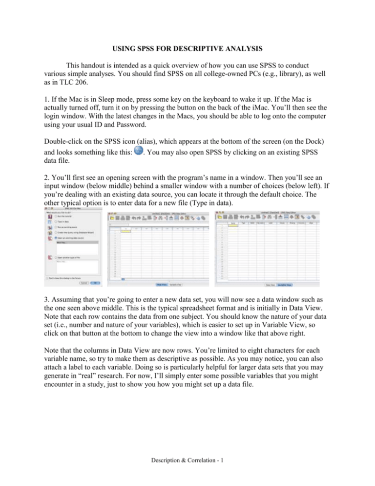
USING SPSS FOR DESCRIPTIVE ANALYSIS This handout is intended as a quick overview of how you can use SPSS to conduct various simple analyses. You should find SPSS on all college-owned PCs (e.g., library), as well as in TLC 206. 1. If the Mac is in Sleep mode, press some key on the keyboard to wake it up. If the Mac is actually turned off, turn it on by pressing the button on the back of the iMac. You’ll then see the login window. With the latest changes in the Macs, you should be able to log onto the computer using your usual ID and Password. Double-click on the SPSS icon (alias), which appears at the bottom of the screen (on the Dock) and looks something like this: . You may also open SPSS by clicking on an existing SPSS data file. 2. You’ll first see an opening screen with the program’s name in a window. Then you’ll see an input window (below middle) behind a smaller window with a number of choices (below left). If you’re dealing with an existing data source, you can locate it through the default choice. The other typical option is to enter data for a new file (Type in data). 3. Assuming that you’re going to enter a new data set, you will now see a data window such as the one seen above middle. This is the typical spreadsheet format and is initially in Data View. Note that each row contains the data from one subject. You should know the nature of your data set (i.e., number and nature of your variables), which is easier to set up in Variable View, so click on that button at the bottom to change the view into a window like that above right. Note that the columns in Data View are now rows. You’re limited to eight characters for each variable name, so try to make them as descriptive as possible. As you may notice, you can also attach a label to each variable. Doing so is particularly helpful for larger data sets that you may generate in “real” research. For now, I’ll simply enter some possible variables that you might encounter in a study, just to show you how you might set up a data file. Description & Correlation - 1 Note that I set up gender as a string variable (nominal variable), so the data can be alphanumeric (letters and numbers). In this case, I’ve used m and f for male and female. For integer data, you could set the number of decimals to 0, but you’d actually be better off if you didn’t do so. For real numbers, you can set the number of decimal places to whatever makes sense, or leave the default setting of 2 decimal places. Note, also, that I’ve labeled some of the variables and for one variable (group), I’ve set up value labels (1 = control, 2 = drug x, 3 = drug y). Labeling the values will make your output more comprehensible. Of course, you can return to the Variable View window to modify your variables, add new variables, etc. For now, though, let’s return to the Data View and enter the actual data, as seen below left. Above right is a far simpler data set. In fact, these data illustrate a portion of the data from Ray (10th ed.), Table 5.2, p. 118. Even though the data are integers, it’s best to input the data as real numbers with one decimal place (containing zero), because some output is determined by the number of decimal places. 4. To compute basic statistical information, simply click and drag down Analyze menu to reveal Descriptive Statistics as seen below left. For the Dream data set, I might choose Frequencies, which would first produce a window (below middle) in which you choose the variable you want to analyze. (In this case there is only the one variable—dreams.) As you can see (below right), the output from Frequencies is helpful to see a frequency distribution of your data. As you’ll note in the middle window above, you also have three options for output (Statistics…, Charts…, and Format…). Description & Correlation - 2 If you chose Statistics…, you’d see the choices below left. (Note that I’ve chosen to output some measures of variability, or dispersion, and central tendency.) If you chose Charts…, you’d see the choices below middle. If you chose Format…, you’d see the choices below right. Visual displays are quite helpful, so even though SPSS doesn’t produce “pretty” graphs, you can see the difference between a bar chart (below left) and a histogram (below middle). The bar chart looks quite similar to the bar graph illustrated in Fig. 5.1 on p. 119. The statistical choices would appear in the output as seen below on the right. Now, let’s consider the original (more complex) data file. Another approach is to choose Descriptive Statistics->Descriptives… As you can see below, I’ve moved all the variables to the right, so that they might be included in the analysis. SPSS knows that it can’t compute these descriptive statistics on the nominal variable (gender), but it gives results for the other variables. 5. To print out your output, choose Print from the File menu. When you are through with SPSS, choose Quit from the SPSS menu (or close the data file). Description & Correlation - 3 Correlation Preliminaries and caveats This handout is not intended to be comprehensive in its coverage of correlation. Instead it should serve as a brief review of concepts in correlation while giving you details about how to conduct analyses and interpret output from the SPSS program (with some StatView as well). First of all, you should read pages 131-137 in Ray’s textbook (10th ed.). Pay particular attention to the scatterplots shown in Figure 5.10 that illustrate various types of relationships. It would probably also be useful to review the chapter on correlation in your old statistics textbook. Overview of correlation On some occasions we are interested in determining the extent to which there is a relationship between two variables. That is, we are interested in seeing if the two variables “go together” or if knowing information about one variable helps us to predict scores on the second variable. The statistic used to assess the degree of relationship is the Pearson product-moment correlation coefficient (r), which can take on values from -1 to +1. Negative values of r indicate that higher scores on one variable are associated with lower scores on the other variable (see Figure 1). Positive values of r indicate that higher scores on one variable are associated with higher scores on the other variable and lower scores on one variable are associated with lower scores on the other variable (see Figure 2). Figure 1 Figure 2 A correlation coefficient that is not significant (more on that later) means that you have no indication that there is a linear relationship between your two variables. Typically a non- Description & Correlation - 4 significant relationship will appear in a scattergram as a cloud of points with no apparent linear trend and a value of r that is near 0 (see Figure 3). A non-significant relationship means that knowing a person’s IQ is of no benefit in predicting that person’s GPA—your best guess about the person’s GPA is the mean GPA. Note that the correlation coefficient is only useful for assessing linear relationships. So a very strong curvilinear relationship (see Figure 4) between two variables might produce a very weak correlation coefficient (an r value near zero), even though there is a strong relationship between the two variables. That’s why it is so very important to look at a graph of your data. Figure 3 Figure 4 Typically one examines a relationship post hoc (after the fact) because a research design that lends itself to correlational analysis is not experimental (i.e., nothing is manipulated). For instance, you might wonder if there is a relationship between a person’s intelligence and grade point average. To answer this question, you would simply take two measures on a group of people—their intelligence (e.g., measured on the WAIS) and their GPA. Notice that these people’s IQs and GPAs existed prior to your interest in their relationship. In fact, the relationship itself existed prior to your interest in it. All you are doing is “uncovering” the pre-existing relationship. Correlation vs. Causation It is because of the fact that nothing is being manipulated that you must be careful to interpret any relationship that you find. That is, you should understand that determining that there is a linear relationship between the two variables doesn’t tell you anything about the causal relationship between the two variables—correlation does not imply causation. If you did not know anything at all about the person’s IQ, your best guess about that person’s GPA would be to guess the typical (average, mean) GPA. Finding that a correlation exists between IQ and GPA simply means that knowing a person’s IQ would let you make a better prediction of that person’s GPA than simply guessing the mean. You don’t know for sure that it’s the person’s IQ that determined that person’s GPA, you simply know that the two tend to covary in a predictable fashion. If you find a relationship between two variables, A and B, it may arise because A directly affects B, it may arise because B affects A, or it may be because an unobserved variable, C, affects both A and B. In this specific example of IQ and GPA, it’s probably unlikely that GPA could affect IQ, but it’s not impossible. It’s more likely that either IQ affects GPA or that some other variable (e.g., test-taking skill, self-confidence, patience in taking exams) affects both IQ and GPA. Description & Correlation - 5 The classic example of the impact of a third variable on the relationship between two variables is the fact that there is a very strong negative linear relationship between number of mules in a state and number of college faculty in a state. As the number of mules goes up, the number of faculty goes down (and vice versa). It should be obvious to you that the relationship is not a causal one. The mules are not eating faculty, or otherwise endangering faculty existence. In fact, the relationship arises because rural states tend to have more farms and fewer institutions of higher learning—so there is a third variable that produces the relationship between number of mules and number of faculty. Procedure for correlational analyses Your first step would be to specify the two variables whose relationship you are interested in assessing. Then you would select a sample of participants and take measures on each participant for the two variables. Thus, in the example we’ve been using, you would need an IQ score and a GPA score for each participant. As should be clear from this example, the two measures do not have to be in the same units, but they can be. For example, we could look to see if there is a relationship between scores on the first and second exams in a course. Both exams could be measured in units of percent correct. Using the normal hypothesis-testing procedure, we would specify null and alternative hypotheses. In this case, our null hypothesis would be that there is no linear relationship between the two variables in the population. Our population parameter for correlation is , so our null hypothesis (H0) would be = 0. Using a non-directional alternative hypothesis (H1), we would specify ≠ 0. Given the normal procedure, we are expecting (hoping) that we can reject the null hypothesis, which would provide us with evidence that the alternative hypothesis is more reasonable (i.e., there is a linear relationship between the two variables). There are several procedures for testing the reasonableness of the H0, but the best way to think about what’s actually being done is to think of the test as seeing how often you would get the r value you obtain if sampling from a distribution in which the null hypothesis is true. That is, you should imagine a distribution of possible r values centered around 0 (which would be the case if H0 were true). In the upper and lower tails of that distribution would be found the r values that are unlikely to occur by chance. We typically use an -level of .05, so if we obtain a value of r that falls in the upper or lower 2.5% of this distribution, we would reject H0. In your statistics class, you probably used a table to determine if the r value you obtain fell in the critical (rejection) region of this distribution. In this course, we will have the computer determine whether or not we can reasonably reject H0. If the computer program tells us that the probability (p-value) is less than .05, we will reject H0. If we reject the null hypothesis, we are essentially asserting that there is, in fact, a linear relationship between the two variables. When that is true, we will often want to proceed to compute the regression equation that relates the two variables. On the pages that follow is an example of how SPSS could be used to compute a correlation/regression analysis. Description & Correlation - 6 Regression/Correlation Analysis in SPSS These analyses are based on Ray’s example (Box 5.1, p. 134). First, you would input the data as seen below left: Next, click-and-drag on the Analyze menu to select Regression and then Linear…. Doing so will produce the window seen above right, in which you assign the variables to be the “Dependent” variable and the “Independent” variable. As you can see, I’ve chosen Questionnaire as the Independent Variable and Observation Score as the Dependent Variable. (You might have thought that you’d use Analyze->Correlate->Bivariate… for the correlational analysis, but doing so wouldn’t provide you with the coefficients that will emerge from the Regression analysis. It will give you the sign of the correlation coefficient, which Regression doesn’t do.) Clicking on OK at this point will produce the analyses seen below: First of all, note that SPSS computes the correlation coefficient (r) and other statistics (r2, adjusted r2, Standard Error of Estimate). Unfortunately, SPSS doesn’t indicate the sign of r in this window, so in order to determine whether the relationship is positive or negative, it is essential that you either look at the sign of the slope (Helpfulness Questionnaire) or look at the scattergram (see below). If the slope is negative, then the relationship is negative and r will also be negative. (Another way to check the sign is to compute the Correlation analysis, which does show the appropriate sign.) Description & Correlation - 7 Besides r, the statistic that you might find most useful is r2, which is the coefficient of determination. This statistic tells us the proportion of variability in the y-variable (Observation, in this case) that is shared with the participants’ scores on the x-variable (Helpfulness Questionnaire). In this case, you could think of the results as showing that about 84% of the variability in Observation is shared with the participant’s score on the Questionnaire. Conversely, that means that 16% of the variability in Observation is shared with other factors than those measured on the Questionnaire. Adjusted r2 is a similar measure, but corrects for the number of independent variables relative to the number of observations. We will only deal with single independent variables in this class, though the number of observations may be relatively small. The actual formula is: AdjR 2 = 1- SSError /df Error MSError =1SSTotal /df Total MSTotal As you may remember from your introductory statistics course, the standard error of estimate is a useful measure to determine the extent to which your scores deviate from the line of best fit. Thus, as the standard error of estimate is smaller, the points will be near the line of best fit. In the next part of the output, SPSS tests the significance of the correlation coefficient by analysis of variance (ANOVA). If the Sig. value shown next to the F-test value were less than .05, we would conclude that the correlation coefficient is significantly different from 0. That is, we would reject the H0, and conclude that there is a significant positive linear relationship between the two variables. In this case, r = .915 and is significant because Sig. = .000, which is less than .05 (and you’d report as p < .001). With a significant correlation, it now makes sense to examine the regression equation in order to make predictions. (Had the correlation not been significant, we would not be able to justify the use of the regression equation.) The next piece of the output shows the coefficients for the regression equation. In this case, the y-intercept (Constant) is +.517 and the slope (Helpfulness) is +.888. Thus, in this example, we would have a regression equation like y = .888x + .517. That means that if a person got a score of 8 on the Helpfulness Questionnaire (x), our best prediction would be that that person would get a score of 7.6 on the Observation (y). Take care not to make predictions beyond your observations—at least not without adding all sorts of qualifications. Although SPSS doesn’t automatically produce a scattergram to accompany the statistical analyses, you should get in the habit of doing so (see caveats below). The graph will help you to determine any irregularities in your data. The simplest approach is to choose Curve Estimation from the Regression menu. You’ll next see a window that allows you to define the variables to go on the X and Y axes, as seen below middle. I’ve identified Helpfulness as the independent variable (X axis) and Observation as the dependent variable (Y axis). Clicking on OK prints a lot of info, including the graph seen below right. Description & Correlation - 8 Some final caveats The scattergram is particularly useful for detecting a curvilinear relationship between the two variables (e.g., Figure 4 earlier). That is, your r value might be low and non-significant, but not because there is no relationship between the two variables, only because there is no linear relationship between the two variables. Another problem that we can often detect by looking at a scattergram is when an outlier is present. As seen below on the left, there appears to be little or no relationship between Questionnaire and Observation except for the fact that one participant received a very high score on both variables. Excluding that participant from the analysis would likely lead you to conclude that there is little relationship between the two variables. Including that participant would lead you to conclude that there is a relationship between the two variables. What should you do? You also need to be cautious to avoid the restricted range problem. If you have only observed scores over a narrow portion of the potential values that might be obtained, then your interpretation of the relationship between the two variables might well be erroneous. For instance, in the figure above on the right, if you had only looked at people with scores on the Questionnaire of 1-5, you might have thought that there was a negative relationship between the two variables. On the other hand, had you only looked at people with scores of 6-10 on the Questionnaire, you would have been led to believe that there was a positive linear relationship between the Questionnaire and Observation. By looking at the entire range of responses on the Questionnaire, it does appear that there is a positive linear relationship between the two variables. Description & Correlation - 9 Examples from Old Exams, Etc. Dr. Susan Mee is interested in the relationship between IQ and Number of Siblings. She is convinced that a "dilution of intelligence" takes place as siblings join a family (person with no siblings grew up interacting with two adult parents, person with one sibling grew up interacting with two adults+youngster, etc.), leading to a decrease in the IQ levels of children from increasingly larger families. She collects data from fifty 10-year-olds who have 0, 1, 2, 3, or 4 siblings and analyzes her data with SPSS, producing the output seen below. Interpret the output as completely as you can and tell Dr. Mee what she can reasonably conclude, given her original hypothesis. What proportion of the variability in IQ is shared with Number of Siblings? If a person had 3 siblings, what would be your best prediction of that person's IQ? What about 5 siblings? On the basis of this study, would you encourage Dr. Mee to argue in print that Number of Siblings has a causal impact on IQ? Why or why not? Description & Correlation - 10 Dr. Upton Reginald Toaste conducted a study to determine the relationship between motivation and performance. He obtained the data seen below (with the accompanying SPSS analyses). What kind of relationship should he claim between motivation and performance, based on the analyses? How would you approach interpreting this set of data? If someone had motivation of 4, what would you predict for a level of performance? Description & Correlation - 11 Dr. Buster Gutt believes that laughter is a good antidote to depression. To test his hypothesis, he randomly samples 20 people and asks them to wear a counter device that they press every time they laugh during a given randomly selected day. At the end of the day of the study, he gives participants a device that tests their level of depression. Rather than use the Beck Depression Inventory, he chooses to use the less well-known Degree of Unmanageable Depression Evaluation. Scores on the DUDE run from 0 (no depression) to 20 (very depressed). Dr. Gutt has analyzed his data as seen below. Based on these analyses, interpret his results as completely as you can. (Be explicit!) If a person laughed 10 times a day, what would you predict that person’s DUDE score to be? If a person laughed 20 times a day, what would you predict that person’s DUDE score to be? [Careful…think!] Based on these results, Dr. Gutt begins advising his depressed patients to laugh at least 5 times each day. What might you want to say to the good doctor? Description & Correlation - 12 According to Milton Rokeach, there is a positive correlation between dogmatism and anxiety. Dogmatism is defined as rigidity of attitude that produces a closed belief system (or a closed mind) and a general attitude of intolerance. In the following study, dogmatism was measured on the basis of the Rokeach D scale (Rokeach, 1960), and anxiety is measured on the 30-item Welch Anxiety Scale, an adaptation taken from the MMPI (Welch, 1952). A random sample of 30 undergraduate students from a large western university was selected and given both the D scale and the Welch Anxiety test. The data analyses are as seen below. Explain what these results tell you about Rokeach’s initial hypothesis. Do you find these results compelling in light of the hypothesis? If a person received a score of 220 on the D-Scale, what would you predict that that person would receive on the Anxiety Test? Suppose that a person received a score of 360 on the D-Scale, what would you predict that that person would receive on the Anxiety Test? Description & Correlation - 13 Miller, S. L., & Maner, J. K. (2010) Scent of a woman: Men’s testosterone responses to olfactory ovulation cues. Adapted from their abstract: Adaptationist models of human mating provide a useful framework for identifying subtle, biologically based mechanisms influencing cross-gender social interaction. In line with this framework, the current studies examined the extent to which olfactory cues to female ovulation—scents of women at the peak of their reproductive fertility— influence endocrinological responses in men. Men in the current study smelled T-shirts worn by women near ovulation or far from ovulation. Men exposed to the scent of an ovulating woman subsequently displayed higher levels of testosterone than did men exposed to the scent of a nonovulating woman. Hence, olfactory cues signaling women’s levels of reproductive fertility were associated with specific endocrinological responses in men— responses that have been linked to sexual behavior and the initiation of romantic courtship. I’ve interpolated their data from the graph to produce the output above. The graph is from their paper (note the curve). Interpret their results as completely as you can. Given the output, how would you predict the man’s testosterone level, when presented with a T-shirt from a woman who was ovulating (0 days from ovulation)? Judging from the abstract, would you describe this study as correlational? In other words, would you be comfortable making causal claims? [10 pts] Description & Correlation - 14 In the first lab, we collected a number of different academic measures from members of both sections of PS 306. Below are the results from a correlation analysis of two different SAT scores (Math and Verbal/Critical Reading). First of all, tell me what you could conclude from these results. Then, given an SAT-V score of 600, what SAT-M score would you predict using the regression equation? Given the observed correlation, if a person studied and raised her or his SAT-V score, would you expect that person’s SAT-M score to increase as well? What would you propose as the most likely source of the observed relationship? [10 pts] Description & Correlation - 15 Because old exams show these analyses using StatView, you may benefit from seeing an example of output from that package. You should note that only small differences arise (e.g., Standard Error of Estimate is called RMS Residual in StatView). Studies have suggested that the stress of major life changes is related to subsequent physical illness. Holmes and Rahe (1967) devised the Social Readjustment Rating Scale (SRRS) to measure the amount of stressful change in one’s life. Each event is assigned a point value, which measures its severity. For example, at the top of the list, death of a spouse is assigned 100 life change units (LCU). Divorce is 73 LCUs, retirement is 45, change of career is 36, the beginning or end of school is 26, and so on. The more life change units one has accumulated in the past year, the more likely he or she is to have an illness. The following StatView analyses show the results from a hypothetical set of data. Interpret these results as completely as you can. For these data, if a person had accumulated 100 LCUs, how many doctor visits would you predict? Provide three possible interpretations for the observed relationship. Description & Correlation - 16
