Excel Template for Descriptive Statistics
advertisement

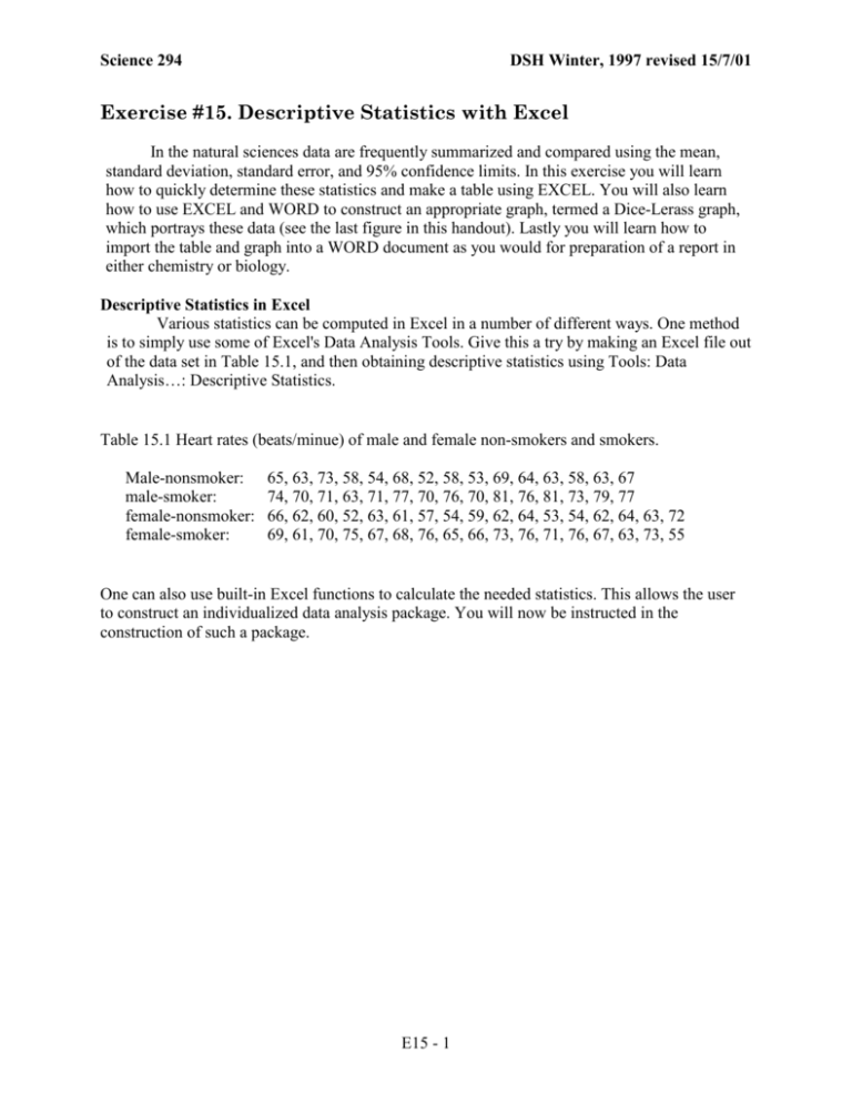
Science 294 DSH Winter, 1997 revised 15/7/01 Exercise #15. Descriptive Statistics with Excel In the natural sciences data are frequently summarized and compared using the mean, standard deviation, standard error, and 95% confidence limits. In this exercise you will learn how to quickly determine these statistics and make a table using EXCEL. You will also learn how to use EXCEL and WORD to construct an appropriate graph, termed a Dice-Lerass graph, which portrays these data (see the last figure in this handout). Lastly you will learn how to import the table and graph into a WORD document as you would for preparation of a report in either chemistry or biology. Descriptive Statistics in Excel Various statistics can be computed in Excel in a number of different ways. One method is to simply use some of Excel's Data Analysis Tools. Give this a try by making an Excel file out of the data set in Table 15.1, and then obtaining descriptive statistics using Tools: Data Analysis…: Descriptive Statistics. Table 15.1 Heart rates (beats/minue) of male and female non-smokers and smokers. Male-nonsmoker: male-smoker: female-nonsmoker: female-smoker: 65, 63, 73, 58, 54, 68, 52, 58, 53, 69, 64, 63, 58, 63, 67 74, 70, 71, 63, 71, 77, 70, 76, 70, 81, 76, 81, 73, 79, 77 66, 62, 60, 52, 63, 61, 57, 54, 59, 62, 64, 53, 54, 62, 64, 63, 72 69, 61, 70, 75, 67, 68, 76, 65, 66, 73, 76, 71, 76, 67, 63, 73, 55 One can also use built-in Excel functions to calculate the needed statistics. This allows the user to construct an individualized data analysis package. You will now be instructed in the construction of such a package. E15 - 1 Exercise 15. Excel Descriptive Statistics Science 294 Excel Template for Descriptive Statistics 1) Open a Workbook in EXCEL 98. Fill out the labels in column A (following the example provided directly to the right. ). Make the column autofit the widest label. 2) Construct the formulae required to determine each of the variables assuming the data are placed in rows 14:100 of column B. As your data use the first row of data in Table 15.1. Many of the calculated variables are functions and can be found using the paste function icon (or Insert:Function). Some calculations are briefly described here. a) Standard error is computed by dividing the standard deviation by the square root of the number of measurements (count or n). b) t (0.05,n-1) is the TINV where the degrees of freedom are the count minus one. c) 95% confidence limits for individuals are equal to the mean ± the standard deviation times the t value. d) 95% confidence limits for the mean are equal to the mean ± the standard error times the t value The data are to start in B14. To check to see that your formulae are correct, you should use the first row of data from Table 15.1. 3) After you are positively sure that the calculations are correct then copy the formulae from B2:B12 to columns C, D, E and F. Copy the data from column B14:B30 into columns CF to make sure that the formulae in rows 2:12 are working. 4) Clear all the data from B14:F30. Save the workbook as a template using the name "DescStat.tmp." Close EXCEL. 5) Reopen EXCEL and the file "DescStat.tmp." Note that the name of the file has now changed (to what?). This is because you saved it as a template. Now enter all the data from the file "DescStat.dat" into your template starting at row 14 (B14:C14:D14:E14). If you have done everything correctly the descriptive statistics should be calculated automatically. Your DescStat.tmp" file should look like the one on page 1. Congratulations, on successfully completing your first Excel template! 6) Save this file using a name different from what it opened as (you must, of course, use the Save As option). E15 - 2 Exercise 15. Excel Descriptive Statistics Science 294 Table Construction 1) Save the file yet again but this time as a text file (ASCII file) with tab delimiters. I typically append ".txt" to the name of the file. Close the file, and then reopen it. When the file is reopened all the formulae are gone and only the numbers are left behind. The numbers can be manipulated into a regular table format while this could not be done with the formulae. 2) Copy A1: E14 and open a new workbook. Select A1, choose File: Paste Special: Transpose:OK. 3) Delete all the columns except those shown below in Table 1. Then save the file as a text only with a unique name. 4) Transport the table from EXCEL to WORD by either a) copying the table in EXCEL and pasting it into a WORD document or b) opening in WORD the text file created in step 3. 5) Use Word to format the table in a nice fashion similar to that shown here. Table 1. Caption to be constructed by students. n mean SE 95% Confidence Limits Range Nonsmokers male female 15 17 61.9 60.5 1.6 1.3 58.4 - 65.3 57.8 - 63.1 52 - 73 52 - 72 Smokers male females 15 17 73.9 68.9 1.3 1.4 71.2 - 76.7 65.9 - 71.9 63 - 81 55 - 76 E15 - 3 Exercise 15. Excel Descriptive Statistics Science 294 Figure construction 1) Reopen the EXCEL file created in B3. 2) Remove all the columns except for mean, low and high 95% confidence limits of means, minimum and maximum. Each value has to be in its own column. 3) Select the remaining data but not the column headings (e.g., A2:F5); note you must include the labels (e.g., “male”) in column A. 4) Select the Chart Wizard. Make the following selections in the Chart Wizard Steps. Step 1 XY (Scatter) Chart type 1 (1st format, no lines) Step 2 Data Range: select columns Step 3 Titles nothing in Chart title Value (X) Axis: leave blank Value (Y) Axis: Heart rate (beats/min) Gridline uncheck all boxes Legend uncheck Show Legend Step 4 Select "As object in:" 5) A graph should appear similar to the one to the immediate right. 6) The graph needs lots of modification so that it appears like the one immediately below the one to the right. The following changes are required. a) Remove the border and area fill by double clicking in the middle of the graph (plot area). Select None for both the border and area. b)Change the scale on the X axis (minimum=0; maximum=4.5, major unit=1; minor unit=1; Value (Y) axis crosses at=0) c) Change the scale on the Y axis (minimum=50; maximum=85, major unit=10; minor unit=5; Value (X) axis crosses at=50) d) Change the tick mark type of both the axis to "inside." e) Remove the border around the outstide of the figure by clicking in the "chart area" outside the X & Y coordinates and selecting no border in the patterns tab. E15 - 4 Exercise 15. Excel Descriptive Statistics Science 294 7) Save the graph. I usually add the suffix of ".plt" or .".gph" to remind myself that the file contains a graph. Decision Point. It is at this point that one has to decide whether to finish the figure using ink and a ruler, or using some computer drawing program. If the former, then one should do two more operations before moving the figure into Word where the caption can easily be added. 8) Change the X axis labels from numbers to the appropriate descriptors. Select the X axis so that the Format Axis window appears. Select Font: Color, white: Background, transparent. This will eliminate the numbers on the X axis. Enter the appropriate labels one at a time by selecting the graph, typing the desired letters, hitting return, selecting the text and moving it to where you wish it. You then need to select outside the graph. Then repeat until you're finished. After this is finished one can use ruler and ink to put in the appropriate lines shown in Figure 4. 9) Change each of the points on the graph to the smallest possible symbol so hand-drawn ink lines will obscure them. Do this by selecting each one of the points and double clicking on it. Then make the marker style be a black small horizontal tick. If a computer drawing program is to be used, then deleting the points and inserting the X axis labels might more easily done in that program. I personally use MACDRAW PRO and it is very easy to put in the labels, lines, and rectangles required. CLARIS WORKS, available to you on the server disk also seems relatively easy to use. One can also do it using either the drawing portions of WORD or EXCEL. Both are tedious and take time. Based on repeated failures in my attempts to do this, my advice is to save, save, save every step that is successfully taken. Following is how I completed the figure using the drawing portion of EXCEL 98. First, I did step 8 above. Then I did the following. 10) Open the Drawing Toolbar (View: Toolbars: Drawing) and then select the figure. Use the drawing toolbar to put in the lines, rectangles, etc. 11) Use the Drawing line tool to put in the vertical line representing the range from the highest to lowest value. As your putting in the line depress the shift key and it will make the line straight vertical. Use the rectangle tool to put in the rectangle representing the 95% confidence limits. Then put in the mean line using the line tool (shift key down for straight horizontal line). You can fill the rectangles by selecting them and using the fill color drawing button (fill color: fill effects: patterns). Lastly, eliminate each of the original symbols indicating a s variable (e.g., mean) by double-clicking on them. Select the none button under Marker. The data points should disappear from the graph. E15 - 5 Exercise 15. Excel Descriptive Statistics Science 294 Heart Rate (beats/min) 80 70 60 50 0 Male 1 Female 2 NonSmokers Male 3 Female 4 Smokers 5 Figure 15.1 Caption to be constructed by students Finished Product 1) Transfer the table and the figure into a single new WORD file. Place the figure above the table and separate them 1.5 point border. Write captions for both the figure and table (figure caption on bottom, table caption on top). Place your header on the single page and be prepared to hand it in. 2) Prepare another page to hand-in. This page should contain your header and the following three pictures. a) Picture one should be of your Table and should clearly show that you used styles, and followed the main rules of word processing of never hitting the space bar or tab key more than once sequentially. b) Picture two should be of your Excel template and should include the reduced values for the heart rate data. c) Picture three should also be of your Excel template but should clearly show the formula used in the template. E15 - 6


