Producing and Interpreting Residuals Plots in SPSS
In a linear regression analysis it is assumed that the distribution of residuals,
ˆ
(Y Y ) , is, in the population, normal at every level of predicted Y and constant in
variance across levels of predicted Y. I shall illustrate how to check that assumption.
Although I shall use a bivariate regression, the same technique would work for a
multiple regression.
Start by downloading Residual-Skew.dat and Residual-Hetero.dat from my
StatData page and ANOVA1.sav from my SPSS data page. Each line of data has four
scores: X, Y, X2, and Y2. The delimiter is a blank space.
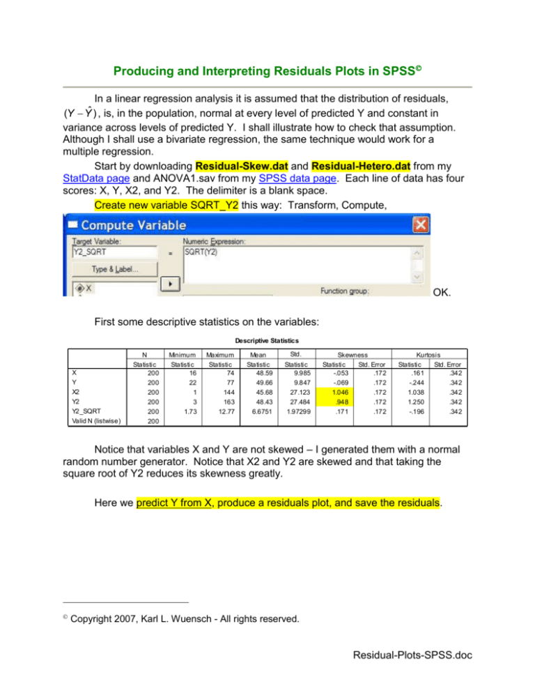
Create new variable SQRT_Y2 this way: Transform, Compute,
OK.
First some descriptive statistics on the variables:
Descriptive Statistics
X
Y
X2
Y2
Y2_SQRT
Valid N (listwise)
N
Statistic
200
200
200
200
200
200
Minimum
Statistic
16
22
1
3
1.73
Maximum
Statistic
74
77
144
163
12.77
Mean
Statistic
48.59
49.66
45.68
48.43
6.6751
Std.
Deviation
Statistic
9.985
9.847
27.123
27.484
1.97299
Skewness
Statistic
Std. Error
-.053
.172
-.069
.172
1.046
.172
.948
.172
.171
.172
Kurtosis
Statistic
Std. Error
.161
.342
-.244
.342
1.038
.342
1.250
.342
-.196
.342
Notice that variables X and Y are not skewed – I generated them with a normal
random number generator. Notice that X2 and Y2 are skewed and that taking the
square root of Y2 reduces its skewness greatly.
Here we predict Y from X, produce a residuals plot, and save the residuals.
Copyright 2007, Karl L. Wuensch - All rights reserved.
Residual-Plots-SPSS.doc
2
3
Model Summaryb
Model
1
R
.450a
R Square
.203
Adjusted
R Square
.199
Std. Error of
the Estimate
8.815
a. Predictors: (Constant), X2
b. Dependent Variable: Y
Here is a histogram of the residuals with a normal curve superimposed. The
residuals look close to normal.
Here is a plot of the residuals versus predicted Y. The pattern show here
indicates no problems with the assumption that the residuals are normally distributed at
each level of Y and constant in variance across levels of Y. SPSS does not
automatically draw in the regression line (the horizontal line at residual = 0). I double
clicked the chart and then selected Elements, Fit Line at Total to get that line.
4
SPSS has saved the residuals, unstandardized (RES_1) and standardized
(ZRE_1) to the data file:
Analyze, Explore ZRE_1 to get a better picture of the standardized residuals.
The plots look fine. As you can see, the skewness and kurtosis of the residuals is about
what you would expect if they came from a normal distribution:
5
De scri ptives
ZRE_1
St atist ic
.0000000
-2. 55481
2.65518
5.20999
-.074
-.264
Mean
Minimum
Maximum
Range
Sk ewness
Kurtos is
Now predict Y from the skewed X2.
You conduct this analysis with the same plots and saved residuals as above.
You will notice that the residuals plots and exploration of the saved residuals
indicate no problems for the regression model. The skewness of X2 may be
troublesome for the correlation model, but not for the regression model.
Next, predict skewed Y2 from X.
Model Summaryb
Model
1
R
.452a
R Square
.204
a. Predictors: (Constant), X
b. Dependent Variable: Y2
Adjusted
R Square
.200
Std. Error of
the Estimate
24.581
6
Notice that the residuals plots shows the residuals not to be normally distributed – they
are pulled out (skewed) towards the top of the plot. Explore also shows trouble:
7
Descriptives
ZRE_1
Mean
Minimum
Maximum
Range
Interquartile Range
Skewness
Kurtosis
Statistic
.0000000
-1.87474
3.61399
5.48873
1.34039
.803
.965
Notice the outliers in the boxplot.
Maybe we can solve this problem by taking the square root of Y2. Predict the
square root of Y from X.
8
Model Summaryb
Model
1
R
.459a
R Square
.211
Adjusted
R Square
.207
Std. Error of
the Estimate
1.75738
a. Predictors: (Constant), X
b. Dependent Variable: Y2_SQRT
Descriptives
ZRE_1
Mean
Minimum
Maximum
Range
Interquartile Range
Skewness
Kurtosis
Statistic
.0000000
-2.21496
2.82660
5.04156
1.42707
.133
-.240
Std. Error
.07053279
.172
.342
Notice that the transformation did wonders, reducing the skewness of the
residuals to a comfortable level.
9
We are done with the Residual-Skew data set now. Read into SPSS the
ANOVA1.sav data file. Conduct a linear regression analysis to predict illness from dose
of drug. Save the standardized residuals and obtain the same plots that we produced
above.
Model Summaryb
Model
1
R
.110a
R Square
.012
Adjusted
R Square
.002
Std. Error of
the Estimate
12.113
a. Predictors: (Constant), dose
b. Dependent Variable: illness
Look at the residuals plot. Oh my. Notice that the residuals are not
symmetrically distributed about zero. They are mostly positive with low and high values
of predicted Y and mostly negative with medium values of predicted Y. If you were to
find the means of the residuals at each level of Y and connect those means with the line
you would get a curve with one bend. This strongly suggests that the relationship
between X and Y is not linear and you should try a nonlinear model. Notice that the
problem is not apparent when we look at the marginal distribution of the residuals.
Produce the new variable Dose_SQ by squaring Dose, OK.
10
Now predict Illness from a combination of Dose and Dose_SQ. Ask for the usual
plots and save residuals and predicted scores.
Model Summary(b)
Model
1
R
.657(a)
R Square
.431
Adjusted R
Square
.419
Std. Error of
the Estimate
9.238
a Predictors: (Constant), Dose_SQ, dose
b Dependent Variable: illness
Notice that the R has gone up a lot and is now significant, and the residuals plot
looks fine.
11
Let us have a look at the regression line. We saved the predicted scores
(PRE_1), so we can plot their means against dose of the drug:
Click Graphs, Line, Simple, Define.
Select Line Represents Other statistic and scoot PRE_1 into the variable box.
Scoot Dose into the Category Axis box. OK.
12
Wow, that is certainly no straight line. What we have done here is a polynomial
regression, fitting the data with a quadratic line. A quadratic line can have one bend in
it.
Let us get a scatter plot with the data and the quadratic regression line. Click
Graph, Scatter, Simple Scatter, Define. Scoot Illness into the Y-axis box and Dose into
the X-axis box. OK. Double-click the graph to open the graph editor and select
Elements, Fit line at total. SPSS will draw a nearly flat, straight line. In the Properties
box change Fit Method from Linear to Quadratic.
Click Apply and then close the chart editor.
13
We are done with the ANOVA.sav data for now. Bring into SPSS the ResidualHETERO.dat data. Each case has two scores, X and Y. The delimiter is a blank space.
Conduct a regression analysis predicting Y from X. Create residuals plots and save the
standardized residuals as we have been doing with each analysis.
14
As you can see, the residuals plot shows clear evidence of heteroscedasticity. In
this case, the error in predicted Y increases as the value of predicted Y increases. I
have been told that transforming one the variables sometimes reduces
heteroscedasticity, but in my experience it often does not help.
Return to Wuensch's SPSS Lessons Page
Copyright 2007, Karl L. Wuensch - All rights reserved.
