Paul Gauguin: Opposite Color Masterpieces
advertisement
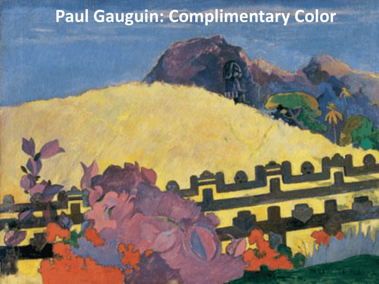
Paul Gauguin: Complimentary Color Who was Paul Gauguin? 19th Century Artist Used color in a new way Traveler and Explorer Loved exotic places, people and things What are complimentary colors? Complimentary colors are opposite each other on the color wheel. Yellow & Purple Blue & Orange Red & Green Why are color compliments special? Complementary colors appear brighter and more intense when they are placed next to each other. How did Gauguin paint with complimentary colors? Gauguin used complimentary colors to make his artwork look more “colorful” -- brighter and more intense. Let’s explore the Opposite Colors of Gauguin’s Sacred Mountain • Step 1: Draw the Outline of the picture • Step 2: Color in the Opposite Colors • Step 3: Add details if you have time Step 1: Draw the Outline with Pencil Draw the Outline of the bushes in the foreground Foreground means the part of the picture that looks closest. Draw the foreground at the bottom edge of your page. Draw the Outline of the flowers on the bushes Draw the Outline of the fence Draw the Outline of the hill The hill in this picture helps show the horizon line. The horizon line is the line that separates earth from sky. Draw the Outline of the mountain in the background Background means the part of the picture that looks farthest away. Draw the background at the top of your page. Draw over your lines with Black Sharpie Pen Step 2: Color in the Opposite Colors Color in Yellow and Purple Yellow and Purple are on the opposite sides of the color wheel. Gauguin painted the mountain and the flower bushes purple to compliment and balance the yellow of the hill in the middleground. Color in Blue and Orange Blue and Orange are on the opposite sides of the color wheel. Gauguin painted the palm tree orange to compliment and balance the blue of the sky. Color in Red and Green Red and Green are on the opposite sides of the color wheel. Gauguin painted the tree green to compliment and balance the red of the flowers in the foreground. Step 3: Add details if you have time
