Good vs. Bad Still Life
advertisement
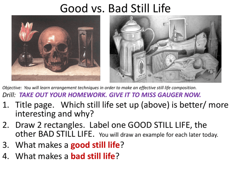
Good vs. Bad Still Life Objective: You will learn arrangement techniques in order to make an effective still life composition. Drill: TAKE OUT YOUR HOMEWORK. GIVE IT TO MISS GAUGER NOW. 1. Title page. Which still life set up (above) is better/ more interesting and why? 2. Draw 2 rectangles. Label one GOOD STILL LIFE, the other BAD STILL LIFE. You will draw an example for each later today. 3. What makes a good still life? 4. What makes a bad still life? Draw two boxes/ rectangles You will draw an example of a good and bad still life, one in each: GOOD STILL LIFE Why? A. B. C. BAD STILL LIFE Why? A. B. C. LIST 2 REASONS WHY YOU LIKE OR DON’T LIKE EACH: A. A. B. B. Make it look natural. • Have a variety of heights. • Overlap objects. • Put one in front of the other. • Groups objects. • Groups of 3 or 2. • Pull one object so that it is separated. 3. Use your pencil to get the angles. What makes a good/ bad still life? • Bad- evenly spaced, symmetrical, not touching, plain, boring, same size, stacked object sculpture, everything face the same way. • Good- Overlapping, in groups, touching, asymmetrical, off the paper, different heights, variety of objects, a theme, natural looking, opposite diagonals. Still Life RACE: 1. 2. 3. 4. 5. 6. 7. Work with the person next to you. You will have 5 minutes to get objects. Get a minimum of 5 objects. Get forms from up front, too. Set up your bad still life first. Then draw it. Change it to make it a good still life. Timer: 5 minutes 1. You will have 5 minutes to set up a good still life and a bad still life using the qualities listed from previous slide. 2. Get 5 objects. 3. 5 objects for the bad still life 4. 5 object for the good still life Time is up! 1. Set up bad still life first, then draw it in BAD STILL LIFE box. 2. How can you change it to make it a good still life? 3. Set up a good still life and sketch it in GOOD STILL LIFE box. What makes a good/ bad still life? MAKE A SKETCH OF EACH: • Bad- evenly spaced, symmetrical, not touching, plain, boring, same size, stacked sculpture • Good- Overlapping, in groups, touching, asymmetrical, off the paper, different heights, variety of objects, a theme, natural looking, OBJECTS TOUCHING THE SIDES OF THE PAPER. Assignments due: Turn in sketchbook this week: 1. Charcoal/ Chalk 2. Charcoal Pencil 3. Continuous Contour lesson and bike 4. Continuous Contour 3 objects/ designs 5. Blind contour definition. 7 drawings. 6. Negative space chairs 7. Negative space flower. 8. Angles 9. Ellipses 10. Shading 5 forms 11. Good vs. Bad still life with 2 drawings. 12. Still life homework. • What makes a bad still life? • What makes a good still life?
