WAC PowerPoint Guidelines - Watershed Agricultural Council
advertisement
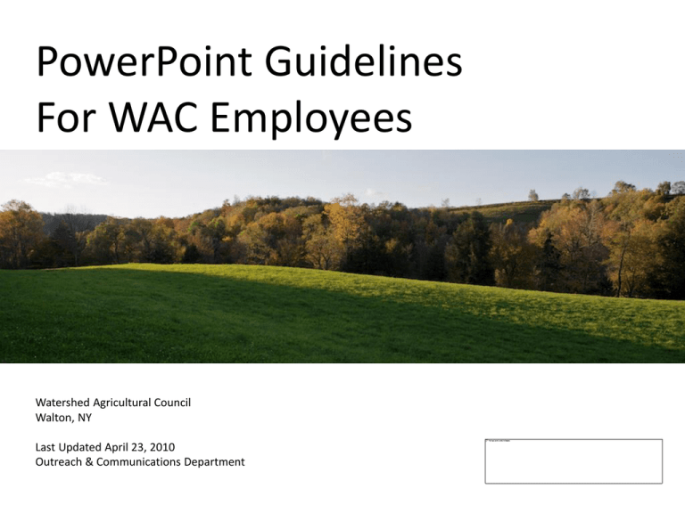
PowerPoint Guidelines For WAC Employees Watershed Agricultural Council Walton, NY Last Updated April 23, 2010 Outreach & Communications Department Introduction • When applicable, use a slide to take care of housekeeping business at beginning of presentation. (i.e., location of bathrooms, surveys to be collected, etc.) • Acknowledge and thank your partners/host for the opportunity to present . • Introduce yourself, your qualifications and the program/topic to be discussed. • Outline your key presentation points to come. • Let’s get started! EXAMPLE Housekeeping • Thanks to Andy Hubbard and the Watershed Agricultural Council for this opportunity to share tips, tricks and guidelines to PowerPoint presentations with our staff. • Feel free to ask questions at any time. • Provide feedback or improvements to this presentation by emailing taracollins@nycwatershed.org. • These are simply “guidelines” to PowerPoint presentations; ask for help if you need it. EXAMPLE Speaker: Tara Collins* • WAC Communications Director • Walton, NY office • Outreach & Communications Department here to help you with your visual, electronic , print and media needs • B.A. - Communications Mass Media (Professional Writing minor) College of New Jersey • Freelance writer for more than 25 years * Use this slide to reinforce your credibility by providing background about yourself. You may also provide background on the WAC program/topic you’re presenting. EXAMPLE Key Points PowerPoint Guidelines For WAC Employees • The organization’s suggested approach to PowerPoint presentations • Discussion of presentation layout o Logo use o Slide titles o Slide formats o Presentation examples and templates EXAMPLE Slide Titles Minimum of 8 Slides: 1. Title 2. Housekeeping 3. Program/Speaker Introduction 4. Key Points 5. Content Slides (1-45) 6. Recap Key Points 7. Funder Acknowledgement 8. Final Slide with Contact Information Slide Formats – Title Page Presentation Title Group Being Addressed Presentation Location Date Your Name & Title WAC Program (if applicable) PowerPoint Guidelines For WAC Employees Watershed Agricultural Council Walton, NY April 15, 2009 Tara Collins, Communications Director Outreach & Communications Department EXAMPLE Slide Formats – Logos • The WAC logo should appear on every page, where possible, either in the upper right or lower right corner of slide. • A logo on every other slide is also appropriate. • Keep logo consistently in same spot from slide to slide. EXAMPLE Slide Formats – General • Use 3-5 bullets per page. • Keep font size large. • A slide represents 1-5 minutes of talking time. • Presentations may run 5-50 slides. EXAMPLE Slide Formats – Backgrounds If you use images coloring… Use images to attract and keep people’s attention, but not distract from your message. Slide Formats – Backgrounds Place an image in a background mode by right clicking Format Picture > left click Recolor > left click Color Modes > Make your selection. Images should enhance what you are saying, not compete for the audience’s attention. EXAMPLE Slide Formats – Text • Use fonts appropriate to your program. Calibri (sans serif) and Adobe Garamond Pro (serif) are options. For a program example: Pure Catskills uses Broadway and Century Gothic fonts. • Use no more than two fonts. • Use no more than three font sizes such as o Headlines in 44 point o Body text in 32 point o Footnotes and sources in 12 point* * In total, you will have six possible type styles to access (3 Calibri, 3 Garamond). Slide Formats – Text • Provide adequate contrast. Use dark lettering/text on light backgrounds (black print on yellow) • Or light lettering on dark backgrounds (white lettering on navy). • Consider how the color and text look within the frame and on the slide. • Keep slides visually interesting but consistent . • View your slide on the Big Screen! Slide Presentation – Content • Multiple slides fill the bulk of your PowerPoint presentation. • Cluster key points and supporting facts. • Don’t put too much on a page. • Use slide content to keep your presentation on track. Slide Presentation – Summarize Key Presentation Points • People have a short attention span and usually remember three key points. • Use one slide to reiterate those points; this is your “Call to Action.” • Keep it simple . Key Point Summary • Use background, text, color and images to enhance your presentation ~ but not overrun it! • Keep it visually consistent, simple, clean and easy to read. • ALWAYS have someone proofread your PowerPoint – Mistakes are BIGGER on screen. • Don’t be bashful ~ Ask for help! EXAMPLE The Watershed Agricultural Council is funded in part by: along with other federal, foundation and private sources. The WAC is an equal opportunity employer and provider. EXAMPLE Our Mission For more information: Andy Hubbard, Watershed Forester East of Hudson Program (914) 962-6335, ext. 12 ahubbard@nycwatershed.org Or visit our website: EXAMPLE PowerPoint Slide Order Your topic and audience will dictate how you arrange and order the slides. Here is a suggested presentation order: • • • • • • • • • Title Housekeeping WAC Program Introduction/Speaker qualifications Key Points to Cover Content Slides/Bulk of Presentation Key Point Summary Funder Acknowledgement Final Slide with Your Contact Information Optional: Mission statement Checklist for WAC PowerPoints • • • • View on the Big Screen Ask someone else to proof Get final approval of Program Manager Email final approved version to Communications Director for inclusion on the WAC intranet for others to access • Thank You! Additional Logos
