PowerPoint research poster template
advertisement
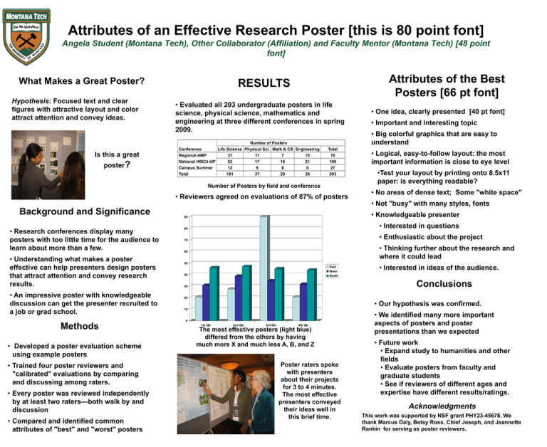
Attributes of an Effective Research Poster [this is 80 point font] Angela Student (Montana Tech), Other Collaborator (Affiliation) and Faculty Mentor (Montana Tech) [48 point font] What Makes a Great Poster? Hypothesis: Focused text and clear figures with attractive layout and color attract attention and convey ideas. Is this a great poster? Attributes of the Best Posters [66 pt font] RESULTS • Evaluated all 203 undergraduate posters in life science, physical science, mathematics and engineering at three different conferences in spring 2009. Number of Posters Conference Life Science Physical Sci. Math & CS Engineering Regional AMP 37 11 7 15 National HBCU-UP 52 17 16 21 Campus Summer 12 9 6 0 Total 101 37 29 36 Total 70 106 27 203 Number of Posters by field and conference • Reviewers agreed on evaluations of 87% of posters Background and Significance • Research conferences display many posters with too little time for the audience to learn about more than a few. • Understanding what makes a poster effective can help presenters design posters that attract attention and convey research results. • An impressive poster with knowledgeable discussion can get the presenter recruited to a job or grad school. Methods • Developed a poster evaluation scheme using example posters • Trained four poster reviewers and "calibrated" evaluations by comparing and discussing among raters. • Every poster was reviewed independently by at least two raters—both walk by and discussion • Compared and identified common attributes of "best" and "worst" posters • One idea, clearly presented [40 pt font] • Important and interesting topic • Big colorful graphics that are easy to understand • Logical, easy-to-follow layout: the most important information is close to eye level •Test your layout by printing onto 8.5x11 paper: is everything readable? • No areas of dense text; Some "white space" • Not "busy" with many styles, fonts 90 • Knowledgeable presenter 80 • Interested in questions 70 • Enthusiastic about the project • Thinking further about the research and where it could lead 60 50 East West North 40 • Interested in ideas of the audience. Conclusions 30 20 • Our hypothesis was confirmed. 10 0 1st Qtr 2nd Qtr 3rd Qtr 4th Qtr The most effective posters (light blue) differed from the others by having much more X and much less A, B, and Z Poster raters spoke with presenters about their projects for 3 to 4 minutes. The most effective presenters conveyed their ideas well in this brief time. • We identified many more important aspects of posters and poster presentations than we expected • Future work • Expand study to humanities and other fields • Evaluate posters from faculty and graduate students • See if reviewers of different ages and expertise have different results/ratings. Acknowledgments This work was supported by NSF grant PHY23-45678. We thank Marcus Daly, Betsy Ross, Chief Joseph, and Jeannette Rankin for serving as poster reviewers.
