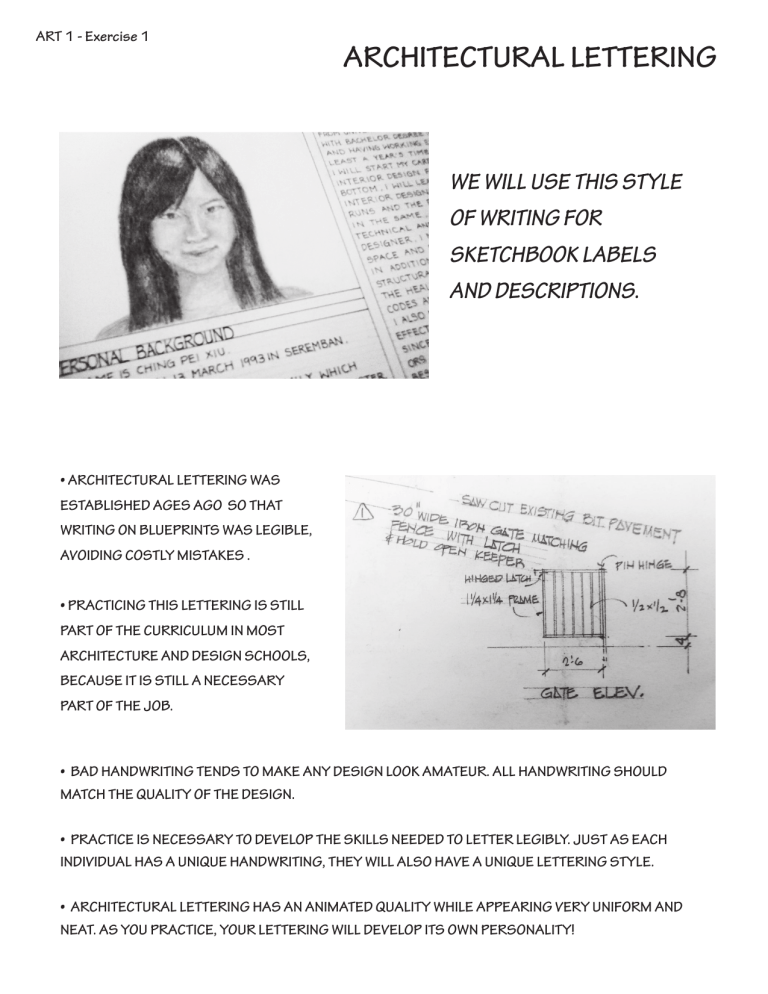
ART 1 - Exercise 1 ARCHITECTURAL LETTERING WE WILL USE THIS STYLE OF WRITING FOR SKETCHBOOK LABELS AND DESCRIPTIONS. • ARCHITECTURAL LETTERING WAS ESTABLISHED AGES AGO SO THAT WRITING ON BLUEPRINTS WAS LEGIBLE, AVOIDING COSTLY MISTAKES . • PRACTICING THIS LETTERING IS STILL PART OF THE CURRICULUM IN MOST ARCHITECTURE AND DESIGN SCHOOLS, BECAUSE IT IS STILL A NECESSARY PART OF THE JOB. • BAD HANDWRITING TENDS TO MAKE ANY DESIGN LOOK AMATEUR. ALL HANDWRITING SHOULD MATCH THE QUALITY OF THE DESIGN. • PRACTICE IS NECESSARY TO DEVELOP THE SKILLS NEEDED TO LETTER LEGIBLY. JUST AS EACH INDIVIDUAL HAS A UNIQUE HANDWRITING, THEY WILL ALSO HAVE A UNIQUE LETTERING STYLE. • ARCHITECTURAL LETTERING HAS AN ANIMATED QUALITY WHILE APPEARING VERY UNIFORM AND NEAT. AS YOU PRACTICE, YOUR LETTERING WILL DEVELOP ITS OWN PERSONALITY! EXAMPLES OF ARCHITECTURAL LETTERING GUIDELINES: Guidelines are drawn very light and will not be erased: the text box is part of the beauty of this hand-drawn lettering style. · Draw guidelines with a sharp H pencil in regular intervals. · Sets of lines should be drawn to the width of your text box or label. LETTERING: Lettering can be written by using sharp B pencil or technical pen. · Use light guidelines · When learning, it is helpful to use a straight edge to draw the vertical lines for the letters · Letters are written in all caps · Letters should all be the same width · Skip a space between each line In this example, note how all vertical strokes are perpendicular to the guidelines. The horizontal strokes are located high or low of center. Rounded letters slant forward. This example preserves a hand-drawn personality by slanting the letters slightly backward and extending the ascenders above the guideline. AS YOU PRACTICE, YOUR LETTERING WILL DEVELOP ITS OWN PERSONALITY!


