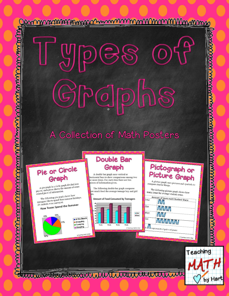
Thank you so much for downloading this teacher-tested resource. You might also be interested in the following: The Average Pumpkin – Data Collection Follow my blog. Join me on Facebook to learn about upcoming resources, ask a question or just leave a comment. Visit me on Teachers Pay Teachers to provide feedback about this resource and find more math resources that you can use in your own classroom. Credits Fonts by Jen Jones – Hello Literacy Creative Clips by Krista Wallden Dreamlike Magic Copyright © Teaching Math by Hart 2012 All rights reserved by the author. Permission to copy for classroom use only. Electronic distribution limited to classroom use only. © 2012– Teaching Math by Hart - http://www.teacherspayteachers.com/Store/Teaching-Math-By-Hart How to use this Resource Within this resource you will find 6 posters to display in your classroom, to help reinforce the concept of using graphs to display different types of information. These posters could also be incorporated into centers, where students are provided with data of some sort and need to decide how to best to represent it using a specific type of graph. I recommend printing on cardstock and laminating before use. I hope you find this resource useful. Enjoy! © 2012– Teaching Math by Hart - http://www.teacherspayteachers.com/Store/Teaching-Math-By-Hart A graph is used to represent information in the form of a picture, diagram, or drawing. © 2012– Teaching Math by Hart - http://www.teacherspayteachers.com/Store/Teaching-Math-By-Hart A picture graph uses pictures and symbols to compare similar things. The following picture graph shows how many jeans the average student owns. Amount of Jeans each Student Owns Drew Aliya Jaxton Olivia Each represents 2 pairs of jeans © Teaching Math by Hart © 2012– Teaching Math by Hart - http://www.teacherspayteachers.com/Store/Teaching-Math-By-Hart A bar graph uses vertical or horizontal bars to show comparisons among two or more items. The following bar graph shows how much food the average teenager eats. © Teaching Math © 2012– Teaching Math by Hart - http://www.teacherspayteachers.com/Store/Teaching-Math-By-Hart by Hart A bar graph uses vertical or horizontal bars to show comparisons among two or more items. The following bar graph shows how much food the average teenager eats. © 2012– Teaching Math by Hart - http://www.teacherspayteachers.com/Store/Teaching-Math-By-Hart © Teaching Math by Hart A double bar graph uses vertical or horizontal bars to show comparisons among two or more items. For each item there are two pieces of information given. The following double bar graph compares how much food the average teenage boy and girl eats. © 2012– Teaching Math by Hart - http://www.teacherspayteachers.com/Store/Teaching-Math-By-Hart © Teaching Math by Hart A pie graph is a circle graph divided into pieces; each piece shows the amount of some related piece of information. The following pie graph shows how teenagers like to spend their summer holidays. 25 students were surveyed. number of people surveyed and divide by the number of people in each category. © 2012– Teaching Math by Hart - http://www.teacherspayteachers.com/Store/Teaching-Math-By-Hart © Teaching Math by Hart A line graph uses lines to show how different pieces of information are related. The following line graph shows the average weight of teenage boys and teenage girls. © 2012– Teaching Math by Hart - http://www.teacherspayteachers.com/Store/Teaching-Math-By-Hart © Teaching Math by Hart Thank you so much for downloading this freebie! Questions? Don’t hesitate to contact me at teachingbyhart@gmail.com © 2012– Teaching Math by Hart - http://www.teacherspayteachers.com/Store/Teaching-Math-By-Hart


