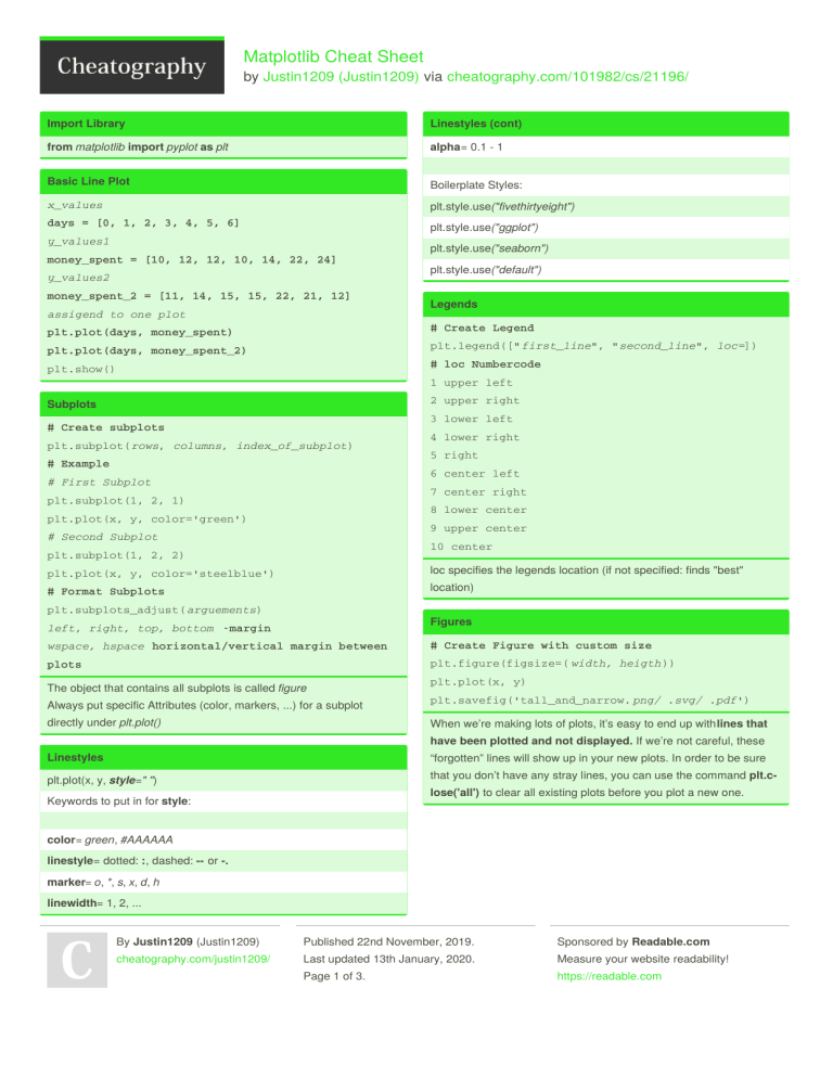
Matplotlib Cheat Sheet by Justin1209 (Justin1209) via cheatography.com/101982/cs/21196/ Import Library Linestyles (cont) from matplotlib import pyplot as plt alpha= 0.1 - 1 Basic Line Plot Boilerplate Styles: x_values plt.style.use("fivethirtyeight") days = [0, 1, 2, 3, 4, 5, 6] plt.style.use("ggplot") y_values1 plt.style.use("seaborn") money_spent = [10, 12, 12, 10, 14, 22, 24] y_values2 money_spent_2 = [11, 14, 15, 15, 22, 21, 12] assigend to one plot plt.style.use("default ") Legends plt.plot(days, money_spent) # Create Legend plt.plot(days, money_spent_2) plt.legend([" first_line", " second_line ", loc=]) plt.show() # loc Numbercode 1 upper left 2 upper right Subplots 3 lower left # Create subplots plt.subplot( rows, columns, index_of_subplot) # Example 4 lower right 5 right 6 center left # First Subplot 7 center right plt.subplot(1, 2, 1) 8 lower center plt.plot(x, y, color='green') 9 upper center # Second Subplot 10 center plt.subplot(1, 2, 2) loc specifies the legends location (if not specified: finds "best" plt.plot(x, y, color='steelblue') location) # Format Subplots plt.subplots_adjust( arguements) Figures left, right, top, bottom -margin wspace, hspace horizontal/vertical margin between # Create Figure with custom size plots plt.figure(figsize=( width, heigth )) The object that contains all subplots is called figure plt.plot(x, y) Always put specific Attributes (color, markers, ...) for a subplot plt.savefig('tall_and_narrow. png/ .svg/ .pdf') directly under plt.plot() When we’re making lots of plots, it’s easy to end up with lines that have been plotted and not displayed. If we’re not careful, these Linestyles “forgotten” lines will show up in your new plots. In order to be sure plt.plot(x, y, style=" ") that you don’t have any stray lines, you can use the command plt.c‐ lose('all') to clear all existing plots before you plot a new one. Keywords to put in for style: color= green, #AAAAAA linestyle= dotted: :, dashed: -- or -. marker= o, *, s, x, d, h linewidth= 1, 2, ... By Justin1209 (Justin1209) Published 22nd November, 2019. Sponsored by Readable.com cheatography.com/justin1209/ Last updated 13th January, 2020. Measure your website readability! Page 1 of 3. https://readable.com Matplotlib Cheat Sheet by Justin1209 (Justin1209) via cheatography.com/101982/cs/21196/ Modify Ticks Stacked Bars # Specify subplot to modify # We use the keyword bottom to do this ax1 = plt.subplot( row, column, index) # The top bar will have bottom set as height # Attributes # First Bar ax1.set_xticks([1, 2, 4]) video_game_hours = [1, 2, 2, 1, 2] ax1.set_yticks([ 0.1, 0.2, ...]) plt.bar(range(len(video_game_hours)), ax1.set_xticklabels(["Jan", "Feb", "Apr"], rota‐ video_game_hours) tion=30) # Second Bar # rotation=degrees rotates the labels book_hours = [2, 3, 4, 2, 1] ax1.set_yticklabels(["10%", "20%", ...]) plt.bar(range(len(book_hours)), We have to do it this way, even if we only have one plot book_hours, bottom=video_game_hours) # Get each bottom for 3+ bars Axis and Labels sport_hours = np.add(video_game_hours, book_hours) Zoom in or out of the plot: If we want to compare "different sub-attributes from one attribute" we plt.axis(x_min, x_max, y_min, y_max) can use stacked bar charts. For example: Labeling the Axes: Attribute: Entertainment hours plt.xlabel("str ")/ plt.ylabel() / plt.title() Sub-Attributes: Gaming, Reading, ... Add Text to Graph Error Bars plt.text(x_coord, y_coord, "text"); # Use the keyword yerr to repersent the error range Simple Bar Chart values = [10, 13, 11, 15, 20] plt.bar(range(len(y_values)), y_values) yerr = [1, 3, 0.5, 2, 4] # singe value possible We use range(len(y_values)) to get a tick for each value we want to plt.bar(y, x, yerr=yerr, capsize=10) represent in the Bar Chart plt.show() If we want to present an uncertainty Range within a Bar Chart we Scatter Plot can use Error Bars plt.scatter(x_values, y_values) Fill Between (Line Plot) Side-By-Side Bars x = range(3) # We have to specifiy the location of each Dataset y = [10, 12, 13] in the Plot using this pattern: y_lower = [8, 10, 11] n = ? # Number of specific dataset y_upper = [i + 2 for i in y_values] t = ? # Number of datasets # Calculate a % deviation d = ? # Number of sets of bars y_lower_bound = [element - (element * error_in_‐ w = 0.8 # Width of each bar decimal) for element in original_list_of_y_values] x_values1 = [t*element + w*n for element in #this is the shaded error range(d)] plt.fill_between(x, y_lower, y_upper, alpha =0.2) # Get x_values in the middle of both bars #this is the line itself middle_x = [ (a + b) / 2.0 for a, b in zip(x_val‐ plt.plot(x, y) ues1, x_values2)] plt.show() Returns a shaded are around the line By Justin1209 (Justin1209) Published 22nd November, 2019. Sponsored by Readable.com cheatography.com/justin1209/ Last updated 13th January, 2020. Measure your website readability! Page 2 of 3. https://readable.com Matplotlib Cheat Sheet by Justin1209 (Justin1209) via cheatography.com/101982/cs/21196/ Pie Chart payment_names = ["Card Swipe", "Cash", "Apple Pay", "Other"] payment_freqs = [270, 77, 32, 11] # Creating Pie Chart plt.pie(payment_freqs) plt.axis('equal') # Two Methods for Labeling # First Method plt.legend(payment_names) # Second Method (directly when creating) plt.pie(payment_freqs, labels=payment_names) Show percentages of total in each slice: plt.pie(payment_freqs, labels=payment_names, auto‐ pct='%0.1f%%') # autopct takes a string formatting instruction # %d%% -> round to decimal plt.show() Histogram # Create one Histogram plt.hist(dataset, range=(0,100), bins=20) # Specifiy number of bins (default = 10) # Create multiple Histograms plt.hist(a, alpha=0.5, normed=True) plt.hist(b, histtype='step', linewidth=2 normed‐ =True) # Specify alpha for opacity or use histtype to draw just the outline # Use linewidth to specifiy the linewidth of the outline # Use the keyword normed to normalize the histograms Normalize divides the x_values by a constat such that the area under the curve sums to 1 By Justin1209 (Justin1209) Published 22nd November, 2019. Sponsored by Readable.com cheatography.com/justin1209/ Last updated 13th January, 2020. Measure your website readability! Page 3 of 3. https://readable.com
