Maggie’s
West London
Charing Cross Hospital
Design
Guide:
an architectural walkthrough by
Rogers Stirk Harbour + Partners
4 Rogers Stirk Harbour + Partners
MaggiesGuideA5_printArtwork_2014-09-16.indd Spread 1 of 8 - Pages(4, i)
Maggie’s West London Centre | Design Guide
i
16/09/2014 12:31:09
Maggie’s Centres provide practical, emotional and
social support for people with cancer, and their
family and friends, following the ideas about cancer
care originally laid out by Maggie Keswick Jencks.
Maggie lived with terminal cancer for two years
and, in the time leading up to her death in 1995,
used her knowledge and experience to create a
blueprint for a pioneering approach to cancer care.
She was determined that people should not ‘lose
the joy of living in the fear of dying’ and in order to
live more positively with cancer believed people
need information that will allow them to be an
informed participant in their medical treatment,
stress-reducing strategies, psychological support
and the opportunity to meet other people in similar
circumstances in a relaxed domestic atmosphere.
In November 1996, the first Maggie’s Centre
opened in Edinburgh and what Maggie had planned
became real. Maggie’s continues to grow and
today provides an evidence-based programme of
support from 18 Centres in the UK, online
and abroad.
Rogers Stirk Harbour + Partners (RSHP) is an
international architectural practice based
in London. Over three decades, RSHP has attracted
critical acclaim and awards with built projects
across Europe, North America, Australia and Asia.
The practice employs around 200 people, including
9 Partners, 10 Associate Partners and 56
Associates, in offices across the world – London,
Shanghai and Sydney. A ‘Think Tank’ philosophy
is employed at every level, to enable design
and management leaders to collaborate and
contribute their individual expertise. This
‘collegiate’ approach to the work of the practice
is embodied in a constitution that consciously
brings a moral dimension to its work and takes
the form of, among other initiatives, a staff
profit-sharing scheme and significant contributions
to charity, with staff members nominating the
charities of their choice.
Richard Rogers has been widely recognised for
his contribution to architecture and urbanism.
To reflect the growing importance of two of the
younger Partners, Graham Stirk and Ivan Harbour,
and their role alongside Richard Rogers in the
practice’s future, Richard Rogers Partnership
became Rogers Stirk Harbour + Partners in 2007.
Together with other long-standing Partners, Stirk
and Harbour represent the inherent continuity and
consistency of the philosophy which the practice
applies to all its work.
Ivan Harbour, design lead on the Maggie’s Centre,
joined the practice in 1985, and has been key in
developing its design language for over 25 years.
He has been design lead on projects as diverse as
the Madrid Barajas Airport, Bordeaux Law Courts
and Mossbourne Community Academy, London.
Maggie’s Centres are for anyone and
everyone affected by cancer.
Built in the grounds of NHS hospitals, Maggie’s Centres offer a programme of support
that has proven to strengthen physical and emotional wellbeing. They are places
to find practical advice; places where qualified experts provide emotional support;
friendly places to meet other people; or simply calming spaces to sit quietly.
Each Centre reintroduces architecture into the medical process but, unlike most
hospital buildings, does so in a way that is ‘non-prescriptive’; with mixed-use spaces
that concentrate on the individual and social needs of visitors; a place where all are in
it together: patients, carers, doctors, fund-raisers and those just there for a cup of tea.
The practical, emotional and social needs of the people Maggie’s supports are
represented expressively and creatively in a Centre’s design. This leads to an
architectural style of imaginative projection: something unusual and suggestive,
something enigmatic and charged. But just as important as the openly expressive
display is the inward-focused support, reflection and private conversation.
For Maggie’s, architecture is a key part of the caring environment; each Centre is
designed by a different architect but all start with the same brief: a small, welcoming
building that places people first, increases human connectedness and makes visitors
feel valued. Collectively, the Centres are an ongoing exponent of the beneficial effects
of space and form and the positive relationship between architecture and wellbeing.
ii Rogers Stirk Harbour + Partners
Maggie’s West London Centre | Design Guide 1
Maggie’s West London Centre; site and ground
floor plan.
This guide provides a personal walkthrough of the
Centre, written by the architects who designed
it. Follow the plan’s line and read along with the
explanation of the architecture, or use the guide to
explore the welcoming environments at your own
pace. The photographs – their location marked and
numbered on the plan and in the text – correspond
to key views outside and inside the building.
Place: London, England
Date: 2001–2008
Client: Maggie’s Centres
Cost: £2.1 million
Gross Internal Area: 370m²
Selected Awards: RIBA Stirling Prize &
Award for London, 2009;
Civic Trust Award, 2009
Architect: Rogers Stirk Harbour
+ Partners
Structural
& Services Engineer: Arup
Quantity Surveyor: Turner & Townsend
Landscape Architect: Dan Pearson Studio
Lighting Consultant: Speirs and Major
Main Contractor: ROK
6
7
8
1
4
9
5
3
2
2 Rogers Stirk Harbour + Partners
Maggie’s West London Centre | Design Guide 3
1
Maggie’s West London Centre at Charing Cross
Hospital in Hammersmith is surrounded by a
collection of pink-stemmed birch trees that shield
the building from a busy junction of the Fulham
Palace Road. At first, the Centre is glimpsed as
only walls of colour and a protecting canopy. Like
a garden pavilion, it appears as a non-institutional
building in a bustling, institutional environment.
We approach it through the hospital grounds, enter
between high walls and discover its heart – an open
room, a kitchen table, a cup of tea.
A relatively small ‘open house’ arranged over two
floors, the Centre was designed and built by
Rogers Stirk Harbour + Partners from 2001–8, led
by senior partner Ivan Harbour. Fully accessible,
flexible and adaptable – like every Maggie’s
Centre – it offers free practical, emotional and
social support to people with cancer, and their
family and friends.
The building is made up of five components: a
boundary wall; a kitchen; small courtyards and
gardens; flexible annexes; and a floating roof.
4 Rogers Stirk Harbour + Partners
2
Together these elements abut, combine, offset
and slide past one another to produce a seamless
habitat that can inspire quiet hope and raise
uncertain spirits.
From the street, the Centre’s deep orange-red
walls are shielded by the birches; the multi‑
stemmed trees form a moving, graphic display
against the block colour. Moving closer, a curving
path leads us to the Centre between old London
plane trees, culminating in a verdant public
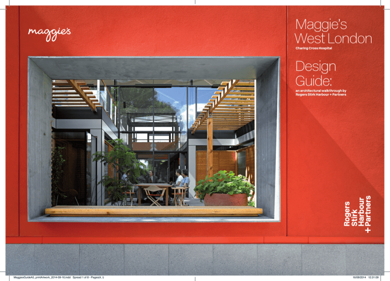
courtyard. 1. The long boundary wall – part
protector and part defiant shout – is punctured
by an opening; we look through to an internal
garden and witness reflections, light and movement
behind a double‑height glass wall, giving hints
of the welcoming space within.
Turning left from this window and following the
pin-wheeling wall inwards, the entrance loggia is
revealed. At this point, the architecture appears
inward looking, almost defensive, turning its back
on the city but the loggia, rustling with evergreen
bamboos and punctuated by sculptures, ensures
we feel welcomed. 2. It acts like a filter, the
greenery a natural cleanser oxygenating the air.
The winding approach and elongated entrance
are early hints of the building’s labyrinthine
nature – here it may simply echo an individual’s
journey, a pathway for a process of restoration.
Landscaping is a fundamental component of all
Maggie’s Centres. Designers Dan Pearson Studio
have used the landscape to integrate the
building into an urban site while also creating
therapeutic environments.
1. Approaching the Centre from the south, visitors
are slowed by the garden path, meandering
through the old London plane trees, in
a landscape designed by Dan Pearson Studio.
2. The entrance is bordered by orange-red
walls; we move along the loggia, which operates
like an external room, and pass beneath the
overhanging roof punctured by louvred openings.
We catch one last glimpse of the city, through a
white glass screen opposite the building’s front
door. A flickering show of arboreal silhouettes
and speeding traffic, the frosted window calls to
mind a Far-Eastern animated scroll, set deep
into the exterior wall bright with the orange-red
of Imperial China.
When entering the building we make our final move
from exterior to interior after a procession through
spaces that mediate between these two conditions.
Maggie’s West London Centre | Design Guide 5
3
4
3. An abundance of natural light flows into the
main spaces. This is achieved by raising the roof
above a ring of clerestory glazing and stopping
the timber walls short of the ceilings.
4. The central area is a social living space; an open
kitchen embodies a sense of home, assisted by its
non-institutional touches, such as connections to
the outside and an absence of signage.
The tree-lined path, secluded courtyard, narrowing
loggia and overhanging roof have all worked
together to lead us towards the calming heart of
the Maggie’s Centre and subtly remove us from the
atmosphere of the street and the hospital.
It is immediately clear that we are in a space much
more domestic in scale and character than most
buildings we attribute to healthcare. 3. A palette of
warm timber and smooth concrete soaks up the
daylight that pours in from the two-storey glazing.
Built-in cabinets and shelves act as partitions; the
furniture and structure becoming interchangeable.
With walls stopping short of full-height, the
clerestory gap at the ceiling establishes a single,
flowing space and links even the most private
areas to the building’s centre. A small library offers
secluded seating to our right but we are drawn, as
we would be when entering a home, to the kitchen
and hearth at the building’s heart.
A communal table 4. completes the domestic
nature of the central area and a lack of signage
reiterates that this is not an institutional building.
6 Rogers Stirk Harbour + Partners
Maggie’s West London Centre | Design Guide 7
5 6
Visitors are free to sit, chat, eat and drink together
at the large table and, if the weather is bad, enjoy
the largest of the three courtyard gardens through
the double-height window. If the weather is good,
however, we can slide back the door and explore
the garden.
We have entered the southernmost – and also
largest – of the three external courtyard gardens,
each designed as extensions of the internal
areas. 5. These inner courtyards are planted with
exotic architectural fauna to provide year-round
interest. A horticulturist works with visitors on the
maintenance of these gardens as a therapeutic
activity, shown to have a positive effect on wellbeing.
5. A sliding door leads to the garden and provides
natural ventilation. Offering sunlight and shade,
the garden is visually linked to the upper terraces,
with both partially covered by the floating roof.
6. The large sitting room also faces the garden.
Timber furnishings contrast with the concrete
structure and this clarity aids in the flexibility of
the space; it can easily change from a sitting area
to an activity zone.
Another space that shares access to this
courtyard is the large sitting room – one of a wide
variety of annexes, social rooms, private spaces
or inglenooks. Entering via double doors to the
outside, the large room is filled with soft furnishings
but is robust and practical to handle a variety
of uses. 6. A key element of the Centre’s design
concept is its flexibility of space, to encourage
8 Rogers Stirk Harbour + Partners
Maggie’s West London Centre | Design Guide 9
7
7. Returning to the open central space we are
increasingly aware of its flexibility; the communal
areas have a lively domestic atmosphere.
8. Yet, in the same space, more intimate seating
creates informal meeting places or areas for
personal reflection.
9. Continuing this theme of flexibility, the private
rooms, adjacent to the work area beneath the
stairs, are bounded by sliding partitions that can
transform the spaces for various events.
10 Rogers Stirk Harbour + Partners
8
people to be at home anywhere in the building,
enabling a feeling of ownership rather than
the sense that they are visitors. The design was
conceived to make the building accessible, homely,
personal and comfortable, with a layout that is open
but incorporates varying degrees of private space.
Other examples of the more intimate, private rooms
are to be found across from the double-height
kitchen space on the building’s southern side. The
kitchen’s position as the open heart of the building
is further enhanced now we have experienced the
juxtaposition of surrounding courtyard gardens,
sitting rooms and more personal spaces. 7. As we
traverse the Centre we are moving towards, away
from and adjacent to pockets of external space and
natural light, areas of calm and of community. It is
in this collection of zones that the complex journey
required of a person affected by cancer is mimicked
and complimented by the multi-layered nature
of the centre itself. 8. The shifting spaces change in
use several times a week or even a day.
The series of spaces on the north side of the Centre
represent this changeability particularly well. After
passing beneath the stairs we stand in a secluded
work area, though views through the open stairs
connect us back to the kitchen table and the main
space. The corner behind us has two timber doors,
one either side of its apex and each leading to a
private room. However, these doors, the walls that
house them and even the divisions between the
two rooms, can be slid back and folded away. 9.
What was once a small lecture room has morphed
into a studio for art therapy; a private consultation
room has become a Tai Chi school.
We can end our tour by climbing the stairs to the
open mezzanine level of office spaces and roof
terraces. 10. This raised storey brings us closer
to the floating roof, where continuous clerestory
glazing elevates the ceiling plane as it extends out
over the wooden decks, populated with benches
and aromatic herbs to be used in the kitchen.
This work level is fully accessible – physically and
visually – to all, ensuring staff remain in constant
9
contact with life at the Centre. The birches provide
a green canopy backdrop and the tree tops
themselves are imitated in louvred openings that
puncture the lightweight steel roof. Each opening
filters dappled light down through every level of the
building, much like a protective forest canopy.
The Centre can be many things to many people:
open house, rest stop, learning centre, thinking
space or social hub. This flexibility of use is the
result of careful consideration and a balance of
overlapping spaces and programmes. Even our first
impression of the Centre as a ‘garden pavilion’ is a
construct of the architecture. Through its five core
elements, and as a consequence of an overbearing
site, the building creates its own environment or
‘garden’, placing itself as a ‘pavilion’ within an outer
wall; a gatehouse providing space and relief.
More simply put, this Centre, like every other, is a
warm and welcoming place where professional
staff are on hand to offer the support people need
to find their way through cancer.
Maggie’s West London Centre | Design Guide 11
10
10. The mezzanine level is free of partitions to
allow for unencumbered views to the ground level
and out to the terraces and tree tops beyond.
This is direct contrast to the more inward-focused
main floor.
You are always welcome to come to a Maggie’s
Centre to ask any questions or just to look around.
Pop in, meet the team and have a cup of tea.
For more information on RSHP and this design
guide, please contact: Tom Wright, Publications
Manager; tom.w@rsh-p.com
Maggie Keswick Jencks Cancer Caring
Centres Trust (Maggie’s) is a registered charity,
No. SC024414
All rights reserved. No part of this publication
may be reproduced by any means without
prior permission in writing by the publisher.
Maggie’s Centres, 2nd Floor, Palace Wharf,
Rainville Road, London W6 9HN
Produced by Rogers Stirk Harbour + Partners 2014
© 2014 Rogers Stirk Harbour + Partners LLP
www.maggiescentres.org
Thames Wharf, Rainville Road, London W6 9HA
www.rsh-p.com
12 Rogers Stirk Harbour + Partners
Maggie’s West London Centre | Design Guide 3


