"Step Sheet: Creating a Data Table and Line Graph" Area of Plant
advertisement

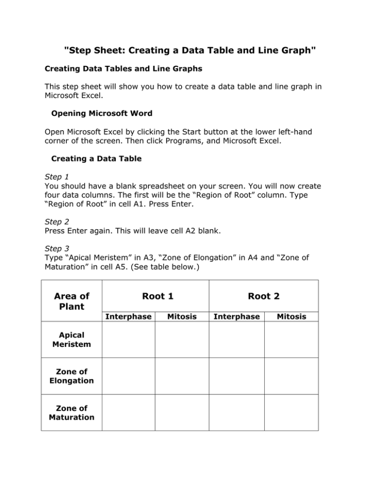
"Step Sheet: Creating a Data Table and Line Graph" Creating Data Tables and Line Graphs This step sheet will show you how to create a data table and line graph in Microsoft Excel. Opening Microsoft Word Open Microsoft Excel by clicking the Start button at the lower left-hand corner of the screen. Then click Programs, and Microsoft Excel. Creating a Data Table Step 1 You should have a blank spreadsheet on your screen. You will now create four data columns. The first will be the “Region of Root” column. Type “Region of Root” in cell A1. Press Enter. Step 2 Press Enter again. This will leave cell A2 blank. Step 3 Type “Apical Meristem” in A3, “Zone of Elongation” in A4 and “Zone of Maturation” in cell A5. (See table below.) Area of Plant Root 1 Interphase Apical Meristem Zone of Elongation Zone of Maturation Mitosis Root 2 Interphase Mitosis Step 4 In cell B1, type “Root 1.” Click the cell again and in the text box, select a 14-sized font and click the B in the tool bar. This will make the “Root 1” appear larger and bolder. Step 5 In cell D1, type “Root 2.” Increase the font and place in bold as in step 5. Step 6 In cell B2, under “Root 1,” type “Interphase.” In cell B3 (under root 1), type “Mitosis.” Enter in the data that you collected in your exercise in the appropriate cells under root 1. Step 7 Check to make sure that your data is correct. Step 8 Repeat steps 6 and 7 for root 2. Determining the Averages Follow these steps to create a new table for averages. Step 1 In cell A7, type “Location.” Step 2 In cell B7, type “Interphase.” Step 3 In cell C7, type “Mitosis.” Step 4 In cell A8, type “Apical Meristem,” “Zone of Elongation” in “Zone of Maturation” in cell A10. Location Apical Meristem Zone of Elongation Zone of Maturation Interphase Mitosis cell A9, and Step 5 In cell B8, type “=average(b2,d2)” then press Enter. This will automatically place the average number of Interphase cells in the apical meristem. Step 6 In cell B9, type “=average(b3,d3)” then press Enter. Step 7 In cell B10, type “=average(b4,d4)” then press Enter. Step 8 In cell C8 type “=average(c2,e2)” then press Enter. Step 9 In cell C9 type “=average(c3,e3)” then press Enter. Step 10 In cell C10 type “=average(c4,e4)” then press Enter. You should have all the cells completed with the average number of cells in each phase calculated. Graphing the Averages Step 1 Click cell B8 and without releasing the mouse button, drag it to cell C10. (All of the cells with your averages should be highlighted. No text should be highlighted.) Step 2 Select “Histogram” as your chart type and then select the first chart subtype that is shown and hit “Next.” Step 3 On the next screen, select the series tab at the top of the screen. Step 4 In the series box under the graph, make sure that “Series 1” is highlighted. Click in the text box next to “Name” and type “Interphase.” Step 5 Highlight “Series 2” in the series box. Click in the text box next to “Name” and type “Mitosis.” Step 6 At the bottom of the screen, click the Category X axis labels and follow the steps below. a. Click the worksheet behind the screen that you are currently working on. b. Find your data table for the averages and with your mouse click cell A8 (Apical Meristem). c. Without lifting the mouse button, drag the highlight over cells A9 and A10. d. Let go of the mouse button and return to the chart wizard. e. Check to make sure that the graph in the chart wizard has the correct data on the X-axis. Step 7 The next screen allows you to add titles to your graph. The first entry is the name for your graph. Type a title that explains the purpose of your graph. Step 8 The next box allows you to enter a title for the X-axis. Type the appropriate title of the X-axis. Be sure to include your units of measurement. Step 9 In the third box, type the title of your Y-axis. Do NOT hit Next yet. Step 10 Before moving to the next screen, read the tabs above your chart. Select the different tabs to see the types of modifications you can make to your graph. Depending upon your description and your assignment, you may need to make modifications to the number of gridlines, the legend or the data labels. Step 11 Press Enter after you have seen all of the options. Step 12 In the next screen, select the “As object in Sheet 1” (the second choice). Congratulations! You have created a data table, performed mathematical functions, and generated a line graph using Excel. Do the lines show a pattern? To make modifications of your graph, simply double-click the area of your graph that you would like to change.


