Assignment 6 AD DESIGN
advertisement
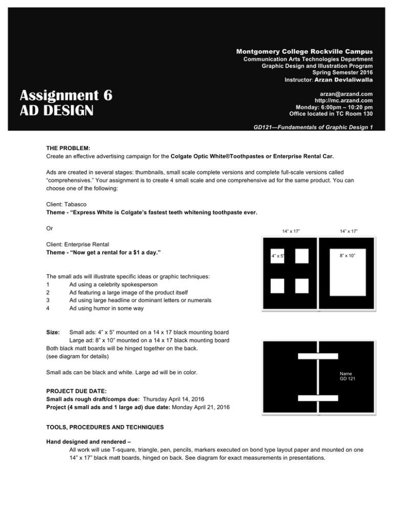
Montgomery College Rockville Campus Assignment 6 AD DESIGN Communication Arts Technologies Department Graphic Design and Illustration Program Spring Semester 2016 Instructor: Arzan Devlaliwalla arzan@arzand.com http://mc.arzand.com Monday: 6:00pm – 10:20 pm Office located in TC Room 130 GD121—Fundamentals of Graphic Design 1 THE PROBLEM: Create an effective advertising campaign for the Colgate Optic White®Toothpastes or Enterprise Rental Car. Ads are created in several stages: thumbnails, small scale complete versions and complete full-­scale versions called “comprehensives.” Your assignment is to create 4 small scale and one comprehensive ad for the same product. You can choose one of the following: Client: Tabasco Theme -­ “Express White is Colgate’s fastest teeth whitening toothpaste ever. Or 14” x 17” 14” x 17” Client: Enterprise Rental Theme -­ “Now get a rental for a $1 a day.” 8” x 10” 4” x 5” The small ads will illustrate specific ideas or graphic techniques: 1 Ad using a celebrity spokesperson 2 Ad featuring a large image of the product itself 3 Ad using large headline or dominant letters or numerals 4 Ad using humor in some way Size: Small ads: 4” x 5” mounted on a 14 x 17 black mounting board Large ad: 8” x 10” mounted on a 14 x 17 black mounting board Both black matt boards will be hinged together on the back. (see diagram for details) Small ads can be black and white. Large ad will be in color. Name GD 121 PROJECT DUE DATE: Small ads rough draft/comps due: Thursday April 14, 2016 Project (4 small ads and 1 large ad) due date: Monday April 21, 2016 TOOLS, PROCEDURES AND TECHNIQUES Hand designed and rendered – All work will use T-­square, triangle, pen, pencils, markers executed on bond type layout paper and mounted on one 14” x 17” black matt boards, hinged on back. See diagram for exact measurements in presentations. TYPE Headline type will be in one of the five classic typefaces discussed in class. It must be sketched or traced accurately and recognizably. ILLUSTRATIONS Illustrations should be drawn or traced accurately. It is your responsibility to provide research material for any photos or logos needed in your ads. COLOR Color should be used in simple ways in addition to photographs or illustrations used: type in color, logos, borders, boxes, bullets, screen tints and reverses, artwork, etc. Computer designed and rendered – Use either Photoshop, Illustrator, InDesign, Word, PowerPoint or any other application of your choice to design your ads. Be sure to pull guides onto your canvas so as to ensure proper alignment of the various design elements TYPE Headline type will be in one of the five classic typefaces discussed in class. Be careful to arrange the type with appropriate line spacing and the various design principles we have discussed in class ILLUSTRATION/ PHOTOS Please acquire your artwork from various internet and library resources or perhaps go and shoot the product with your own digital camera. COLOR Please use a main/focus color and try to use an accent color to create nice contrast in the ad -­ you can achieve those through contrast between your type in color, logos, borders, boxes, bullets, screen tints and reverses, photography illustration, etc.
