Making PowerPoint Slides Accessible
advertisement
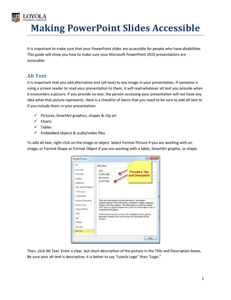
Making PowerPoint Slides Accessible It is important to make sure that your PowerPoint slides are accessible for people who have disabilities. This guide will show you how to make sure your Microsoft PowerPoint 2010 presentations are accessible. Alt Text It is important that you add alternative text (alt text) to any image in your presentation. If someone is using a screen reader to read your presentation to them, it will read whatever alt text you provide when it encounters a picture. If you provide no text, the person accessing your presentation will not have any idea what that picture represents. Here is a checklist of items that you need to be sure to add alt text to if you include them in your presentation: Pictures, SmartArt graphics, shapes & clip art Charts Tables Embedded objects & audio/video files To add alt text, right-click on the image or object. Select Format Picture if you are working with an image, or Format Shape or Format Object if you are working with a table, SmartArt graphic, or shape. Then, click Alt Text. Enter a clear, but short description of the picture in the Title and Description boxes. Be sure your alt text is descriptive; it is better to say “Loyola Logo” than “Logo.” 1 Making PowerPoint Slides Accessible Working with Tables If your presentation includes tables, you need to make sure that you have provided clear column headings, in addition to alt text for the table. This will help with navigation of the table if someone is using a screen reader. To include a header row in your table, first click on your table to select it, and then click on the Table Tools Design tab at the top. Check the Header Row checkbox if it is not already checked. Reading Order Be sure that the order in which the content of your slides is read makes sense. If you are using a built-in layout for your slides, you will likely have no problem with this. However, if you add objects, text boxes, images, or other content that is not part of the slide layout, you may not know in what order these objects will be read back with a screen reader. To check the reading order, go to the Home Tab. In the Drawing group of commands, select Arrange, and then Selection Pane. The Selection Pane will appear, listing all of the objects on the slide. They are read back starting with the bottom item on the list, and ending with the first. If the order is not logical, select the shape that you want to move, and then use the arrows at the bottom of the pane to re-order the items. Check Visibility It is important to make sure that you provide enough contrast in your slides for people to see them accurately. You may be sharing this presentation with or giving this presentation to someone who is colorblind. The colors red, orange, and green can be especially difficult to see. Where possible, use texture in your graphs and charts to indicate different variables, instead of just color. You could circle important information instead of putting something in red. To understand how someone who is colorblind sees your presentation, you can check the contrast by putting your presentation in Grayscale. To do this, click the View Tab and then Grayscale. 2 Making PowerPoint Slides Accessible You will then get a Grayscale tab: Click Grayscale, and you will now see your presentation with the contrast that someone who is colorblind will see it. If you have difficulty seeing your presentation, you need to adjust the colors you are using. Click Back to Color View when you are finished viewing your presentation in Grayscale. General Usability – Best Practices In order to make your presentation as accessible and generally user-friendly as possible, you should run through this check list and make sure your presentation addresses the following items: Use meaningful link text. If you are linking to a website, make sure the link text is descriptive. Avoid “click here.” It is better to use “view our training schedule” as link text instead of “click here for our training schedule.” Give all slides unique titles. People who cannot see your slide will use the titles to navigate your presentation with a screen reader. Keep tables simple. They are not easy to navigate for screen readers. Nested tables, merged cells, and split cells make navigation more difficult. Avoid blank cells. You may wish to leave a table cell blank for formatting purposes, but this can be confusing if someone is using a screen reader. Blank cells can make it appear that the user has reached the end of the data in the table, when in fact they have not. Be sure that any video you embed or link to is captioned. Use the slide layouts that PowerPoint provides wherever possible. They are optimized to be more accessible. Make sure your font size is large enough to be read. Remember that if you are showing this presentation on a projector, you may need to increase your font size even more. Use simple slide transitions and avoid complicated animations. These can be distracting. 3 Making PowerPoint Slides Accessible Accessibility Checker PowerPoint 2010 has a built-in accessibility checker. You should use this to check for any issues related to accessibility. Go to the File tab, and then to Info. Click the Check for Issues Button, and then Check Accessibility. PowerPoint will check your presentation for accessibility issues, and provide you with a list of errors and suggestions on how to fix them. If you have questions, or for further information on accessibility at Loyola, visit our Accessibility website. 4
