The Distribution of Stock Returns
advertisement
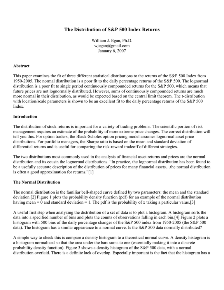
The Distribution of S&P 500 Index Returns William J. Egan, Ph.D. wjegan@gmail.com January 6, 2007 Abstract This paper examines the fit of three different statistical distributions to the returns of the S&P 500 Index from 1950-2005. The normal distribution is a poor fit to the daily percentage returns of the S&P 500. The lognormal distribution is a poor fit to single period continuously compounded returns for the S&P 500, which means that future prices are not lognormally distributed. However, sums of continuously compounded returns are much more normal in their distribution, as would be expected based on the central limit theorem. The t-distribution with location/scale parameters is shown to be an excellent fit to the daily percentage returns of the S&P 500 Index. Introduction The distribution of stock returns is important for a variety of trading problems. The scientific portion of risk management requires an estimate of the probability of more extreme price changes. The correct distribution will tell you this. For option traders, the Black-Scholes option pricing model assumes lognormal asset price distributions. For portfolio managers, the Sharpe ratio is based on the mean and standard deviation of differential returns and is useful for comparing the risk-reward tradeoff of different strategies. The two distributions most commonly used in the analysis of financial asset returns and prices are the normal distribution and its cousin the lognormal distributions. “In practice, the lognormal distribution has been found to be a usefully accurate description of the distribution of prices for many financial assets…the normal distribution is often a good approximation for returns.”[1] The Normal Distribution The normal distribution is the familiar bell-shaped curve defined by two parameters: the mean and the standard deviation.[2] Figure 1 plots the probability density function (pdf) for an example of the normal distribution having mean = 0 and standard deviation = 1. The pdf is the probability of x taking a particular value.[3] A useful first step when analyzing the distribution of a set of data is to plot a histogram. A histogram sorts the data into a specified number of bins and plots the counts of observations falling in each bin.[4] Figure 2 plots a histogram with 500 bins of the daily percentage changes of the S&P 500 index from 1950-2005 (the S&P 500 data). The histogram has a similar appearance to a normal curve. Is the S&P 500 data normally distributed? A simple way to check this is compare a density histogram to a theoretical normal curve. A density histogram is a histogram normalized so that the area under the bars sums to one (essentially making it into a discrete probability density function). Figure 3 shows a density histogram of the S&P 500 data, with a normal distribution overlaid. There is a definite lack of overlap. Especially important is the fact that the histogram has a greater density at the extremes than the normal distribution predicts, which you can see in the bottom part of Figure 3. Another good technique to use when analyzing distributions is the probability plot.[5] In a probability plot, the data is ordered and plotted against its percentage points from a theoretical distribution. If the plot produces a straight diagonal line, the data is distributed the same as the theoretical distribution. Figure 4 shows a normal probability plot for the S&P 500 data. The plot is strongly s-shaped indicating that the daily percentage changes in the S&P 500 are not normally distributed. In contrast, Figure 5 shows a normal probability plot of 1,000 random values drawn from a normal distribution with mean = 0 and standard deviation = 1. The data points form a straight line indicating they have a normal distribution. More quantitative measures confirm that the daily percentage returns of the S&P 500 data are not normal.[6] Skewness is a measure of lack of symmetry, and deviations from zero indicates the data is spread more to the left or right than in a normal distribution. Kurtosis is a measure of how peaked the distribution is and how fat its tails are; positive values indicate heavy tails. The skewness of the S&P 500 data is -0.91, indicating a slight negative asymmetry, while the kurtosis is +24.7, indicating their distribution has heavy tails. The Jarque-Bera test is a statistical hypothesis test that uses the skewness and kurtosis of a data set to test if it is normally distributed. [7] The Jarque-Bera test p-value for the daily percentage returns is < 0.001 indicating it is highly unlikely that this data is normally distributed. Using the normal distribution to estimate risk for the S&P 500 would be unwise. For the daily percentage changes of the S&P 500, the mean = +0.0347% and standard deviation = 0.8946%. Daily percentage losses of > 2% are predicted to occur 1.15% of the time, but actually occur 1.6% of the time, a 39 % increase. The greater the percentage loss, the greater the discrepancy. From 1950-2005, there were 11 days out of 14090 days where the loss was > 5%, giving an observed incidence rate of 0.078%. The normal distribution predicts that losses of that magnitude should never happen. The predicted incidence rate is 9.13x10⁻⁷%, or about 1 day in 434,211 years. The Lognormal Distribution Now we can move to the interesting lognormal distribution. If a variable x is lognormally distributed, the natural logarithm of x, ln(x), is normally distributed. A lognormal distribution is defined by the mean and standard deviation of ln(x). Figure 6 shows an example of a lognormal distribution. The lognormal distribution has the property of being bounded at zero, i.e., the natural logarithm of negative numbers is undefined. This is considered a useful property because asset prices do not go below zero. The lognormal distribution also has a much longer right tail which permits it to fit more extreme values. The continuously compounded return of an asset over a given holding period is defined as ln(ending price/beginning price). “…if a stock’s continuously compounded return is normally distributed, then the future stock price is necessarily lognormally distributed.” [1] Figure 7 shows a plot of the 1-day continuously compounded return for the S&P 500 data. There is considerable deviation from linearity indicating that the daily continuously compounded returns are not normally distributed. Logarithms have the useful property that the logarithms of products equal the sum of the logarithms of the individual components, i.e., ln(A*B) = ln(A) + ln(B). Therefore, the continuously compounded return over a month is simply the sum of the separate daily continuously compounded returns. This is important because of the central limit theorem which states that as the sample size grows, the sampling distribution of the mean becomes normal regardless of the original distribution of the variable. [2] The mean is of course defined as the sum of the observations divided by their count. Therefore, a monthly continuously compounded return created by summing daily continuously compounded returns should be more normally distributed. Figure 8 shows a normal probability plot of the monthly continuously compounded returns of the S&P 500 data. The monthly sum behaves as the central limit theorem predicts and is much more normal than the daily continuously compounded returns. The only serious deviation from normality occurs for the more negative months. The same effect should be seen for daily continuously compounded returns created by summing short period intra-day continuously compounded returns. The skewness of the daily continuously compounded returns is -1.3, indicating a slight negative asymmetry, while the kurtosis is +35.2, indicating their distribution has heavy tails. In contrast, the skewness of the monthly continuously compounded returns is -0.58 and the kurtosis is +2.4, indicating their distribution has more normal-like tails than the daily continuously compounded returns. The Jarque-Bera test p-values for the daily and monthly continuously compounded returns are both < 0.001, indicating both are not normally distributed. The t-distribution The t-distribution is similar in appearance to the normal distribution. However, the heaviness of the tails is variable and controlled by the shape parameter nu. A small nu gives heavy tails, while a large nu (> 30) provides a very good approximation to the normal distribution. [8] Figure 9 shows four different t-distributions with increasing nu values overlaid with the normal distribution. The t-distribution is generally used in standardized form, but can be used with location (mean) and scale (standard deviation) parameters to fit data. It should fit the S&P 500 data much better than the normal distribution. Using a t-distribution with location (mu) and scale parameters (sigma) to fit the daily percentage returns of the S&P 500 from 1950-2005 does in fact give a very interesting result. The fitted values and 95% confidence intervals computed using maximum likelihood estimation are: mu = 0.042% (0.029%-0.054%) sigma = 0.609% (0.596%-0.623%) nu = 3.60 (3.33-3.81) We can use a variant of the normal probability plot to see how good the fit is. Quantile-quantile plots (q-q plots) plot the quantiles (the fraction of points < x) of two sets of data against each other, instead of one set of data against a theoretical normal distribution. [9] This is easily done by generating a set of random numbers from a t-distribution defined by the fitted nu parameter. The standardization is then reversed by multiplying by sigma and adding mu. Figure 10 shows a q-q plot of 14,090 random values generated in this fashion vs. the 14,090 daily percent changes of the S&P 500 data. The plot is quite linear, except for six outliers, indicating that the t-distribution with location and scale is an excellent fit to the distribution of the daily percentage changes in the S&P 500. The Kolmogorov-Smirnoff test is a non-parametric statistical test which tests if two distributions are identical or not. [10] For the random values vs. the daily percent changes, the p-value is 0.39, indicating the differences in the two distributions are not statistically significant. This strongly supports the conclusion that the t-distribution with location/scale parameters is an excellent fit to the daily percentage changes in the S&P 500 Index. An example of how this might be used is the calculation of the probability of an observed daily percent change in the S&P 500. On July 18, 2006 the S&P 500 closed at 1236.86. On July 19, 2006 the S&P 500 closed at 1259.81, a change of +1.86%. The standardized t-value = (percent change – mu)/sigma = 2.98. Using the Excel TDIST function, =TDIST(2.98,3.6,1) we can compute that the (one-tailed) probability of one day increase of +1.86% is 0.029. Conclusion This analysis has shown that the daily returns of the S&P 500 Index are poorly modeled by both the normal and lognormal distributions. Traders using these distributions will be exposed to more risk than they bargained for. The t-distribution with location/scale parameters is very good fit to the distribution of the daily percentage returns of the S&P 500 Index. 0.4 0.35 0.3 Probability 0.25 0.2 0.15 0.1 0.05 0 -5 -4 -3 -2 -1 0 1 2 3 4 5 X Figure 1. An example of a probability density function for a normal distribution with mean = 0, standard deviation = 1. 600 500 Count 400 300 200 100 0 -25 -20 -15 -10 -5 0 5 Daily Percentage Changes in the S&P 500 from 1950-2005 Figure 2. Histogram of daily percentage changes in the S&P 500 index 1950-2005. 10 0.05 Probability 0.04 0.03 0.02 0.01 0 -25 -20 -15 -10 -5 0 5 10 -20 -15 -10 -5 0 5 10 -3 5 x 10 Probability 4 3 2 1 0 -25 Daily Percentage Changes in the S&P 500 from 1950-2005 Figure 3. (top) A density histogram of the S&P 500 data, with a normal distribution overlaid. (bottom) expanded view of the lower portion of the top plot, showing the histogram has a greater density at the extremes than the normal distribution predicts. Normal Probability Plot for the S&P 500 Data Probability 0.999 0.997 0.99 0.98 0.95 0.90 0.75 0.50 0.25 0.10 0.05 0.02 0.01 0.003 0.001 -20 -15 -10 -5 0 5 Daily Percentage Changes in the S&P 500 from 1950-2005 Figure 4. Normal probability plot for the S&P 500 data. The curvature (s-shape) indicates that the data does not come from a normal distribution and that large daily percentage changes are more common than the normal distribution would predict. Normal Probability Plot for Random Normal Data 0.999 0.997 0.99 0.98 0.95 Probability 0.90 0.75 0.50 0.25 0.10 0.05 0.02 0.01 0.003 0.001 -3 -2 -1 0 1 2 3 Random Normal Data (mean = 0, standard deviation = 1) Figure 5. Normal probability plot for 1,000 observations drawn from a normal distribution with mean = 0 and standard deviation = 1. The data falls on the diagonal straight line correctly indicating it is from a normal distribution. 0.7 0.6 Probability 0.5 0.4 0.3 0.2 0.1 0 0 0.5 1 1.5 2 2.5 3 3.5 4 4.5 5 X Figure 6. An example of a probability density function for a lognormal distribution with mean = 0, standard deviation = 1. 0.999 0.997 0.99 0.98 0.95 Probability 0.90 0.75 0.50 0.25 0.10 0.05 0.02 0.01 0.003 0.001 -0.2 -0.15 -0.1 -0.05 0 0.05 Daily Continuously Compounded Returns for the S&P 500 Data Figure 7. Normal probability plot of the daily continuously compounded returns of the S&P 500 data. There is considerable deviation from linearity indicating that the daily continuously compounded returns are not normally distributed. 0.999 0.997 0.99 0.98 0.95 Probability 0.90 0.75 0.50 0.25 0.10 0.05 0.02 0.01 0.003 0.001 -0.25 -0.2 -0.15 -0.1 -0.05 0 0.05 0.1 0.15 Monthly Continuously Compounded Returns for the S&P 500 Data Figure 8. Normal probability plot of the monthly continuously compounded returns of the S&P 500 data computed by summing daily continuously compounded returns. The monthly returns are much more normal than the daily returns shown in Figure 7. The only serious deviation from normality occurs for the more negative months. 0.4 0.4 0.3 0.3 0.2 0.2 0.1 0.1 0 -5 0 5 0 -5 nu = 1 0.4 0.3 0.3 0.2 0.2 0.1 0.1 0 nu = 5 5 nu = 3 0.4 0 -5 0 5 0 -5 0 5 nu = 10 Figure 9. Examples of t-distributions with increasing nu values (solid black) overlaid with a normal distribution (red dashes). Random Numbers from the Fitted t-distribution 20 15 10 5 0 -5 -10 -15 -20 -25 -25 -20 -15 -10 -5 0 5 10 15 20 Daily Percentage Changes in the S&P 500 from 1950-2005 Figure 10. Q-Q plot of random numbers from the fitted t-distribution vs. daily percent changes in the S&P 500 Index. The linearity indicates that the two data sets have very similar distributions. References 1. Chartered Financial Analyst Program Curriculum, year 2006, level 1, volume 1, reading 10. 2. www.itl.nist.gov/div898/handbook/eda/section3/eda3661.htm 3. www.itl.nist.gov/div898/handbook/eda/section3/eda362.htm#PDF 4. www.itl.nist.gov/div898/handbook/eda/section3/histogra.htm 5. www.itl.nist.gov/div898/handbook/eda/section3/probplot.htm 6. www.itl.nist.gov/div898/handbook/eda/section3/eda35b.htm 7. en.wikipedia.org/wiki/Jarque-Bera_test 8. www.itl.nist.gov/div898/handbook/eda/section3/eda3664.htm 9. www.itl.nist.gov/div898/handbook/eda/section3/qqplot.htm 10. www.itl.nist.gov/div898/handbook/eda/section3/eda35g.htm Acknowledgements I would like to thank my wife, Dr. Marie Egan, and Dr. Victor Niederhoffer of Manchester Trading for their helpful comments which improved this paper.
