Scatter Plots: Constructing & Interpreting
advertisement
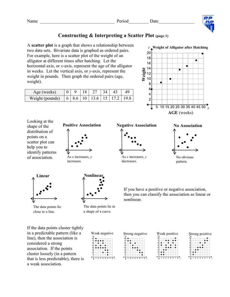
Name _________________________________ Period_________ Date________________ Constructing & Interpreting a Scatter Plot (page 1) Age (weeks) Weight (pounds) Weight of Alligator after Hatching Weight (pounds) A scatter plot is a graph that shows a relationship between two data sets. Bivariate data is graphed as ordered pairs. For example, here is a scatter plot of the weight of an alligator at different times after hatching. Let the horizontal axis, or x-axis, represent the age of the alligator in weeks. Let the vertical axis, or y-axis, represent the weight in pounds. Then graph the ordered pairs (age, weight). 0 9 18 27 34 43 49 6 8.6 10 13.6 15 17.2 19.8 AGE (weeks) Looking at the shape of the distribution of points on a scatter plot can help you to identify patterns of association. Positive Association As x increases, y increases. Negative Association As x increases, y decreases. No Association No obvious pattern. Nonlinear Linear If you have a positive or negative association, then you can classify the association as linear or nonlinear. The data points lie close to a line. The data points lie in a shape of a curve. If the data points cluster tightly in a predictable pattern (like a line), then the association is considered a strong association. If the points cluster loosely (in a pattern that is less predictable), there is a weak association. Weak negative Strong negative Weak positive Strong positive Constructing & Interpreting a Scatter Plot (page 2) 1. Construct a scatter plot of the data in the table. The data describes Insignia televisions on sale at Best Buy. Television size (inches) 19 28 32 32 39 42 50 Cost (dollars) 110 140 170 200 230 280 390 2. For each scatter plot consider the different associations: (a) positive, negative, none; (b) linear or nonlinear; (c) strong or weak.
