Choose a graph.
advertisement

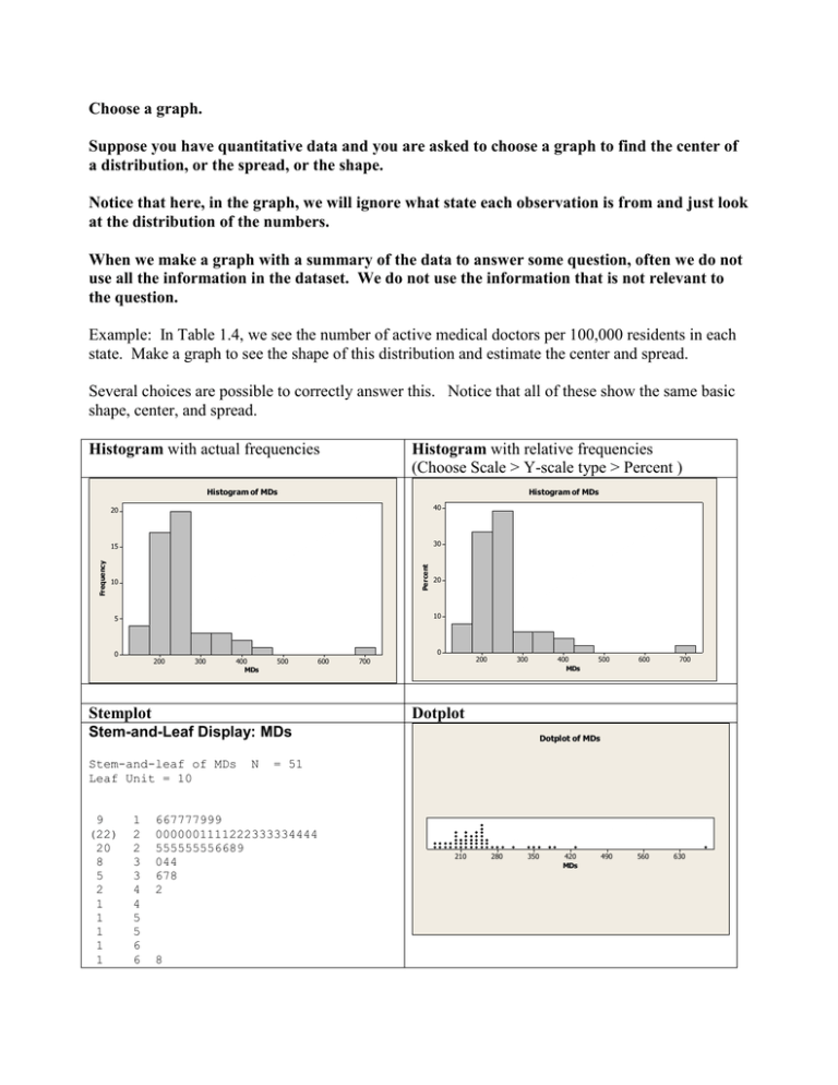
Choose a graph. Suppose you have quantitative data and you are asked to choose a graph to find the center of a distribution, or the spread, or the shape. Notice that here, in the graph, we will ignore what state each observation is from and just look at the distribution of the numbers. When we make a graph with a summary of the data to answer some question, often we do not use all the information in the dataset. We do not use the information that is not relevant to the question. Example: In Table 1.4, we see the number of active medical doctors per 100,000 residents in each state. Make a graph to see the shape of this distribution and estimate the center and spread. Several choices are possible to correctly answer this. Notice that all of these show the same basic shape, center, and spread. Histogram with actual frequencies Histogram with relative frequencies (Choose Scale > Y-scale type > Percent ) Histogram of MDs 40 15 30 Percent Frequency Histogram of MDs 20 10 20 10 5 0 0 200 300 400 MDs 500 600 Stemplot 200 700 300 Stem-and-leaf of MDs Leaf Unit = 10 1 2 2 3 3 4 4 5 5 6 6 500 600 700 Dotplot Stem-and-Leaf Display: MDs 9 (22) 20 8 5 2 1 1 1 1 1 400 MDs N = 51 667777999 0000001111222333334444 555555556689 044 678 2 8 Dotplot of MDs 210 280 350 420 MDs 490 560 630 Each of the following is NOT an appropriate graph to answer that question. Below is a chart which gives the number of MDs by state. This is not a very useful graph to answer any kind of question. While you can see what the heights of the bars represent, the fact that there is no really meaningful ordering of the categories (states) here and the fact that there are so many of them, just about the only thing obvious from this graph is that one has a lot higher number of MDs than others. You could just as easily have seen that from the numerical data or a frequency graph (histogram, stemplot, or dotplot.) And the frequency graph would tell you more useful information too. Chart of MDs vs state 700 600 MDs 500 400 300 200 100 0 t e a a ii t a . s a a s a e s a i i a a a e a a a s a a a a a a e s a m sk n sa n i docu ar id g i a ho o i n w sa k y n in ndett anot pp ur n sk d ir sey ic o r kli n ot hio m onn ia ndli n ot se xa ta hon ini tonin i sining .C baA la r izoanifo rlor aec til aw loreo rHawI daI l in diaI o antuc isiaMar y l aus hignes issiissont ar a ev apshJer ex Yor o ak O hor egl v aI slar o aknes Te U r m ir ging ir gc onom D Ken o u a c h ic in iss M o eb N m w M ewC ahD k la O sy de C ahD n e V sh tV is y In A la AA r kC alC o n n De F G V M w L a M a e t t e s M N N n K M e h o h a W M e W O n h ut u T o H N N r t or ss C w WW Pe RSo So Ma No N Ne state Below is a chart which gives the number of instances of each possible count of MDs. It is treating each possible value of “count” as one value of a categorical variable and showing how many times that value appears. That is useless here. If there were only a few possible values for the counts of MDs, so we could think of the counts of MDs it was reasonable to think of as a categorical variable, this might be an useful graph. (Recall problem 1.1 where the individuals were cars and one variable was the number of cylinders. A bar graph of the number of cylinders (like this graph) might be interesting for that dataset. Chart of MDs 3.0 2.5 Count 2.0 1.5 1.0 0.5 0.0 1 3 1 4 6 8 4 6 0 1 2 4 7 8 0 5 9 1 2 8 0 3 6 7 1 2 8 0 1 2 3 6 8 3 5 0 1 5 1 6 0 8 5 7 3 16 16 17 17 17 17 19 19 20 20 20 20 20 20 21 21 21 22 22 22 23 23 23 23 24 24 24 25 25 25 25 25 25 26 26 28 29 30 34 34 36 37 38 42 68 MDs Summary: Suppose you have quantitative data and you are asked to choose a graph to find the center of a distribution, or the spread, or the shape. The only appropriate choices are frequency graphs, which have the values of the variables along one axis and the frequencies, or relative frequencies, on the other axis. (Histograms have values of the variable on the horizontal axis and frequencies up the vertical axis, stemplots have values of the variable vertically and the “leaves” extend horizontally, giving a visual display of the frequency, dotplots can be oriented in either direction and aren’t shown in our text, but MINITAB will make them.) It is true that these frequency graphs often do not use all the information in the dataset, such as which individual each observation is from. But that information may not be relevant to answer the particular question asked, so that’s why we don’t need a type of graph that includes it. Suppose you have categorical data and you want to choose a graph to illustrate the distribution of the data. Again, you need a frequency graph. One such graph is a pie chart, and another is a bar graph, as described in our text. Notice that a bar graph has values of the variable along the horizontal axis and the frequencies, or relative frequencies, on the vertical axis.


