Observations * User isn't sure where to go for changing shock... * Not immediately known that the A button was Fire
advertisement
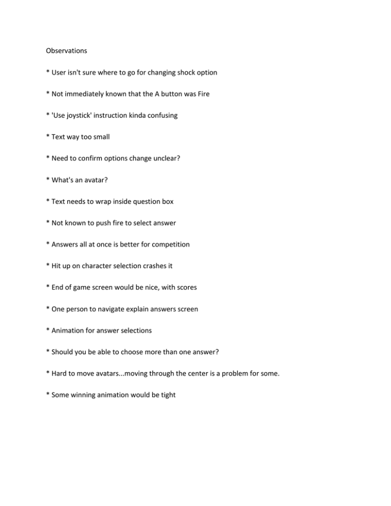
Observations * User isn't sure where to go for changing shock option * Not immediately known that the A button was Fire * 'Use joystick' instruction kinda confusing * Text way too small * Need to confirm options change unclear? * What's an avatar? * Text needs to wrap inside question box * Not known to push fire to select answer * Answers all at once is better for competition * Hit up on character selection crashes it * End of game screen would be nice, with scores * One person to navigate explain answers screen * Animation for answer selections * Should you be able to choose more than one answer? * Hard to move avatars...moving through the center is a problem for some. * Some winning animation would be tight


