California State University, Fullerton Campus Information Technology Desktop Application Training Materials
advertisement
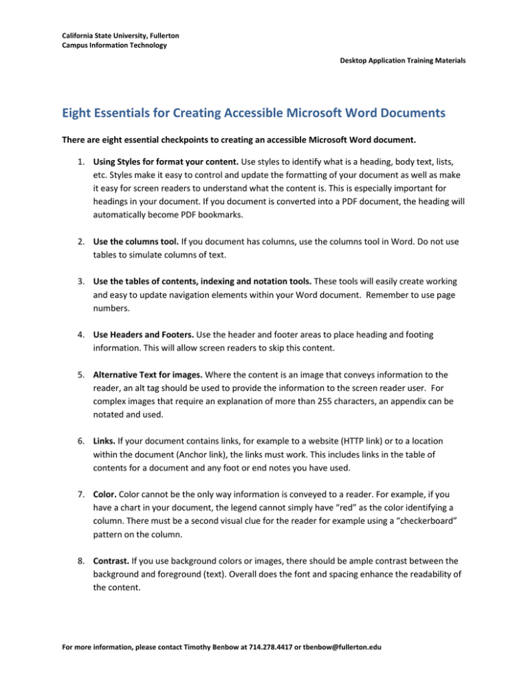
California State University, Fullerton Campus Information Technology Desktop Application Training Materials Eight Essentials for Creating Accessible Microsoft Word Documents There are eight essential checkpoints to creating an accessible Microsoft Word document. 1. Using Styles for format your content. Use styles to identify what is a heading, body text, lists, etc. Styles make it easy to control and update the formatting of your document as well as make it easy for screen readers to understand what the content is. This is especially important for headings in your document. If you document is converted into a PDF document, the heading will automatically become PDF bookmarks. 2. Use the columns tool. If you document has columns, use the columns tool in Word. Do not use tables to simulate columns of text. 3. Use the tables of contents, indexing and notation tools. These tools will easily create working and easy to update navigation elements within your Word document. Remember to use page numbers. 4. Use Headers and Footers. Use the header and footer areas to place heading and footing information. This will allow screen readers to skip this content. 5. Alternative Text for images. Where the content is an image that conveys information to the reader, an alt tag should be used to provide the information to the screen reader user. For complex images that require an explanation of more than 255 characters, an appendix can be notated and used. 6. Links. If your document contains links, for example to a website (HTTP link) or to a location within the document (Anchor link), the links must work. This includes links in the table of contents for a document and any foot or end notes you have used. 7. Color. Color cannot be the only way information is conveyed to a reader. For example, if you have a chart in your document, the legend cannot simply have “red” as the color identifying a column. There must be a second visual clue for the reader for example using a “checkerboard” pattern on the column. 8. Contrast. If you use background colors or images, there should be ample contrast between the background and foreground (text). Overall does the font and spacing enhance the readability of the content. For more information, please contact Timothy Benbow at 714.278.4417 or tbenbow@fullerton.edu
