tests
advertisement
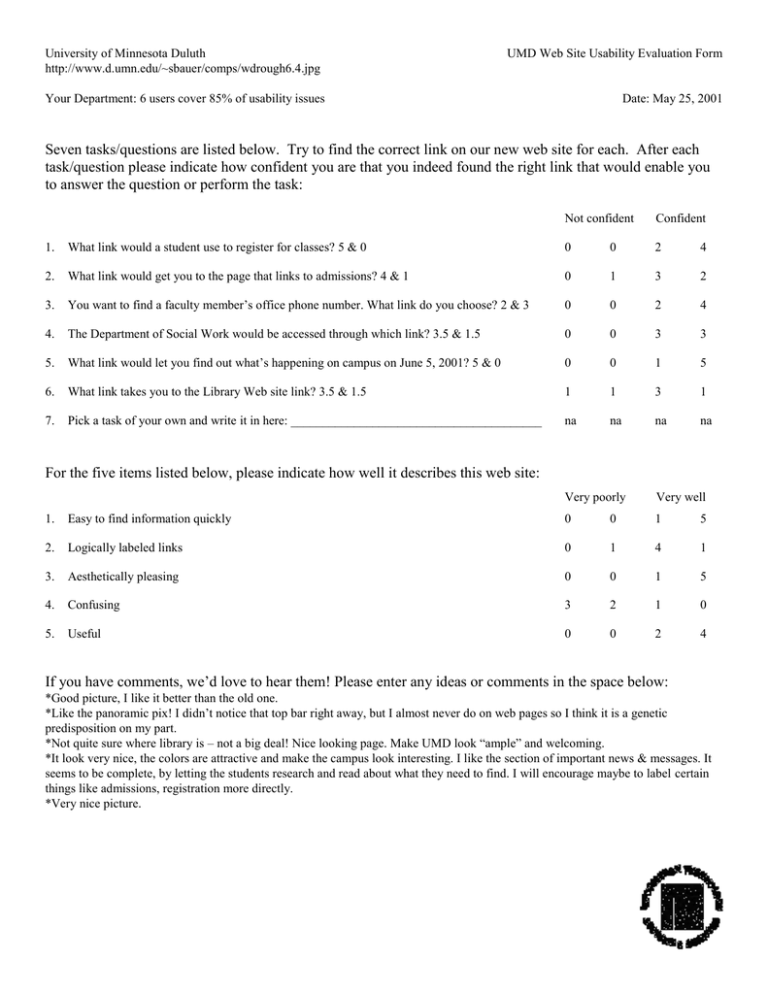
University of Minnesota Duluth http://www.d.umn.edu/~sbauer/comps/wdrough6.4.jpg UMD Web Site Usability Evaluation Form Your Department: 6 users cover 85% of usability issues Date: May 25, 2001 Seven tasks/questions are listed below. Try to find the correct link on our new web site for each. After each task/question please indicate how confident you are that you indeed found the right link that would enable you to answer the question or perform the task: Not confident Confident 1. What link would a student use to register for classes? 5 & 0 0 0 2 4 2. What link would get you to the page that links to admissions? 4 & 1 0 1 3 2 3. You want to find a faculty member’s office phone number. What link do you choose? 2 & 3 0 0 2 4 4. The Department of Social Work would be accessed through which link? 3.5 & 1.5 0 0 3 3 5. What link would let you find out what’s happening on campus on June 5, 2001? 5 & 0 0 0 1 5 6. What link takes you to the Library Web site link? 3.5 & 1.5 1 1 3 1 7. Pick a task of your own and write it in here: ________________________________________ na na na na For the five items listed below, please indicate how well it describes this web site: Very poorly Very well 1. Easy to find information quickly 0 0 1 5 2. Logically labeled links 0 1 4 1 3. Aesthetically pleasing 0 0 1 5 4. Confusing 3 2 1 0 5. Useful 0 0 2 4 If you have comments, we’d love to hear them! Please enter any ideas or comments in the space below: *Good picture, I like it better than the old one. *Like the panoramic pix! I didn’t notice that top bar right away, but I almost never do on web pages so I think it is a genetic predisposition on my part. *Not quite sure where library is – not a big deal! Nice looking page. Make UMD look “ample” and welcoming. *It look very nice, the colors are attractive and make the campus look interesting. I like the section of important news & messages. It seems to be complete, by letting the students research and read about what they need to find. I will encourage maybe to label certain things like admissions, registration more directly. *Very nice picture.
