Guide for Web Site Development A Synopsis of Steve Krug’s
advertisement
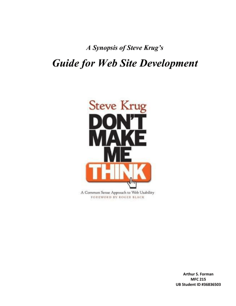
A Synopsis of Steve Krug’s Guide for Web Site Development Arthur S. Forman MFC 215 UB Student ID #36836503 Steve Krug’s book, “Don’t Make Me Think,” is a book about web-usability looking at the interaction between a human and the computer. The premise behind the book is that a good web site lets a user accomplish his/her tasks as easily and trouble free as possible. The book is well written and concise in content. Steve Krug professes being brief and well-focused in web design. Most web site users simply scan for the first thing that looks good and really read the entire web page. They don’t attempt to totally understand the web site, but prefer to make do with what appears to be good choices. Because of this, Krug begins in explaining that pages should be designed for scanning and not reading. A well designed page should create for the user a clear visual hierarchy, as well as the text should be nested to show what belongs to what. Conventions are useful because they help the user to avoid thinking. You also need to clearly define portions of the page and be very clear as to what is clickable. He also points out that you should avoid “noise.” In writing for the web you need to be brief. Make things self-evident rather than provide instructions that are useless to the user. In navigation of the web site you need to design for both the person that is a browser as well as the person that searches. It is important to remember that navigation exists to guide us as to how to use the site, as well as where we are and if successful in doing so the confidence of the user in the site increases. Tabs are a great means of doing navigation because they are obvious, hard to miss and look good. Steve Krug gives the example of “The trunk test.” Krug goes on to explain, “If you’ve been locked in the trunk of a car and driven around for a while,” you should, once the blindfold is removed, be able to answer the following questions. “What site is this?” “What page am I on?” “What are the major sections of this site? “What are my options at this level?” “Where am I in the scheme of things?” “How can I search?” It is important that the Home Page contains the site identity, mission and give a clear idea of what the site contains. It should also contain a search box, teasers for content, current content, promotional offers, shortcuts for frequently viewed data, and space for registration or login. This is your opportunity to spell out the big picture of what the site is all about. You need to look at what works for your site and most importantly test it. Any testing is far better than no testing; it doesn’t have to be perfect. To do testing you only need three or four people, an empty room with a desk, computer, a few chairs, and a video recording device to show others what the user is doing. Tests need to consist of several parts. You need to see if the users understand what the site is about, how it works, etc. Also you need to ask the users to perform some tasks on the site and see how they accomplish the tasks. It is important to debrief and review immediately after testing and put the information gained to use. Usability is very important because it means you are making sure that the web site works well and that an average person can use the web site for its intended purpose without getting frustrated. With usability comes accessibility. Accessibility in your site can help a visually impaired person using a screen reader to navigate and utilize a web site. By keeping accessibility in mind while designing your web site you inevitably broaden your web site’s audience.
