RPHS Statistics Test
advertisement
Algebra 1
Unit 2: Statistics
Test
Name: _______________________
Period: ___________
SHOW ALL WORK!!! Attach any scratch paper you use.
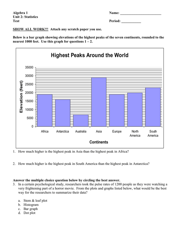
Below is a bar graph showing elevations of the highest peaks of the seven continents, rounded to the
nearest 1000 feet. Use this graph for questions 1 – 2.
Highest Peaks Around the World
35000
Elevation (feet)
30000
25000
20000
15000
10000
5000
0
Africa
Antarctica
Australia
Asia
Europe
North
America
South
America
Continents
1. How much higher is the highest peak in Asia than the highest peak in Africa?
2. How much higher is the highest peak in South America than the highest peak in Antarctica?
Answer the multiple choice question below by circling the best answer.
3. In a certain psychological study, researchers took the pulse rates of 1200 people as they were watching a
very frightening part of a horror movie. From the plots and graphs listed below, what would be the best
way for the researchers to summarize their data?
a.
b.
c.
d.
Stem & leaf plot
Histogram
Bar graph
Dot plot
Use the list of the weights of a college football team below for questions 4 – 5.
{220, 207, 229, 199, 216, 231, 220, 215, 276, 235, 209, 203, 210, 235, 225, 207}
4. Create a dot plot for this data. Circle any outliers.
5. Create a stem & leaf plot (stem plot) for this data.
Use the test score data below for questions 6 – 11.
{88, 56, 78, 94, 87, 88, 55, 94, 100, 99, 88, 55, 80}
6. Find the mode of this data.
Mode = _______________
7. Find the median of this data.
Median = ______________
8. Find the mean of this data.
Mean = ________________
9. Find the range of this data.
Range = ________________
10. Find the five-number summary of this data.
11. Create a box and whisker plot (box plot) for this data.
Answer the following multiple choice questions by circling the best answer.
12. Approximately what percentage of the data values are located above the upper quartile (Q3) in a set of
data?
a.
b.
c.
d.
100%
75%
50%
25%
13. Approximately what percentage of the data values are located below the median in a set of data?
a.
b.
c.
d.
100%
75%
50%
25%
Number of Students
A histogram showing a group of students and the amount of lunch money they were carrying on a
certain day is shown below. Use this to answer questions 14 – 17.
10
9
8
7
6
5
4
3
2
1
0
1.00 2.00 3.00 4.00 5.00 6.00 7.00 8.00 9.00 10.00
Lunch Money (Dollars)
14. How many total students are represented in this histogram?
15. How many students had between $3.00 - $3.99?
16. Which interval contains only 1 student?
17. How many students had $5.00 or more?
