A Visual Analytics System for Radio Frequency Fingerprinting-based Localization Yi Han
advertisement
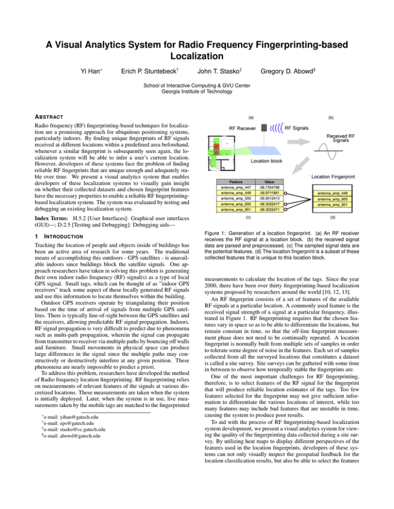
A Visual Analytics System for Radio Frequency Fingerprinting-based Localization Yi Han∗ Erich P. Stuntebeck† John T. Stasko‡ Gregory D. Abowd§ School of Interactive Computing & GVU Center Georgia Institute of Technology A BSTRACT Radio frequency (RF) fingerprinting-based techniques for localization are a promising approach for ubiquitous positioning systems, particularly indoors. By finding unique fingerprints of RF signals received at different locations within a predefined area beforehand, whenever a similar fingerprint is subsequently seen again, the localization system will be able to infer a user’s current location. However, developers of these systems face the problem of finding reliable RF fingerprints that are unique enough and adequately stable over time. We present a visual analytics system that enables developers of these localization systems to visually gain insight on whether their collected datasets and chosen fingerprint features have the necessary properties to enable a reliable RF fingerprintingbased localization system. The system was evaluated by testing and debugging an existing localization system. Index Terms: H.5.2 [User Interfaces]: Graphical user interfaces (GUI)—; D.2.5 [Testing and Debugging]: Debugging aids— 1 I NTRODUCTION Tracking the location of people and objects inside of buildings has been an active area of research for some years. The traditional means of accomplishing this outdoors - GPS satellites - is unavailable indoors since buildings block the satellite signals. One approach researchers have taken in solving this problem is generating their own indoor radio frequency (RF) signal(s) as a type of local GPS signal. Small tags, which can be thought of as ”indoor GPS receivers” track some aspect of these locally generated RF signals and use this information to locate themselves within the building. Outdoor GPS receivers operate by triangulating their position based on the time of arrival of signals from multiple GPS satellites. There is typically line-of-sight between the GPS satellites and the receivers, allowing predictable RF signal propagation. Indoors, RF signal propagation is very difficult to predict due to phenomena such as multi-path propagation, wherein the signal can propagate from transmitter to receiver via multiple paths by bouncing off walls and furniture. Small movements in physical space can produce large differences in the signal since the multiple paths may constructively or destructively interfere at any given position. These phenomena are nearly impossible to predict a priori. To address this problem, researchers have developed the method of Radio frequency location fingerprinting. RF fingerprinting relies on measurements of relevant features of the signals at various discretized locations. These measurements are taken when the system is initially deployed. Later, when the system is in use, live measurements taken by the mobile tags are matched to the fingerprinted ∗ e-mail: yihan@gatech.edu eps@gatech.edu ‡ e-mail: stasko@cc.gatech.edu § e-mail: abowd@gatech.edu † e-mail: Figure 1: Generation of a location fingerprint. (a) An RF receiver receives the RF signal at a location block. (b) the received signal data are parsed and preprocessed. (c) The sampled signal data are the potential features. (d) The location fingerprint is a subset of these collected features that is unique to this location block. measurements to calculate the location of the tags. Since the year 2000, there have been over thirty fingerprinting-based localization systems proposed by researchers around the world [10, 12, 13]. An RF fingerprint consists of a set of features of the available RF signals at a particular location. A commonly used feature is the received signal strength of a signal at a particular frequency, illustrated in Figure 1. RF fingerprinting requires that the chosen features vary in space so as to be able to differentiate the locations, but remain constant in time, so that the off-line fingerprint measurement phase does not need to be continually repeated. A location fingerprint is normally built from multiple sets of samples in order to tolerate some degree of noise in the features. Each set of samples collected from all the surveyed locations that constitutes a dataset is called a site survey. Site surveys can be gathered with some time in between to observe how temporally stable the fingerprints are. One of the most important challenges for RF fingerprinting, therefore, is to select features of the RF signal for the fingerprint that will produce reliable location estimates of the tags. Too few features selected for the fingerprint may not give sufficient information to differentiate the various locations of interest, while too many features may include bad features that are unstable in time, causing the system to produce poor results. To aid with the process of RF fingerprinting-based localization system development, we present a visual analytics system for viewing the quality of the fingerprinting data collected during a site survey. By utilizing heat maps to display different perspectives of the features used in the location fingerprints, developers of these systems can not only visually inspect the geospatial feedback for the location classification results, but also be able to select the features to use by visually finding those that are temporally stable and spatially differentiable in a high dimensional feature space. When necessary, developers can even explore lower level details of any individual feature to see raw values and relationships to others through a multivariate visualization. Using our system, developers of localization systems can tell whether their datasets collected are capable of building good RF location fingerprints that can enable accurate location estimates over time. The contribution of this work is to show how visual analytics can support the development and practical deployment of fingerprinting-based localization systems. We feel that this tool is a particularly good example of visual analytics because the most effective way to find a good location fingerprint is to combine the computational data analysis with an interactive geospatial visualization interface. 2 R ELATED W ORK The RADAR system proposed by Bahl and Padmanabhan in 2000 was the earliest RF fingerprinting-based localization system [3]. The researchers were able to achieve a median of 2-3 meters accuracy indoors using Wi-Fi signals. Since then, researchers have reported over thirty systems using different RF signals or classification algorithms [10]. However, although these localization systems are easy to deploy, the initial setup and calibration process for generating the fingerprints is tedious and time consuming [11]. They can also be less reliable when the features used for the fingerprints are not spatially differentiable and stable over time. Kaemarungsi and Padmanabhan studied the properties of Wi-Fi location fingerprints using received signal strength and learned that even the presence of a human body can make a significant difference on the fingerprints [9]. Therefore, it is crucial to identify and remove unstable features in the generated fingerprints to maintain the reliability of the localization system over time. Visualizing RF signals on a geospatial map using heat maps is prevalent in 802.11 WLAN site survey tools for optimizing Wi-Fi network coverage. Ekahau Site Survey took a step forward to not only visualize the propagation of Wi-Fi signals but also integrate the output to power their Real-Time Location Tracking System [5]. Nevertheless, this consumer-facing site survey tool cannot support more advanced visual debugging functions on feature selection and location fingerprint classification. Spectrum analyzers for identifying physical locations of signal sources also require visualizing signals on a geospatial map and classifying them. Tektronix’s RFHawk Signal Hunter identifies potential malicious RF signals by singling them out from known signals [14]. The malicious signal will then be documented on a geospatial map with a color-coded wave form or signal strength icon for later reference. However, as the tool did not aim to support location fingerprinting, the wave form icons on the map have little power to show the individual feature differences for building spatially differentiable location fingerprints. Andrienko and Andrienko used interactive cartographic visualization to output results of the C4.5 classification learning algorithm for knowledge discovery [1]. Their work suggested that interactive visual facilities that allow an analyst to manipulate variables and immediately observe the resulting changes in a map is effective for geospatial data analysis. Our visual analytics system took a step further for the K-nearest neighbor classification algorithm as to even visualize the intermediate steps of the algorithm for indoor localization. Our system was developed with data from the PowerLine Positioning localization system (PLP) [12]. PLP injects an RF signal into the power lines of a residential building and uses the power lines as a giant antenna for propagating the signals. The mobile wireless tag can then use this signal’s characteristics as the feature set to fingerprint locations within the area where the power lines can reach. The latest revision of this system utilizes a feature set that samples 44 different frequencies of the amplitudes of the signal for location fingerprinting [13]. All the illustrations shown in this paper are either using the original data of this system or a modified version of it. The data of the system was gathered in a residential laboratory on a university campus. This lab has a similar layout and electrical infrastructure as a common residential house. We marked out one meter by one meter blocks on the floor, producing 66 different locations for our site survey. In the next section, we will discuss the current problems in building a good location fingerprint with the existing, analytic text-based machine learning approaches. In Section 4, we will briefly provide an overview of the visualization interface. We will present a scenario that demonstrates how our visual analytics system works in Section 5. More details and example uses of the visualization will be discussed in Section 6. 3 R ADIO TION F REQUENCY F INGERPRINTING - BASED LOCALIZA - 3.1 System Development Procedure The procedure to build a location fingerprinting system can be roughly decomposed into three steps. The system presented here is focused on supporting the last two steps. 1. The first step is to gather the datasets and feature sets that can be potentially used to generate a location fingerprint database. This requires a tedious site survey that maps where the RF signals are gathered in the real world. 2. The second step is to find the right set of RF signal characteristics for the fingerprints. This step involves feature selection and building the fingerprints with the selected features. 3. The last step is to test the collected fingerprints with RF signals received at random locations in the surveyed area (random fingerprints). The signal data will be input to the localization system to see if it can accurately find the true locations of these random fingerprints through classification algorithms. 3.2 Problems and Challenges for Building Location Fingerprints The generation of the location fingerprint database on a radio map requires a site survey in advance. This survey normally requires a user to manually tell the system where they are so that the system can learn the RF signal pattern at that specific location. This process can be very tedious and time-consuming. For example, in the PowerLine Positioning system, the time to survey each location with the full 44 features can take around 2 minutes. It takes about 2 hours to survey 66 locations in practice. If the location fingerprints are unstable over time, users might need to conduct the site survey again later to calibrate the system. One major challenge is how to find the best features that can be used for building a set of good location fingerprints. In practice, we would like to use as few features as possible to build the fingerprints. There are two reasons for this. First, the fewer the features means that the training time and classification time for the machine learning algorithm can be shorter. For real-time localization, this can be very crucial. Second, fewer numbers of features for a fingerprint can result in a shorter time required for the site survey data collection process. Half the number of features needed means half the time for this tedious preprocessing procedure. However, the fewer the features used, the less likely individual fingerprints will be unique, resulting in higher overall classification error. So the technical challenge is how to find a balancing point where a smaller set of features can be used while the system is still capable to accurately classify a certain area of interest. 3.3 Problems with the Current Approach The current approach used by localization developers to prove these required properties of the location fingerprints are achieved is by running machine learning algorithms with the fingerprints gathered at different times. The outputs of this approach are the text-based classification accuracy and misclassified locations when they test the fingerprints. There are several problems with this approach: First of all, it is not easy to tell how each feature composed in a fingerprint is contributing to the overall classification results. For practical applications, one might have a few locations that are more important to be always classified with high accuracy while other locations are fine to be occasionally incorrect. There are many feature selection algorithms to analyze how each feature can build up the overall accuracy. However, different features may improve the classification accuracies of different areas on the radio map while they all improved the same overall accuracy. Additionally, if there are a few locations that are always misclassified by the algorithm, it is very difficult to dig down into the multidimensional raw feature sets to identify the problem. Is it caused by a problematic training data set gathered or is the current fingerprint just not unique enough to correctly classify this location? If this kind of debugging cannot be performed, it is very hard for a location fingerprinting system to be practically deployed with the desired accuracy for any specified area of interest. Moreover, during the site survey process, sometimes there are RF interferences. These interference events can jeopardize the reliability of the produced fingerprints that should be mostly accurate for the most common cases. Moreover, it is not easy to find extreme cases when dealing with multidimensional data. The requirements can be summed up in two major questions that need to be answered: 1. How do we effectively find a set of location fingerprints that are good enough for certain areas of interest? 2. If there are some locations that consistently receive inaccurate classifications, how do we find the problem? To answer these two questions, several capabilities are required. 1. Test new unknown fingerprints with a preview of classification results on a map. 2. Test different subsets of features that can be used to compose the location fingerprints. 3. Examine the raw data of each individual feature for the fingerprints at different locations and its temporal stability. 4. Examine the spatial variance between locations in the high dimensional feature space of the fingerprints. The design of the visual analytics system directly addresses these questions and targets these tasks. However, in subsequent use of the system, several unexpected interesting insights of the datasets and features were also discovered. 4 V ISUAL A NALYTICS S YSTEM OVERVIEW 4.1 Interface Overview The interface of the system contains four main panels as shown in Figure 2. 1. Dataset selection This panel allows developers to select the datasets to be viewed or used. Datasets can be selected individually or with others according to the operation context. For example, multiple datasets should be selected when one attempts to calculate the standard deviation between them Figure 2: The four panels of our visual analytics system interface. whereas only a single selection is needed when one attempts to view the raw feature value of a specific dataset. To the right of the dataset selection combo box is a timeline that shows when the datasets selected were collected. When a dataset is selected, the oval symbol representing it will be highlighted in blue. Each oval symbol on the top or bottom of the timeline represents a data set gathered. 2. Feature selection This panel allows developers to select the features to use to compose the fingerprints. It supports single or multiple selections according to the context of use. 3. Main map The main map panel is the display area for the geospatial visualization. A preloaded map is displayed in the background to provide the geospatial context for the visualization. By selecting different viewing perspectives, datasets and feature sets, this panel shows a grid-based heat map for the selected parameters. The heat map representation is very useful in showing the relative query results between different locations on the map. This visualization technique is particularly effective for examining a fingerprinting-based localization system because we are most interested in the spatial differentiability of the location fingerprints. At the bottom of this perspective is the status bar. It shows the current selected feature set, the mouse interaction mode and information about the heat map being presented. 4. Perspective control This panel is used to control the viewing perspectives. The system provides three different viewing perspectives, each showing a different type of information of the datasets, features and complementing each other when the developer intends to drill down to a specific problem. • Data Variance Perspective (Figure 3) shows the raw data of all the datasets with their corresponding feature sets. • Spatial Variance Perspective (Figure 8) shows the spatial variance of between fingerprints in the high dimensional feature space using the selected features. • Test Classification Perspective (Figure 4) provides a geospatial representation to show the results of the location classification using the generated fingerprints. We use a green-gray-red color scheme for the heat maps displayed in the main map panel. Green indicates better results and red indicates worse. As for other colors used in the system, we avoid using green or red to avoid any semantic confusion. Feature antenna amp antenna amp antenna amp antenna amp antenna amp 447 448 500 600 601 Value -56.7354796 -56.9711881 -55.5012413 -56.3032417 -56.3032471 Rank 2 1 5 4 3 Table 1: Feature transformation for ranking version of PLP 5 S CENARIO 5.1 PLP Ranking Dataset To illustrate use of this visual analytics system, we present an actual analysis scenario we conducted using the PLP data. From our previous research, we knew the original feature values (the raw signal data) from the power line is useful for localization. However, since the original data was real valued, it is sometimes more clustered in the high dimensional feature space. As a result, when the location fingerprints contains certain amount of noise in the signal, the classification would be incorrect. Therefore, one of the researchers proposed to transform the features of the datasets from raw amplitude values into the relative ranks of raw amplitude values as illustrated in Table 1. Using the ranking of the original feature values will create a unified spacing in between the them for each block. In theory, this approach can be more robust to noise because the real values are dynamically ranged and rounded up into a ranking form. Our task is to see if the PLP ranking version is better than the original PLP system. One major evaluation criteria for PLP ranking version is to compare an optimal set of fingerprints built for an area of interest of it to the original PLP. The following scenario will show how to use the system to rapidly build a good location fingerprint database that is capable of maximizing the classification accuracy of an area of interest for the PLP ranking version. The same procedure is conducted on the original PLP for comparison. For the scenario, we assume that the kitchen area in the residential lab (lower left area) is our area of interest as shown in Figure 3. 5.2 5.2.1 Scenario: Building an optimized fingerprint for an area of interest Temporal stability feature selection After importing all the datasets, ranked feature sets and the residential lab map into the system, the system will begin with the Data Variance Perspective (Figure 3). It shows the raw feature values as a heat map on the main map view. The greener blocks represents higher raw values (stronger signal). The first thing we would like to determine for feature selection is whether the datasets we gathered at different times are consistent enough to build reliable fingerprints. Therefore, we check the ”Calculate STD between datasets” checkbox and select all the datasets to calculate the standard deviation of each feature throughout all the datasets. Previous research found that the smaller this standard deviation is, the higher the overall system accuracy will be [8]. Because our focus is to compare the consistency of different features, we then check the ”Global color over all features” checkbox to dynamically range the colors properly for inter-feature comparison. The main map now shows a mostly green heat map. This means that most of the locations on the map for the selected feature are roughly consistent. By cycling through the features, we find that 9 features are exhibiting less consistent values (red blocks) at our area of interest such as the one shown in Figure 3. Therefore, they are eliminated from our potential feature set for the target fingerprints. Figure 3: Standard deviation view of a selected feature in the Data Variance Perspective that shows several temporally unstable blocks. One is in the kitchen area and two are in the rooms at the back of the house. 5.2.2 Preview classification result We now switch to the Test Classification Perspective to preview location classification results on the map (Figure 4). By default, it will use all the features to perform a leave-one-out cross validation on the datasets. As explained earlier in Section 3.2, we generally prefer a smaller fingerprint with fewer features. As a result, we first eliminate the 9 features identified in the last section from the full 44 features. Then, we click the Auto Selection button to use a correlation-based feature selection algorithm to automatically filter out some irrelevant features from the remaining 35 features. This results in an elimination of 14 more features. The classification results are shown in Figure 4. However, by cycling through different test datasets to use for cross validation, we notice that although some of them have all the kitchen’s blocks correctly classified, some test datasets like N2-1, still have a couple of blocks misclassified. 5.2.3 Debugging problematic blocks by finding spatial variance problems In order to find the problem of the two misclassified blocks, we switch into the Spatial Variance Perspective (Figure 5). In this perspective, we click on the problematic block a1.0n located at the lower left corner of the map in the kitchen area. From the heat map shown in Figure 5, we can see the reddest block on the map is b2.0n, the block where a1.0n was misclassified to. In this case, a1.0n was probably misclassified because of the closeness of the fingerprints in the high dimensional feature space of these two blocks. Therefore, if we can find a few features to change this closeness, the classification could potentially be corrected. So by the clicking on the block, we can pull up the parallel coordinates view that shows the differences of all the raw feature values from other blocks to further inspect the data. In the parallel coordinates view, we can visualize all the raw fea- Figure 4: Features selected using automatic correlation-based feature selection in the Test Classification Perspective. 21 features are selected in this view. N2-1 have misclassified two blocks in the lower left corner of the kitchen when used as the test dataset. Figure 5: Selected block a1.0n is clearly closest to block b1.0n as shown in the Spatial Variance Perspective. ture values for a selected block to directly identify its degree of spatial differentiability and temporal stability. The default view shows the difference of raw feature values between a1.0n, the block selected, and the block on the y-axis. A higher value shown in the x-axis indicates there is more spatial variance between the blocks in the high dimensional feature space. Moreover, if we only select one feature to investigate and plot all the datasets’ values together, we will be able to identify the degree of temporal stability too by visually observing the pattern overlapping amount in the plot. Therefore, the ideal form of parallel coordinates for a good feature should have a pattern like the one shown in Figure 6 (a). However, due to RF interference and multi-path propagation, in many cases we will see patterns like Figure 6 (b) or (c) which either do not have sufficient spatial differentiability or temporal stability. As a result, we could identify features like antenna amp 500 (b) and antenna amp 10000 (c) in Figure 6 to be potential removal candidates. Now with these removal candidate features identified, we can go back to the Test Classification Perspective and conduct some trial and error with these features included or excluded to see the effect on the overall classification results. It turns out that removing antenna amp 9500 will give us the distinction needed for the lower left block (Figure 7(a)). We can continue this procedure several times to optimize all the classifications of the blocks in the area of interest. 5.2.4 Result comparison Within a few minutes of experimenting with the feature selection, we managed to find 15 features for the fingerprints that can best classify locations in the kitchen (97.44 percent accuracy) as shown in Figure 7 (a). For comparison, we also used this method to find the best fingerprints in the original PLP datasets. Five features were initially filtered from the temporal stability test and 12 features Figure 6: Parallel Coordinates of three different features plotted from block a1.0n. Each of the lines represents a different dataset. (a) An ideal feature with difference of feature values consistent across datasets and have sufficient spatial variance to most of the blocks (b) Problematic feature with high temporal stability but low spatial differentiability (c) Problematic feature with high spatial differentiability but low temporal stability. Figure 7: (a) PLP ranking version classification results with selected features using N2-1 as test dataset. The overall classification accuracy for the kitchen area is 97.44 percent. (b) PLP original real valued data classification results with selected features using N2-1 as test dataset. The overall classification accuracy for the kitchen area is 94.87 percent. However, the misclassified locations outside of the kitchen is far worse than the ranking version. were further eliminated through the automatic feature selection algorithm. After trial and error selection of features, the resulting fingerprints contains 11 features with good accuracy in the kitchen (94.87 percent accuracy) as illustrated in Figure 7 (b). To sum up, the PLP ranking version was not obviously better than the original version on the numbers. However, the misclassified blocks for the PLP ranking version were misclassified to closer blocks than the original PLP. These geospatial differences on the classification results are not easy to spot when using text-based machine learning programs. In conclusion, the PLP ranking version does seem to do better overall for this scenario. 6 V ISUALIZATION D ESIGN This section will give more details on the design of the three main viewing perspectives and their specific use case in the PLP system. 6.1 6.1.1 Data Variance Perspective Raw feature value view This perspective provides a spatial view for the raw data collected for location fingerprinting. In this perspective, developers can choose which type of feature set to use for fingerprinting and be able to see the relative raw feature values on a heat map. In PLP, the coloring of this perspective is based on the raw signal strength values. The higher the value is, the greener the block is. The heat map can give us a view of the data variance between the blocks for each feature selected. The coloring can be dynamically ranged either over one specific feature or over all the features. Developers can compare the colors of the blocks directly between different features when the colors are dynamically ranged over all the features. In the PLP system, we discovered from the coloring patterns that the received signal strength (feature values) at the multiples of 3500 Hz are in general much stronger than the others. As stronger signals are easier to pickup and less susceptible to noise, they could potentially be better candidates for building the fingerprints. We also noticed that by placing two instances of the heat map visualization Figure 8: Minimal Euclidean distance view in the Spatial Variance Perspective that shows spatial variance. This set of features should not be selected for the location fingerprints if the two red blocks at the doorway is our area of interest. side by side, the color patterns of the blocks for several specific features of the first two datasets are closer to each other while the other four datasets are closer to each other. Since the first two datasets are gathered earlier than the others, we learned that these features are less temporally stable. 6.1.2 Standard Deviation To see the data variance through time at a specific location of a certain feature, developers can chose to calculate the standard deviation of the data between a set of datasets selected in this perspective as shown in Figure 3. By the highlights of the datasets selected in the timeline, it is easy to tell the temporal stability of a certain feature at different locations on the map. One can compare the temporal stability between all the features when the colors are dynamically ranged over all the features. For example, in Figure 3, because smaller temporal variance is preferred, the blocks at the lower left corner and upper right corner showing redder colors in this view exhibited more temporal instability with the feature antenna amp 19000 over all the datasets. By simply selecting and deselecting different sets of datasets for this specific feature, we noticed that if we exclude the first two datasets gathered on the timeline, these two blocks will have much smaller variance (greener). Therefore, if we wish to have a more temporally stable location fingerprint, we better not include this feature in our fingerprints when the two blocks at the bottom are important areas of interest. 6.2 Spatial Variance Perspective 6.2.1 Euclidean distance This perspective shows the spatial variance between the locations inspected using the Euclidean distance of the selected features. The Euclidean distance is a very commonly used function to find the distance between two points in a high dimensional space. The function is also used by the K-nearest neighbor algorithm, the most widely used algorithm for RF location fingerprinting techniques [10]. Using the Euclidean distance of the features selected between the blocks in the high dimensional feature space provides the developers a view of how spatially differentiable a potential fingerprint is. 6.2.2 Minimal Euclidean distance view The default heat map shows the minimal Euclidean distance from all other blocks of the selected features as shown in Figure 8. As we prefer to avoid sets of features that generates little spatial variance, by showing the minimal Euclidean distance from all other blocks on the focused block can give us a general idea of how likely this block can be misclassified. The smaller this distance is, the redder the block is. Since the colors overlaid are by default dynamically ranged over the values shown in this view, it is fine for a red block to be present as long as it can be correctly classified. However, the redder blocks will have a relatively closer neighbor when represented in the high dimensional feature space so we certainly do not want them to be at our area of interest. For example, in Figure 8, if the area in front of the the doorway leading to the stairs is our area of interest, this set of selected features is probably not optimal for this dataset because it is more likely to cause misclassifications at those locations. 6.2.3 Euclidean distance from others view When hovering the mouse over a block in the minimal Euclidean distance view, another heat map will show the Euclidean distance of the block selected from all the other blocks as shown in Figure 5. The closer the Euclidean distance of a block is from the block selected, the redder the block is. Developers can dynamically range the colors over all the Euclidean distances from of the blocks to directly compare the colors of the blocks of one selected block to other selected blocks. In this case, by hovering through different blocks with certain selected features, the more greener blocks are shown, the more spatially differentiable this hovered-over block is. 6.2.4 Parallel coordinates for all the datasets For more details of the spatial differentiability for the multidimensional features, one can select a block and bring up a parallel coordinates plot as shown in Figure 5. Parallel coordinates can transform the analysis of the relations of multidimensional data into a two-dimensional pattern recognition problem [6]. Many works in geovisual analytics for multivariate visualization have used parallel coordinates for further exploration of the underlying data [2, 4, 7]. for The y-axis of the parallel coordinates lists all the blocks ordered by their physical distance from the selected block. By default, the value on the x-axis shows the individual feature value differences from the selected block’s. The slider on top can highlight individual features in the parallel coordinates. This view is particularly useful when used to identify temporal stability and spatial differentiability problems for a specified block when the x-axis is showing the feature value differences, the higher this value is for a specific feature generally means the more essential this feature is for creating spatial variance between the yaxis block and the block selected. If we choose to display multiple datasets’ values for a specific feature, the overlapping pattern of these lines will directly indicate how temporally stable this feature is. An ideal visual pattern of a feature at a block should be like the one shown in Figure 6 (a). On the contrary, features of (b) and (c) in Figure 6 are probably not good candidates because they do not show both the preferred properties mentioned above. By selecting an area of interest, developers can add in features one by one to generate the best minimalist set of features that make this location fingerprint more spatially differentiable when used together with the heat map. Developers can also select all the features at first and use the feature highlighting slider on the top of the parallel coordinates to find out which features are more problematic and eliminate them. The parallel coordinates view also provides the developers a view of all the original feature values of all the blocks in the selected dataset. This view is very useful for finding extreme values in the raw feature data. In PLP, this view helped us find features with higher amplitudes that may be more distinguishable and less prone to noise. An extreme feature value might be caused by a temporary RF interference that occurred during the site survey process. Clearly, we normally do not want to include it in the location fingerprints. Therefore, avoiding using features that produce extreme peaks at our area of interest is one way to optimize the location fingerprints generated. 6.3 6.3.1 Test Classification Perspective Leave-one-out cross validation This perspective shows a geospatial view of the location classification results as shown in Figure 4. In this perspective, developers can select the training datasets, test dataset, and the machine learning algorithm to classify fingerprints with their selected features. All the datasets used for the classification are first selected in the dataset selection panel. Then, by selecting one of the selected datasets as the test dataset on the Perspective Control panel, the system will use the rest of the selected datasets as the training datasets to classify the instances in the test dataset, performing a step in the leave-one-out cross validation. By default, the K-nearest neighbor classifier using one nearest neighbor is used as it is the most frequently used classifier for RF location fingerprinting systems [10]. Several other classifiers provided by Weka machine learning toolkit [15] such as J48 decision trees, K-Star, Naive Bayes etc. are also provided in this perspective. The result of the classification will be shown as a heat map that is color-coded by how physically far a location is misclassified. The further a block is misclassified, the redder the block is. A line pointing to the misclassified location will also be drawn on the map. To avoid confusion introduced by overlapping lines when many locations are misclassified, the lines will jitter upon mouse movement. Hovering the mouse over the block will place a highlighted circle on the misclassified block and a static highlighted line pointing to the misclassified location. For example in Figure 7(b), the block in the bathroom (the smaller highlighted area) was misclassified to the block far away, therefore, it is red. 6.3.2 Feature selection Developers can select features that are used for location classification in the Test Classification Perspective through the feature selection panel as shown in Figure 4. They can use this panel to test the features they selected and use a trial and error approach to select the features that show the most promising results on the heat map. The visual analytics system provides an automatic feature selection function that uses Weka’s correlation-based feature subset selection (CFS) algorithm with best-first search. The result of this feature selection function is not optimal but provides a fast and relatively good result as a starting point for the trial and error approach. The automatic feature selection button uses all the currently selected features as the full feature set to select from. Therefore, developers can first select a subset of features that they would like to automatically select from and execute the CFS algorithm on them to further narrow down the features selected. The major advantage of this approach of feature selection is that developers can see how each feature contributes to the accuracy of the classification for each block. We would like to select a subset of features for fingerprinting that can better classify our area of interest with a lower overall accuracy than a subset of features that cannot but with a higher overall accuracy. In PLP, from the scenario given in Section 5, with the trial and error feature selection method, we can quickly identify 11 out of 44 features that matters most for the fingerprinting system to achieve an over 90 percent classification accuracy in the kitchen within a few minutes as shown in Figure 7 (b). 7 D ISCUSSION AND F UTURE D IRECTIONS Two major issues of this visual analytics system are its scalability and generalizability. With regard to scalability, the system was developed with the PLP data which consists only 6 datasets, 44 features, and 66 blocks surveyed. The low number of instances allowed the system to produce almost instantaneous results when running K-nearest neighbor classifier on it. The fast calculation of all the Euclidean distances in the spatial variance perspective also benefited by the small amount of instances present. If there are hundreds of datasets, each dataset has hundreds of features, or a slower classifier is used, the system will very likely be running too slow to be usable. Moreover, developers will also have more trouble navigating through the current implementation when hundreds of datasets and features are shown. A more scalable design of the system should support distributed computing for the machine learning algorithms when dealing with large and high dimensional datasets. The second issue is generalizability. The system design can be generalized for different kinds of features provided by different types of RF systems such as Wi-Fi and GSM. However, its support for different types of machine learning algorithms is very limited, especially on the Spatial Variance Perspective. If using a different algorithm other than K-nearest neighbors for classification, the notion of ”distance” will be different. Future work for generalizability should explore having more distance functions built in for showing spatial variances between different blocks and coupling them with the classification algorithm in the Test Classification Perspective. Systematic user evaluations on other fingerprinting-based location systems can be further conducted to better understand the generalizability and scalability issues of our system. The visual analytics system presented in this paper can be further improved by delegating more currently required manual work to the computational system. For example, in the Data Variance Perspective, a color-coded feature list that can show the ”reddest” block color or the average color presented in its individual view can save developers the manual work of going through all the features in the list to find the temporally unstable features. In the Test Classification Perspective, instead of requiring developers to cycle through the more detailed leave-one-out cross validation, providing one meta 3-fold cross-validation view should be sufficient for them to learn whether the selected features are good enough. 8 C ONCLUSION The visual analytics system presented in this paper aids in the development of RF fingerprinting-based localization systems by helping developers select appropriate features for a good location fingerprint. The geospatial visualization in the Test Classification Perspective gives developers not only the accuracy results of the location classification, but also the exact location of misclassified blocks. The Data Variance Perspective with the standard deviation heat map can give the developers an idea of which features are better with respect to temporal stability. For more detailed spatial differentiability information, the Spatial Variance Perspective allows users to go down level by level into the raw feature value differences. This system supports many visual aids for location fingerprint feature selection and a clear geospatial output representation that text-based analytic machine learning algorithms can not deliver. The system was able to effectively identify good location fingerprints on the PLP system as shown in this paper. By combining the power of interactive visualization and computational data analysis, we think this system is a great example of how visual analytics can support the development of technologies that will potentially shape our lives in the future. ACKNOWLEDGEMENTS The authors would like to thank Mario Romero, Shwetak Patel, Jeffrey Hightower and the Georgia Tech Ubicomp group for their valuable input to the development of this system. R EFERENCES [1] G. Andrienko and N. Andrienko. Data mining with c4.5 and interactive cartographic visualization. In User Interfaces to Data Intensive Systems, 1999. Proceedings, pages 162–165, 1999. [2] G. L. Andrienko and N. V. Andrienko. Interactive visual tools to support spatial multicriteria decision making. In UIDIS ’01: Proceedings of the Second International Workshop on User Interfaces to Data Intensive Systems (UIDIS’01), page 127, Washington, DC, USA, 2001. IEEE Computer Society. [3] P. Bahl and V. N. Padmanabhan. RADAR: An in-building RF-based user location and tracking system. In INFOCOM (2), pages 775–784, 2000. [4] R. M. Edsall. The parallel coordinate plot in action: design and use for geographic visualization. Comput. Stat. Data Anal., 43(4):605–619, 2003. [5] Ekahau. http://www.ekahau.com/. [6] A. Inselberg. Multidimensional detective. In INFOVIS ’97: Proceedings of the 1997 IEEE Symposium on Information Visualization (InfoVis ’97), page 100, Washington, DC, USA, 1997. IEEE Computer Society. [7] S. Johansson and M. Jern. Geoanalytics visual inquiry and filtering tools in parallel coordinates plots. In GIS ’07: Proceedings of the 15th annual ACM international symposium on Advances in geographic information systems, pages 1–8, New York, NY, USA, 2007. ACM. [8] K. Kaemarungsi and P. Krishnamurthy. Modeling of indoor positioning systems based on location fingerprinting. In IEEE Infocom, Hong Kong, pages 1012–1022, 2004. [9] K. Kaemarungsi and P. Krishnamurthy. Properties of indoor received signal strength for wlan location fingerprinting. Mobile and Ubiquitous Systems, Annual International Conference on, 0:14–23, 2004. [10] M. B. Kjærgaard. A taxonomy for radio location fingerprinting. In LoCA, pages 139–156, 2007. [11] B. Li, J. Salter, A. G. Dempster, and C. Rizos. Modeling of indoor positioning systems based on location fingerprinting. In First IEEE International Conference on Wireless Broadband and Ultra Wideband Communications, Sydney, Australia, 2006. [12] S. N. Patel, K. N. Truong, and G. D. Abowd. Powerline positioning: A practical sub-room-level indoor location system for domestic use. In Ubicomp, pages 441–458, 2006. [13] E. P. Stuntebeck, S. N. Patel, T. Robertson, M. S. Reynolds, and G. D. Abowd. Wideband powerline positioning for indoor localization. In UbiComp ’08: Proceedings of the 10th international conference on Ubiquitous computing, pages 94–103, New York, NY, USA, 2008. ACM. [14] Tektronix. http://www.tek.com/. [15] I. H. Witten and E. Frank. Data Mining: Practical Machine Learning Tools and Techniques. Morgan Kaufmann, 2 edition, 2005.
