Proceedings of the Twenty-Ninth AAAI Conference on Artificial Intelligence
Scalable and Interpretable Data Representation
for High-Dimensional, Complex Data
Been Kim∗ , Kayur Patel† , Afshin Rostamizadeh† and Julie Shah∗
beenkim@csail.mit.edu, rostami@google.com, kayur@google.com, julie a shah@csail.mit.edu
∗Massachusetts Institute of Technology, †Google
Abstract
The majority of machine learning research has been focused on building models and inference techniques with
sound mathematical properties and cutting edge performance. Little attention has been devoted to the development of data representation that can be used to improve
a user’s ability to interpret the data and machine learning models to solve real-world problems. In this paper,
we quantitatively and qualitatively evaluate an efficient,
accurate and scalable feature-compression method using latent Dirichlet allocation for discrete data. This
representation can effectively communicate the characteristics of high-dimensional, complex data points. We
show that the improvement of a user’s interpretability
through the use of a topic modeling-based compression technique is statistically significant, according to
a number of metrics, when compared with other representations. Also, we find that this representation is scalable — it maintains alignment with human classification accuracy as an increasing number of data points are
shown. In addition, the learned topic layer can semantically deliver meaningful information to users that could
potentially aid human reasoning about data characteristics in connection with compressed topic space.
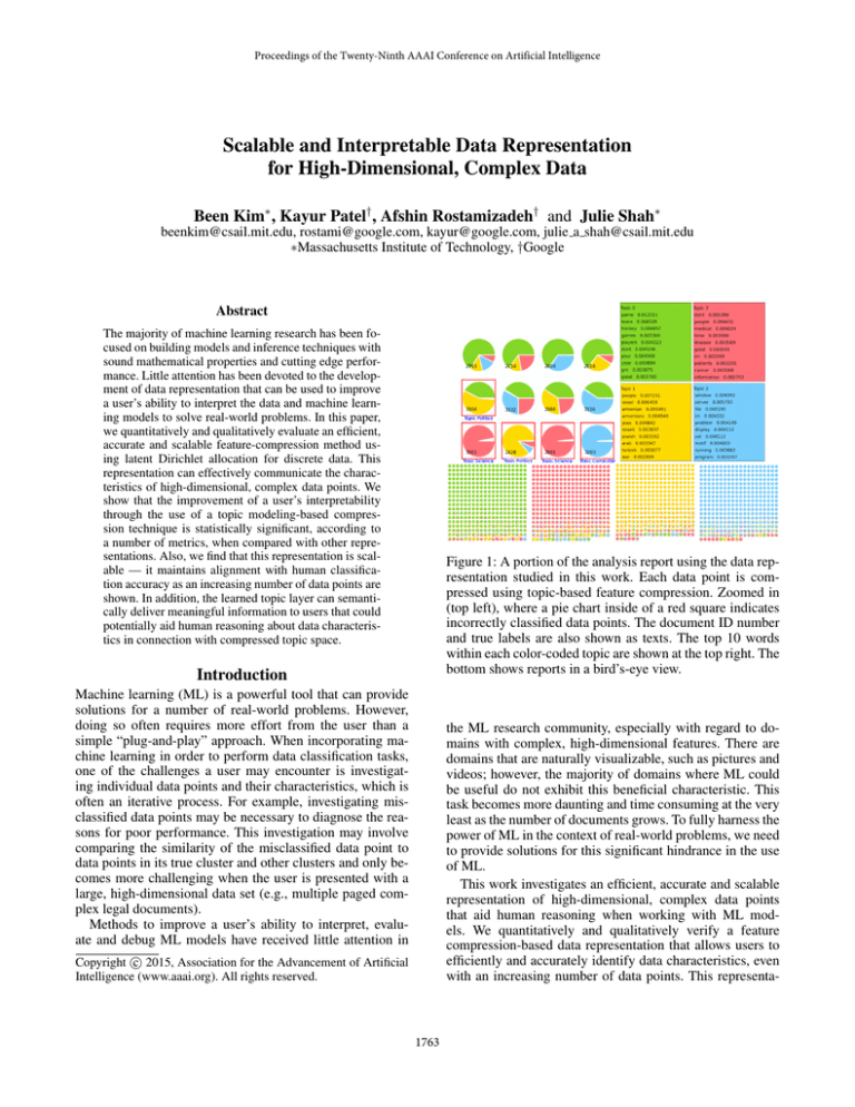
Figure 1: A portion of the analysis report using the data representation studied in this work. Each data point is compressed using topic-based feature compression. Zoomed in
(top left), where a pie chart inside of a red square indicates
incorrectly classified data points. The document ID number
and true labels are also shown as texts. The top 10 words
within each color-coded topic are shown at the top right. The
bottom shows reports in a bird’s-eye view.
Introduction
Machine learning (ML) is a powerful tool that can provide
solutions for a number of real-world problems. However,
doing so often requires more effort from the user than a
simple “plug-and-play” approach. When incorporating machine learning in order to perform data classification tasks,
one of the challenges a user may encounter is investigating individual data points and their characteristics, which is
often an iterative process. For example, investigating misclassified data points may be necessary to diagnose the reasons for poor performance. This investigation may involve
comparing the similarity of the misclassified data point to
data points in its true cluster and other clusters and only becomes more challenging when the user is presented with a
large, high-dimensional data set (e.g., multiple paged complex legal documents).
Methods to improve a user’s ability to interpret, evaluate and debug ML models have received little attention in
the ML research community, especially with regard to domains with complex, high-dimensional features. There are
domains that are naturally visualizable, such as pictures and
videos; however, the majority of domains where ML could
be useful do not exhibit this beneficial characteristic. This
task becomes more daunting and time consuming at the very
least as the number of documents grows. To fully harness the
power of ML in the context of real-world problems, we need
to provide solutions for this significant hindrance in the use
of ML.
This work investigates an efficient, accurate and scalable
representation of high-dimensional, complex data points
that aid human reasoning when working with ML models. We quantitatively and qualitatively verify a feature
compression-based data representation that allows users to
efficiently and accurately identify data characteristics, even
with an increasing number of data points. This representa-
c 2015, Association for the Advancement of Artificial
Copyright Intelligence (www.aaai.org). All rights reserved.
1763
tures), simply visualizing the raw data point is sufficient to
communicate characteristics of the high dimensional (i.e.,
many pixels) data point. For example, Fails et al. (Fails and
Olsen Jr 2003) present images with translucent highlights
indicating how pixels are classified by a learned model.
However, the challenge of efficiently communicating
characteristics of data points exists for many other domains
where the natural visualization does not exist. One attempt
to this challenge is to project data points onto two dimensional space, for example, mapping attribute values to points
in a two-dimensional space by selecting the most useful data
projections (Leban et al. 2006).
For high-dimensional, complex data points, however, neither projection nor performance metrics are sufficient. It is
unclear, for example, how to project complex, 10-page documents, especially when the contents of these documents are
also complex. Working with performance metrics is a realistic approach if, and only if, one can completely rule out
potential faults within the dataset (e.g., hand-tagged labels
with no mistakes). A data representation that can express
the characteristics of individual data points to allow for efficient investigation is essential to improve the human reasoning process when working with ML models.
When it comes to representing the features of individual data points, one of the biggest challenges is ensuring
the scalability of the representation. This work takes an approach based on feature compression methods, and investigates efficient and scalable data representations. One of
the popular ways to compress a large corpus of text documents is to learn an abstract layer called “topics” (e.g.,
Latent Dirichlet allocation (LDA) (Blei, Ng, and Jordan
2003)), and to map each data point onto the topic space.
The majority of data representation work incorporating LDA
has been focused on the development of a visualization
framework (Chuang et al. 2013) or the design of user interfaces (Chuang et al. 2012).
More recently, Chang et al. (Chang et al. 2009) showed
that LDA learns the most human-intuitive topics compared
with other topic modeling methods, and the level of abstraction using topics is appropriate for compressing complex documents. This raises the following questions: first,
whether there are other feature compression methods that
are more intuitive than LDA; and second, whether any of
these other feature compression methods are scalable, interpretable and efficient. This work investigates a several
feature compression methods (LDA, PCA, NMF and ICA),
along with other, more traditional ways to represent data
points (Tf-idf, raw documents) in order to answer these
questions.
tion accelerates the user’s understanding of the complex interaction between ML models and data, and reduces the burden of the iterative debugging process.
The work is part of an effort to provide analysis reports
for those who use ML as a problem-solving tool and require an efficient way to interpret, evaluate and debug ML
problems. The report provides information about individual
data points and their relationships with one another and with
class labels, and is presented in a way that allows for quick
investigation of the status of classification tasks. Figure 1
presents an example report, where each pie chart represents
one document (i.e. one datapoint). The bottom portion of
Figure 1 shows reports in a bird’s-eye view. A detailed view
of a subset of points is shown in the top-left of the report,
where misclassified data points are indicated by a red box.
The compressed feature space representation allows users
to more easily diagnose problems such as incorrect ground
truth labels in cases when the misclassified point really resembles other points that belong to the predicted class. In
order for such a report to be practical in a real-world setting,
the data representation in question should not only be interpretable and scale with the number of data points, but also
be capable of working with high-dimensional features.
Here, we compare and analyze several popular feature
compression methods, including latent Dirichlet allocation
(LDA), principal component analysis (PCA), independent
component analysis (ICA), non-negative matrix factorization (NMF) and term frequency-inverse document frequency
(Tf-idf), in order to assess how a user’s classification accuracy with these methods scales with the number of data
points. Through user study, we measure human performance
according to both objective and subjective terms: accuracy,
efficiency and user confidence and preference. We show
that humans’ performance of classification tasks when using
topic modeling-based compression techniques is improved
across various measures, often with statistical significance,
compared with traditional techniques.
Related work
A common approach for improving the interpretability of
a trained model is to visualize data and it’s relationship to
classification results. Popular machine learning APIs, such
as Weka (Leban et al. 2006), provide basic visualizations for
understanding feature distribution and classifications (e.g.,
bar charts, confusion matrices). Recent work focuses on
making some of these basic visualizations interactive (Talbot et al. 2009; Kapoor et al. 2010).
Researchers have also worked on algorithm specific visualizations (Ankerst, Elsen, and Ester 1999; Becker, Kohavi, and Sommerfield 2001). These visualizations link data
points and features to the parameters of a model. Algorithm
agnostic approaches for visualizing a dataset have also been
suggested. For example, one approach helps users find labeling error or opportunities for generating new features by
visualizing the relationship between a dataset and the output
of multiple learned models (Patel et al. 2011).
Further insight into model performance can be gained
by better visualizing the data points themselves. For domains where data points are naturally visualizable (e.g., pic-
Experiment methodology
Measuring human understanding is a challenging task due
to the complexity of human cognition. In order to quantitatively measure human understanding, we must first define
the interpretability and scalability of a data representation.
Interpretability An interpretable data representation allows humans to correctly identify data-to-data relationships
(e.g., data points that belong to the same cluster share similar
1764
Principal component analysis (PCA) PCA is a statistical procedure that incorporates an orthogonal transformation to convert a set of observations of potentially correlated
variables into a set of values for linearly uncorrelated variables, called “principal components.” A data point is compressed into weights of these principal components, a vector
of length K (set to 4 in our experiment) (Pearson 1901).
PCA provides both positive and negative weights for each
component. Figure 2 depicts an example of PCA representation using bar graphs, with each component color-coded.
Figure 2: An example of PCA in bar graphs (top, two documents) and LDA in table representations (bottom, four documents) shown to participants during experiments
Independent component analysis (ICA) ICA is a statistical method for transforming an observed multidimensional
random vector into components that are as statistically independent from one another as possible (Jutten and Herault
1991). Similar to PCA, ICA provides both positive and negative weights for each component.
characteristics).
Non-negative matrix factorization (NMF) Among other
methods, NMF is used for text mining applications (Sra
and Dhillon 2005). In this process, a document-term matrix is constructed using the weights of various terms collected from a set of documents. (Typically, such a matrix
would consist of weighted word frequency information.)
This matrix is then factored into a term-feature and a featuredocument matrix. The features are derived from the contents of the documents, and the feature-document matrix describes data clusters of related documents.
Scalability A scalable representation maintains a human’s
ability to efficiently interpret data-to-data relationships as
the number of data points increases.
First, we selected a subset of feature compression techniques that are widely used within the ML community. Then,
we evaluated them and chose a smaller set of methods to
use in an experiment with human subjects, according to their
computationally superior metrics (i.e., quality of clustering).
We used a dataset of news articles (20 Newsgroups (Lang
1995)), compressed each document using the chosen methods, and projected the data from each document onto identically sized dimensional spaces. Next, we conducted experiments in which human subjects utilized the chosen techniques, and compared the participants’ interpretability performance with the different data representations. We also
evaluated whether different ways of presenting the same information (e.g., a bar graph vs. a table) impacted human
performance. In order to place this study with respect to
traditional representations, non-feature-compression-based
methods were also evaluated.
Term frequency-inverse document frequency (Tf-idf)
Tf-idf is a numerical statistic intended to reflect how important a given word is to a document within a collection or
corpus (Salton 1991). It is often used as a weighting factor
in information retrieval and text mining. The Tf-idf value
increases proportionally with the number of times a word
appears in a document, but is offset by the frequency of that
word in the corpus, which helps to control for the fact that
some words are generally more common than others. In our
experiment, we selected the 10 highest-weighted words for
each document.
Models and corpora
Dataset The 20 Newsgroups dataset includes articles on
various topics, along with their true labels. In this paper, we
will refer these articles as documents. We first used support
vector machine to filter four categories from the initial corpora that consistently performed better than the others (20%
test set and train on the remaining 80%). The purpose of limiting categories to a small, fixed number is to maintain a reasonable length of experiment time and limit participant fatigue. The four chosen topics were: sports, politics, medicine
and computers. After filtering, the dataset consists of 3,519
documents with a vocabulary of 1,048,576 unique words.
The dataset was preprocessed to remove all stop words.
In this section, we briefly present the technical details of
four candidate feature compression methods, evaluated according to metrics indicating the quality of clustering: latent Dirichlet allocation (Blei, Ng, and Jordan 2003), principal component analysis (Pearson 1901), independent component analysis (Jutten and Herault 1991), non-negative matrix factorization (Sra and Dhillon 2005) and Tf-idf (Salton
1991). The number of latent topics in LDA and the number of components in PCA, ICA and NMF, K, are set to be
identical.
Latent Dirichlet allocation (LDA) LDA is a generative
model of documents wherein each document is modeled
to be generated from a mixture of topics. Each data point
becomes a proportion of low-dimensional topics, a vector
of length K (set to 4 in our experiment). We use Gibbs
Sampling implementation to perform inference (Phan and
Nguyen 2013). The parameter α is set to 0.1, and β is set to
0.1. Additional details for this method can be found at (Blei,
Ng, and Jordan 2003).
Experiment design
In our experiment, each participant was shown N number
of documents (N ∈ {2, 8, 16, 32}) and asked whether the
documents belonged in the same category as one another. If
any of the documents did not belong with the others, participants were instructed to answer “different”; if all documents
shared a common category, they were instructed to answer
1765
Per number of documents shown
Group 1 R - T - BP - TL - TP - BL
Group 2 T - TL - R - BL - BP - TP
Group 3 TL - BL - T - TP - R - BP
Group 4 BL - TP - TL - BP - T - R
Group 5 TP - BP - BL - R - TL - T
Group 6 BP - R - TP - T - BL - TL
Table 1: Design of experiment (R: raw documents, T: Tfidf, TL: LDA in table, BL: LDA in bar graphs TP: PCA in
table, BL: PCA in bar graphs). Participants were randomly
assigned to one of the four groups, with four participants per
group.
Figure 3: Entropy measure (left) and Dunn Index (right).
The entropy measure is calculated for each cluster, then averaged. The error bars represent standard deviation across
clusters.
“same.” This measures the interpretability of the chosen data
representation. The accuracy of participant responses was
determined via the ground truth category provided from the
dataset. In light of the quantitative results found using convention metrics (shown in the following section), PCA and
LDA are chosen as the superior methods to be further evaluated via human experiment. We also provided the top 10
words for each topic, and all topics were color-coded.
To evaluate the scalability of the representation, the number of documents included per question increased from two
to eight, sixteen and finally thirty-two. In this paper, we refer
to questions depicting the same number of documents as a
batch. All participants were given batch2 first, then batch8,
batch16 and batch32 in order to keep the learning effect
equivalent across participants.
There were six questions within each batch, and each
question depicted documents using four different representations: LDA via bar graph and table representations, PCA
via bar graph and table representations, Tf-idf and raw documents. The difference between the table and bar graph representations is that a table depicts the weight of each component in numbers, whereas a bar graph visualizes each weight
without the numbers (Figure 2). We include both table and
bar representations for two reasons: 1) to understand the effect, if any, of a visual versus textual presentation, and 2)
to provide comparable presentation for Tf-idf and raw documents, which do not lend themselves to standard visualizations.
To control learning effects, the order in which representations were shown to a participant was decided by the 6 × 6
balanced Latin square, as shown in Table 1. There were four
subjects in each group. In total, each participant answered
24 questions (four batches of six questions each). For each
representation we uniformly at random decide an outcome
of “same” or “different” and, based on this, choose documents uniformly at random from one or more categories. In
order to maintain roughly equivalent reading times per document and question for the reading of raw documents, we
only included documents of 700 ± 200 words in length. All
participants took mandatory breaks after every five questions
in order to manage fatigue. After each question participants
rated their confidence on a five point Likert-scale (e.g., 1:
not very confident - 5: very confident). At the end of the
study, participants rated their overall preference on a five
point Likert-scale.
Participants
Twenty-four engineers (seven women and seventeen men)
were recruited via email for this experiment. The participants were randomly assigned to one of the groups described
above, and performed four batches of tasks. In total, each
participant answered 24 questions, and took approximately
40 minutes to finish the task. All participants received a gift
card for their role in the experiment.
Results
Through an experiment with human subjects, we verify that
the topic modeling-based feature compression method is significantly better than other methods in terms of interpretability and scalability. For the majority of participants, this was
true across all evaluated performance measures, including
accuracy, speed and confidence, regardless of the batch (i.e.,
the number of documents shown) or method of display (bar
graphs vs. tables).
We first present the pre-experiment evaluation of candidate methods using conventional metrics (entropy and Dunn
Index) that measure inter-data relationships. This is followed
by the experiment results, and how classification accuracy
scaled with increasing data points for each method. We define statistical significance at the α = 0.05 level.
Evaluation using conventional metrics
This section presents an evaluation of the candidate methods
using standard metrics, Dunn index and entropy, which can
be used to measure different aspects of the quality of clusters defined by the true class labels in the compressed feature
space induced by each candidate method. Based on these results, a subset of the candidate feature compression methods
are evaluated using human experiments. We find that the best
method according to these metrics also performs the best according to human performance based metrics.
Dunn index The Dunn index is defined as the ratio between minimum inter-cluster distance and maximum intracluster distance. In other words,
n
n δ(C , C ) oo
i
j
DIm = min
min
(1)
1≤i≤m 1≤j≤m,j6=i
max ∆k
1≤k≤m
1766
where ∆i = max d(x, y) and Ci is a cluster of vectors,
x,y∈Ci
and x, y are any two n dimensional feature vectors assigned
to the same cluster Ci . The inter-cluster distance, δ(Ci , Cj ),
is defined as the distance between the centers (mean vector)
of cluster i and j. We use the L2 -norm distance to compute
∆i and δ(Ci , Cj ). Note that clusters here are defined by the
ground truth label and distance is measured using the reduced dimensionality space. A larger Dunn index suggests
a better clustering, since it implies either a smaller intracluster distance or larger inter-cluster distance (or both).
Shannon entropy In information theory, Shannon entropy characterizes uncertainty or disorder within information (Shannon 2001). Formally, the entropy of a discrete random variable X is defined as
X
E=−
p(x) log p(x),
(2)
Figure 4: Comparison of accuracy (first row), and the portion
of time spent (second row) for LDA and PCA. The performance of the table representation of each method is depicted
on the left column, while the bar graph representation is on
the right. Note that the large standard deviation is due to
the accuracy averaged over binary values (one element for
each participant). A smaller time spent (second row) indicates faster speed.
x
where p(x) is the probability of the event X = x. In the
case of LDA, the value of each coordinate of the feature
vector defines the probability of the instance belonging to
a particular topic. Thus, the entropy computed over the topic
probabilities describes how concentrated (low-entropy) or
how distributed (high-entropy) the weights within the feature vector are. In the case of other methods, such as PCA,
we can take the absolute value of each coordinate of the feature vector and normalize in order to induce a probability
distribution over feature vector coordinates.
The entropy values in Figure 3 are computed by first averaging together all feature vectors within a class, then normalizing the average feature vector if necessary, and then
finally computing the entropy of that aver- aged and normalized vector; the entropy values of all classes are then averaged to produce the final value displayed in the plot.
We note that a low feature vector entropy is not required
in order to have a good clustering, e.g. a good Dunn index
value, however, may aide in providing an interpretable encoding of the features.
Using these two metrics, we chose LDA and PCA as the
superior methods from each of two groups: the compression
methods that give positive only weights and those that give
positive and negative weights. Both Dunn index and entropy
metrics suggest that LDA is better than NMF for methods
that produce positive only weights. PCA is better than ICA
in terms of both entropy measure and Dunn index.
Although these metrics indicate that LDA may be a
promising method, it remains to be verified which of the feature compression methods both scale well with an increasing
number of data points and maintain interpretability. We conducted experiments with human subjects in order to answer
this question.
better than PCA with regard to accuracy, speed and the subject’s degree of confidence in 23 of 24 cases, with a statistically significant difference in performance in the majority of
cases. We used the Wilcoxon signed rank test for paired observation to assess the statistical significance of differences
in accuracy, speed and confidence between the methods with
α
a requisite Bonferroni correction of N
, N = 2. Unlike the Ttest, the Wilcoxon signed rank test does not assume normal
data distribution.
Note that the portion of time spent by each subject is defined as the time spent on a question, normalized by the
total time spent on all representations within a batch. For
example, the amount of time spent with Tf-idf, raw documents, PCA via table, PCA via bar graph, LDA via table
and LDA via bar graph for a given batch add up to 1; a lower
amount for a specific method represents faster speed using
that method.
Table 2 indicates that the average performance of the human subjects was better when using LDA rather than PCA,
in both bar and table representations, especially as the number of documents increased. With regard to accuracy, we observed a statistically significant difference between PCA and
LDA with an increasing number of documents, suggesting
the superior scalability of LDA compared to PCA. Figure 4
indicates that LDA maintains performance accuracy as the
number of documents shown increases, whereas the accuracy of PCA drops with an increasing number of documents.
LDA was also superior to PCA with regard to speed and confidence, regardless of the number of documents shown.
Beyond scalability, what is ultimately useful for humans
is the semantic meaningfulness of the compressed layer.
This is different from interpretability — even if the layer
is not semantically meaningful, the user may still be able to
identify same or different data points, but may not be able to
draw useful conclusions by determining the meanings of the
Statistically better performance using
topic-modeling based feature compression
Our experiment results verified that human performance is
better when using the topic modeling-based feature compression method rather than other representations, according
to both objective and subjective measures. LDA performed
1767
Bar
Table
Batch
2
8
16
32
2
8
16
32
Accuracy
z = 1.41, p = 0.1
z = -1.63, p = 0.1
z = -1.60, p = 0.1
z = -3.05, p < 0.05
z = -1.90, p = 0.05
z = -1.00, p = 0.3
z = -3.32, p < 0.05
z = -3.21, p < 0.05
Speed
z = 3.54, p < 0.05
z = 3.34, p < 0.05
z = 2.60, p < 0.05
z = 3.57, p < 0.05
z = 3.91, p < 0.05
z = 3.43, p < 0.05
z = 3.06, p < 0.05
z = 3.06, p < 0.05
Confidence
z = 6.10, p < 0.025
z = 6.11, p < 0.025
z = 6.09, p < 0.025
z = 6.10, p < 0.025
z = 6.13, p < 0.025
z = 6.08, p < 0.025
z = 6.08, p < 0.025
z = 6.11, p < 0.025
raw document
vs. LDA
Tf-idf
vs. LDA
batch
2
8
16
32
2
8
16
32
Accuracy
z = 1.41, p = 0.1
z = 0.00, p = 1.0
z = 1.13, p = 0.2
z = 0.00, p = 1.0
z = -1.41, p = 0.1
z = 0.00, p = 1.0
z = -0.82, p = 0.4
z = -0.71, p = 0.4
Speed
z = 3.83, p < 0.05
z = 3.80, p < 0.05
z = 4.09, p < 0.05
z = 4.29, p < 0.05
z = 3.51, p < 0.05
z = 3.97, p < 0.05
z = 3.89, p < 0.05
z = 4.20, p < 0.05
Confidence
z = 6.31, p = 0.5
z = 6.23, p = 0.3
z = 6.31, p < 0.025
z = 6.24, p = 1.0
z = 6.09, p < 0.025
z = 6.23, p = 0.01
z = 6.11, p = 0.1
z = 6.15, p = 0.05
Table 3: Statistical significance test for performance between Tf-idf and LDA, and raw document and LDA. Statistically significant differences between methods are bolded.
Table 2: Statistical significance test of the performances of
LDA and PCA. Statistically significant differences between
the two are shown in bold.
tation was, on average, 2.8 times faster (±1.6) and, at most,
20 times faster than the raw document representation. When
compared with Tf-idf, the speed of LDA with bar graph representation was three times faster (± 1.2) on average, and,
at most, 12 times faster, while the speed of LDA with table
representation was two times faster on average (± 0.8), and
9.9 times faster at most compared with Tf-idf.
These results suggest that LDA-based representation
maintains performance metrics while significantly decreasing the time it takes for humans to investigate data point
characteristics.
Figure 5: Performance comparison for all representations
Post-experiment questionnaire
compressed layer and making connections to the characteristics of data points.
Results from the post-experiment questionnaire indicated
that 83% of participants paid attention to the top 10 keywords for topics. In addition, 92% of participants stated
their preference for positive-only weighted keywords (LDA)
over positive and negative weighted keywords (PCA). Even
though a separate subject experiment is need to evaluate the
quality of subjects’ understanding of the topic layer, our results suggest that the topic-layer from LDA could be useful
beyond interpretability.
Despite the superior performance of LDA, results from
the post-experiment questionnaire indicated that participants
tended to only slightly prefer LDA representations when
compared to raw document representations in general. However, these results may differ if the number of documents
shown to participants becomes larger by an order of magnitude. Due to time constraints related to experiments involving human subjects, we leave this possibility to be explored
in future work.
Conclusion
Comparison with non-feature compression-based
representations
We quantitatively and qualitatively verified accurate, efficient and scalable data representations for a highdimensional complex data points. Our findings are supported by both evaluations based on conventional metrics and human subject experiments. The improvement
of a user’s interpretability throughout the use of a topic
modeling-based compression is statistically significant, according to a number of metrics. Furthermore, the compressed layer delivers meaningful informations to users. For
the layer to maintain the rich information about the data,
the topic modeling-based approach assumes that the features
of the input data are interpretable. One method of relaxing this assumption is to add a layer in the LDA model to
include domain-specific interpretable representations. This
work aims to accelerate the user’s understanding of the complex interaction between ML models and data, and reduces
the burden of the iterative debugging process.
In order to compare this study with more standard representations, we also evaluated participants’ performance using
traditional data representations: Tf-idf and raw documents.
Figure 5 indicates that the user’s accuracy of classification
with LDA are similar to those observed for raw documents.
The confidence measure also showed a similar trend. Compared with Tf-idf, accuracy and confidence values are higher
with LDA, regardless of batch. As indicated in Table 3, the
observed differences between the methods in accuracy and
confidence are not statistically significant.
However, there was a huge gain in speed when using the
LDA representation compared with viewing a raw document. The speed at which participants answered questions
using the LDA bar graph representation was significantly
greater than that observed when using both raw documents
and Tf-idf representations, regardless of the number of documents shown (Table 3). In particular, the speed of LDA
with bar graph representation was 4.5 times faster (± 3.5)
on average, and at most, 40 times faster than the raw document representation. The speed of LDA with table represen-
References
Ankerst, M.; Elsen, C.; and Ester, M. 1999. Visual classification: an interactive approach to decision tree construction.
KDD.
1768
Becker, B.; Kohavi, R.; and Sommerfield, D. 2001. Visualizing the Simple Bayesian Classifier. Information Visualization in Data Mining and Knowledge Discovery.
Blei, D.; Ng, A.; and Jordan, M. 2003. Latent Dirichlet
allocation. JMLR.
Chang, J.; Boyd-Graber, J.; Gerrish, S.; Wang, C.; and Blei,
D. 2009. Reading tea leaves: How humans interpret topic
models. NIPS.
Chuang, J.; Ramage, D.; Manning, C.; and Heer, J. 2012.
Interpretation and trust: Designing model-driven visualizations for text analysis. In Proceedings of the SIGCHI Conference on Human Factors in Computing Systems. ACM.
Chuang, J.; Gupta, S.; Manning, C. D.; and Heer, J. 2013.
Topic model diagnostics: Assessing domain relevance via
topical alignment. ICML.
Fails, J., and Olsen Jr, D. 2003. Interactive machine learning. International conference on intelligent user interfaces.
Jutten, C., and Herault, J. 1991. Blind separation of sources,
part I: An adaptive algorithm based on neuromimetic architecture. Signal processing.
Kapoor, A.; Lee, B.; Tan, D.; and Horvitz, E. 2010. Interactive optimization for steering machine classification. Proceedings of international conference on Human factors in
computing systems.
Lang, K. 1995. Newsweeder: Learning to filter netnews.
ICML.
Leban, G.; Zupan, B.; Vidmar, G.; and Bratko, I. 2006.
Vizrank: Data visualization guided by machine learning.
Data Mining and Knowledge Discovery.
Patel, K.; Drucker, S.; Kapoor, A.; and Tan, D. 2011.
Prospect: Using multiple models to understand data. IJCAI.
Pearson, K. 1901. LIII. on lines and planes of closest fit
to systems of points in space. The London, Edinburgh, and
Dublin Philosophical Magazine and Journal of Science.
Phan, X., and Nguyen, C. 2013. GibbsLDA++, C/C++ implementation of latent Dirichlet allocation using Gibbs sampling for parameter estimation and inference.
Salton, G. 1991. Developments in automatic text retrieval.
Science.
Shannon, C. E. 2001. A mathematical theory of communication. ACM SIGMOBILE Mobile Computing and Communications Review.
Sra, S., and Dhillon, I. S. 2005. Generalized nonnegative
matrix approximations with bregman divergences. NIPS.
Talbot, J.; Lee, B.; Kapoor, A.; and Tan, D. S. 2009.
Ensemblematrix: Interactive visualization to support machine learning with multiple classifiers. Proceedings of the
SIGCHI Conference on Human Factors in Computing Systems.
1769
