TABLES AND FIGURES-- GENERAL GUIDELINES
advertisement
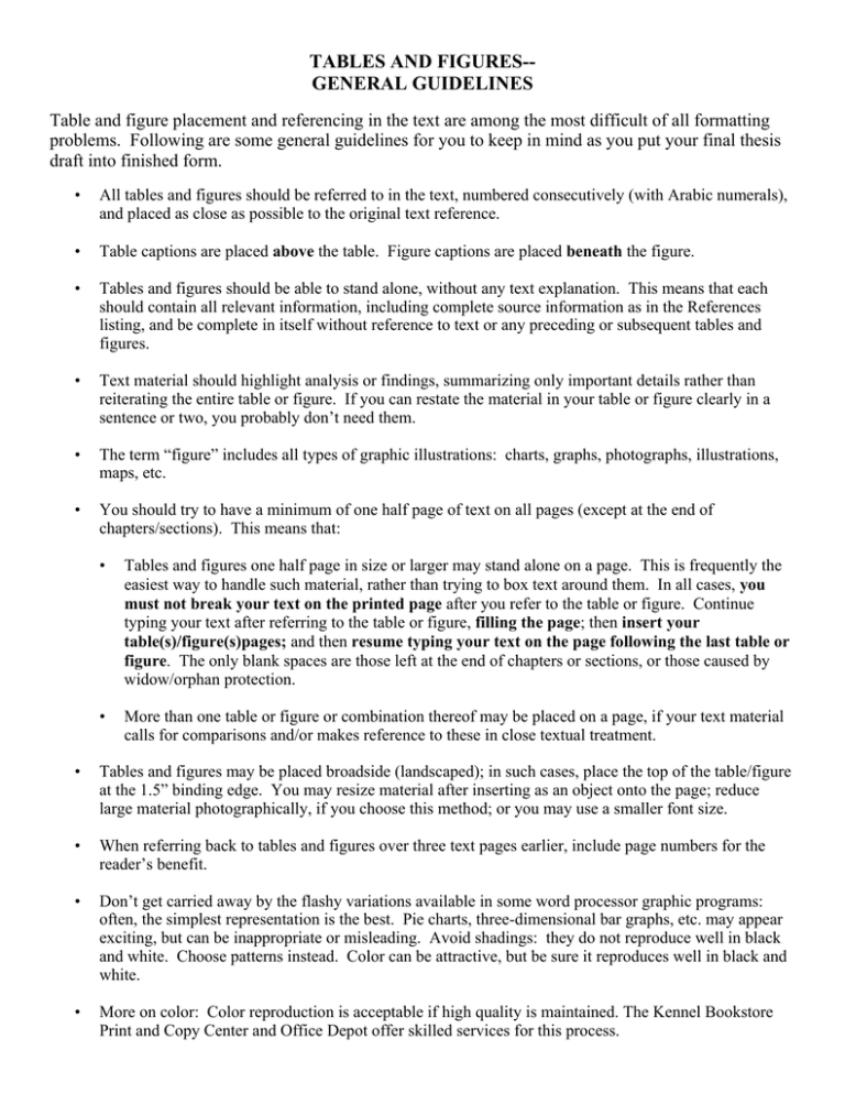
TABLES AND FIGURES-GENERAL GUIDELINES Table and figure placement and referencing in the text are among the most difficult of all formatting problems. Following are some general guidelines for you to keep in mind as you put your final thesis draft into finished form. • All tables and figures should be referred to in the text, numbered consecutively (with Arabic numerals), and placed as close as possible to the original text reference. • Table captions are placed above the table. Figure captions are placed beneath the figure. • Tables and figures should be able to stand alone, without any text explanation. This means that each should contain all relevant information, including complete source information as in the References listing, and be complete in itself without reference to text or any preceding or subsequent tables and figures. • Text material should highlight analysis or findings, summarizing only important details rather than reiterating the entire table or figure. If you can restate the material in your table or figure clearly in a sentence or two, you probably don’t need them. • The term “figure” includes all types of graphic illustrations: charts, graphs, photographs, illustrations, maps, etc. • You should try to have a minimum of one half page of text on all pages (except at the end of chapters/sections). This means that: • Tables and figures one half page in size or larger may stand alone on a page. This is frequently the easiest way to handle such material, rather than trying to box text around them. In all cases, you must not break your text on the printed page after you refer to the table or figure. Continue typing your text after referring to the table or figure, filling the page; then insert your table(s)/figure(s)pages; and then resume typing your text on the page following the last table or figure. The only blank spaces are those left at the end of chapters or sections, or those caused by widow/orphan protection. • More than one table or figure or combination thereof may be placed on a page, if your text material calls for comparisons and/or makes reference to these in close textual treatment. • Tables and figures may be placed broadside (landscaped); in such cases, place the top of the table/figure at the 1.5” binding edge. You may resize material after inserting as an object onto the page; reduce large material photographically, if you choose this method; or you may use a smaller font size. • When referring back to tables and figures over three text pages earlier, include page numbers for the reader’s benefit. • Don’t get carried away by the flashy variations available in some word processor graphic programs: often, the simplest representation is the best. Pie charts, three-dimensional bar graphs, etc. may appear exciting, but can be inappropriate or misleading. Avoid shadings: they do not reproduce well in black and white. Choose patterns instead. Color can be attractive, but be sure it reproduces well in black and white. • More on color: Color reproduction is acceptable if high quality is maintained. The Kennel Bookstore Print and Copy Center and Office Depot offer skilled services for this process.
