Display and Summary of Data
advertisement
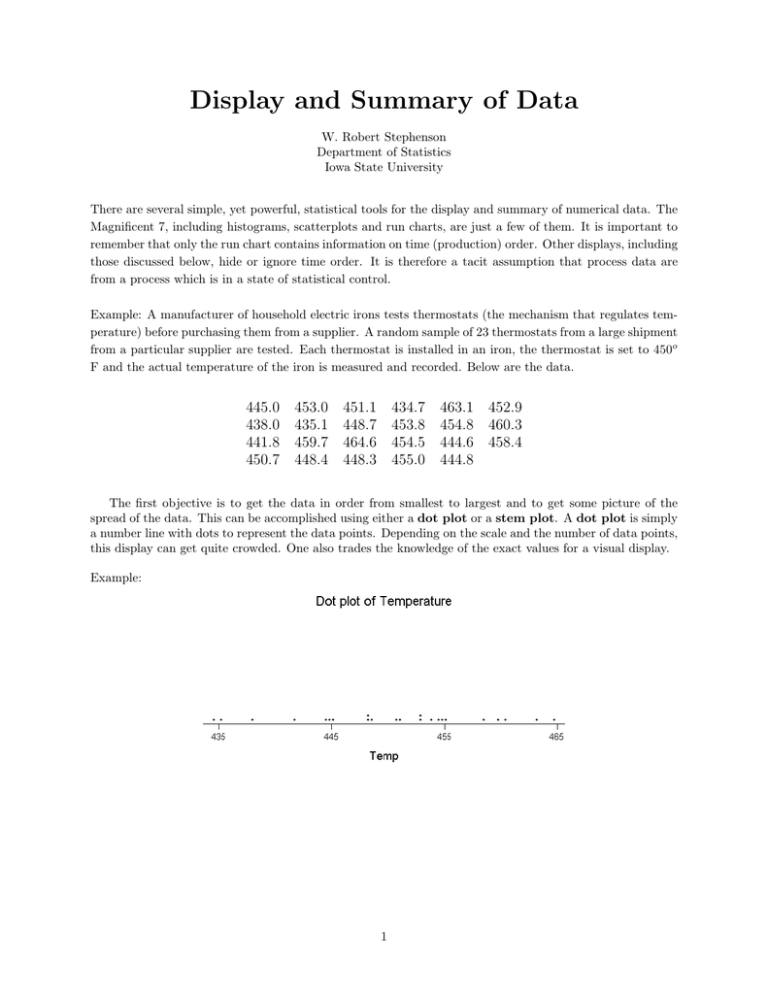
Display and Summary of Data W. Robert Stephenson Department of Statistics Iowa State University There are several simple, yet powerful, statistical tools for the display and summary of numerical data. The Magnificent 7, including histograms, scatterplots and run charts, are just a few of them. It is important to remember that only the run chart contains information on time (production) order. Other displays, including those discussed below, hide or ignore time order. It is therefore a tacit assumption that process data are from a process which is in a state of statistical control. Example: A manufacturer of household electric irons tests thermostats (the mechanism that regulates temperature) before purchasing them from a supplier. A random sample of 23 thermostats from a large shipment from a particular supplier are tested. Each thermostat is installed in an iron, the thermostat is set to 450o F and the actual temperature of the iron is measured and recorded. Below are the data. 445.0 438.0 441.8 450.7 453.0 435.1 459.7 448.4 451.1 448.7 464.6 448.3 434.7 453.8 454.5 455.0 463.1 452.9 454.8 460.3 444.6 458.4 444.8 The first objective is to get the data in order from smallest to largest and to get some picture of the spread of the data. This can be accomplished using either a dot plot or a stem plot. A dot plot is simply a number line with dots to represent the data points. Depending on the scale and the number of data points, this display can get quite crowded. One also trades the knowledge of the exact values for a visual display. Example: 1 The stem plot or stem-and-leaf plot turns the number line on its side. The stem gives the major divisions of the number line with the leaves representing the last digit(s) of the data points. Below is a partial stem plot for the first row of the iron thermostat data. 43 43* 44 44* 45 45* 46 46* 4.7 5.0 3.0 1.1 2.9 3.1 The full stem plot, and a second version with the numbers on each stem ordered from smallest to largest when reading left to right are given below. 43 43* 44 44* 45 45* 46 46* 4.7 8.0 1.8 5.0 3.0 9.7 3.1 5.1 4.6 8.7 1.1 8.4 0.3 4.8 8.4 2.9 5.0 4.6 43 43* 44 44* 45 45* 46 46* 4.7 5.1 1.8 5.0 0.7 5.0 0.3 8.0 4.6 8.3 1.1 8.4 3.1 4.8 8.4 2.9 9.7 4.6 8.3 3.8 4.8 4.5 0.7 8.7 3.0 3.8 4.5 4.8 The stem plot retains all the information from the original values. It is a stepping stone to the construction of a histogram. It also allows one to easily identify values according to rank, such as the minimum, maximum, median and quartiles. The minimum and maximum are the smallest and largest observations, respectively. The median is the value in the middle of the ordered data. When n, the number of obserin the ordered array. When n is even, the vations, is odd, the median is the observation with rank n+1 2 median is the average of the two observations with rank n2 and n2 + 1. 2 Example: minimum = 434.7 maximum = 464.6 n=23, n+1 2 = 24 2 = 12. The median is the 12th observation in the ordered set of data. median = 451.1 The median also divides the data into an upper and lower half. When n is even, there are n2 observations in each half. When n is odd, there is some ambiguity, and little agreement, as to how to define the halves. We will use the definition that excludes the median from either half. Therefore, when n is odd, the n−1 2 smallest observations make up the lower half and the n−1 2 largest observations make up the upper half. Once the halves are defined, the quartiles are defined as the medians of those halves. Specifically, the lower or first quartile, Q1 , is the median of the lower half. The upper or third quartile, Q3 , is the median of the upper half. Example: Lower Half 434.7 435.1 438.0 444.8=Q1 445.0 448.3 448.4 441.8 444.6 452.9 453.0 454.5 454.8 453.8 Upper Half 455.0=Q3 458.4 459.7 460.3 448.7 450.7 463.1 464.6 The minimum, Q1 , median, Q3 , maximum together are a five number summary. The five number summary is used to construct a box plot. Each segment of the box plot represents one fourth of the data. By comparing the relative lengths of each segment one can get some idea of the shape (skew or symmetry) of the distribution of the data. Additionally, the box plot visually displays the spread of the data. The spread can be summarized by the range, which is the maximum minus the minimum or the InterQuartile Range, IQR which is Q3 minus Q1 . Whereas the range gives the length of the interval needed to capture the entire spread of the data, the IQR is the length of the interval necessary to capture the central 50% of the data. Example: minimum = 434.7, Q1 = 444.8, median = 451.1, Q3 = 455.0, maximum = 464.6 range = 464.6 – 434.7 = 29.9 o F IQR = 455.0 – 444.8 = 10.2 o F 3 4
