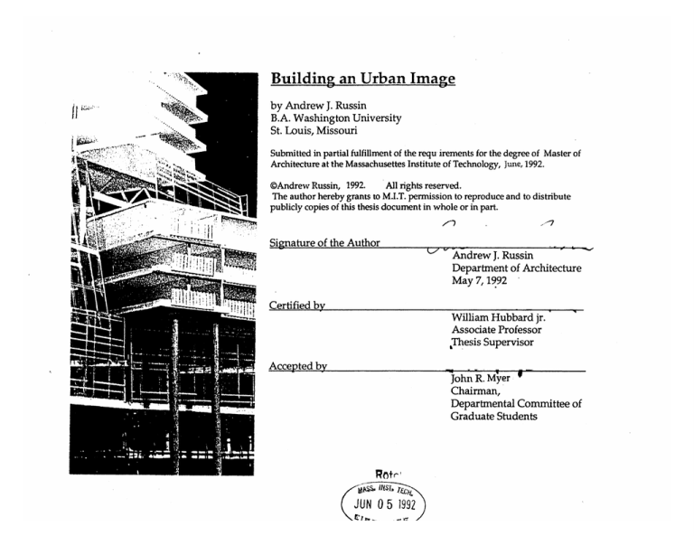
Building an Urban Image
by Andrew J. Russin
B.A. Washington University
St. Louis, Missouri
Submitted in partial fulfillment of the requ irements for the degree of Master of
Architecture at the Massachusettes Institute of Technology, June, 1992.
@Andrew Russin, 1992.
All rights reserved.
The author hereby grants to M.I.T. permission to reproduce and to distribute
publicly copies of this thesis document in whole or in part.
Signature of the Author
Andrew J. Russin
Department of Architecture
May 7,1992
Certified by
William Hubbard jr.
Associate Professor
,Thesis Supervisor
Accepted by
JohnR.MIW
John R. M,yer
Chairman,
Departmental Committee of
Graduate Students
JUN 0 5 1992
Buildine An Urban Image
by
Andrew J. Russin
Submitted to the Department of Architecture on 8 May 1992 in partial fulfillment of
the requirements for the degree of Master of Architecture.
Abstract
This design project explores the principles of "urban legibility" and "shared space".
The readability, or imageability (in Kevin Lynch's term) of a city results from the
recognition of larger urban patterns, organizations, and elements. One such pattern,
the "city edge", is identified and explored through the design. A "shared space" is one
which can be experienced (to some degree) from both inside and outside of the
enclosure of a building.
The site is on the Boston waterfront. The program is a 70 room hotel with comercial
space on ground level.
Thesis advisor: William Hubbard Jr.
Title: Associate Professor
Contents
Abstract ...................................................................................
---.-.
.
.---------. 3
-----............ 5
Introduction................................................................................----------..-..
.... ----------.........------ 5
Urban Legibility .................................................................................
Shared Space ..........................................................................-----...........-------.--...--.------..
9
The Site. ..............................................................................--......---..---.-..............-------.
...15
.......
......
.......................................................................
design
The
.. .. ----------------------------------.......................... 69
Credits ...................................................--.--. 69
Bibliography...........................................................................................
i
IG.
3. The visual form
of Ioion
aj seen in
ihe field
Introduction
The following work is a design project generated primarily by two intentions : to
establish an "urban legibility" and to explore the idea of "shared space". Both are
briefly defined below.
Urban Legibility
Kevin Lynch, in The Image of the City argues that legibility is an essential quality of
any urban environment and that it "heightens the potential depth and intensity of
human experience" 1. In Boston the continuous brick walls of Beacon Hill, the
regular directional grid of the Back Bay, and the land marking nature of the Prudential
Tower all present clear comprehensible urban images which make Boston navigable,
accessible, and enduring. Lynch categorizes the city into five primary patterns: path,
edge, node, district, landmark. Most of Lynches examples are retrospective; that is,
their effects were not necessarily preconceived or planned, but Lynch's as the "high
and tall building spine through the heart of the city suggest an active reordering of the
city, not determined by existing local urban patterns but by an opportunity and desire
to create a new, clear, imageable reading of the city.
In Lynch's examples legibility requires a certain clarity and simplicity at the urban
scale. The clarity of the urban form is not intended to predicate simplicity in its
building nor human size forms. On the contrary, because of a larger clear
organization, the elements within may, and should, be differentiated,
contrasted,opened,closed,according to the needs of habitation without becoming
unreadable.
Urban legibility as defined above is not derived from a careful reading of the
immediate local area or neighborhood. It requires inspection and manipulation of
districts, and multiple block zones at the larger city size.
Shared Space
Late twentieth century urban western society spends most of its time indoors. This is
particularly true in moderate and northern climates. The fabric of these cities is
generally still a figure to ground system. Building edges are either a continuous
surface with small openings or, in newer districts, continuous glass surfaces with few
opaque surfaces. In either case there is a distinct dividing plane between what is
inside and what is out.
This leaves the outside space as simply a zone between buildings, (streets) a zone
which is connected to the interior only through a particular surface treatment. Streets
therefore become primarily simply accessways with limited volumetric variant ions .
The idea of "shared space" consists in opening the interior space and the life within to
the outside in order to create a physical exchange with the life outdoors and invite a
mutual awareness on both sides (not just the inside looking out).
This can be achieved through the use of transparency (glass and frames) and also
through volumetric shifts in both plan and section which interlock with the street.
Transparency must be balanced against some opaque surfaces in order for the void to
read as void , otherwise there is the risk that an entire single volume of glass will read
as a solid. Transparency also provides an abundance of daylight which (especially in
northern climates) is generally essential for humane living.
The idea of "shared space" comes directly from early modern Architectural notions
about open interior to exterior space which breaks away from the figure ground
bearing wall system.
11%N. o1 I JL
The Site.
The project site is a small area along the Boston waterfront. The present plan to
depress the existing highway artery and create open space along a new surface road
presents an opportunity to define an urban image for the Boston waterfront. With the
highway removed, there is the possibility of imagining the buildings of downtown
being brought to form an "edge" (in Lynch's terms) at the edge of the new waterfront
boulevard. Lynch's notion of city "edge" as a legible order serves as the main urban
design guideline.
A second organizing condition is the opportunity to extend Franklin Street through to
the waterfront, providing a direct visual connection and pedestrian access from nearby
Post Office Square, the heart of the business district. This would offer a second
through street to the water ( State Street connects the city to the waterfront a few
blocks away) making orientation and navigation through the existing medieval street
pattern markedly easier.
The program is a 70-room hotel with meeting room facilities, 100 seat restaurant, and
commercial space on the street level. This seemed to be appropriate to the site
location and represents a relatively conventional program, thus allowing the design to
focus on general city form issues rather than specialized building program..
The size of the site is relatively small. This helps make more manageable the
resolution of the design, but more importantly it serves as a test to see if a modest
intervention can participate in a larger urban system.
Li
.s
s
m'so~..""'
"
"
a..
.
-,Tap
.S
3~I
I.*
*
..
-_4..'...
...
.
. -ij
i ...
TRE.
A
STATE STRET AND FRANKLIN ST7REET THROUGH POST OFFICE SQUARE
10
EXISTING SITE ALONG THE WATERFRONT]
~*
-
POST OFFICE SQUARE
-a
\\
V/1 ,
.
\ \V
NEW PLAN WITH FRANKLIN STREET EXTENSION
14
The design
A structure spanning over the Franklin Street extension serves to both reinforce the
city edge and unify the project into a larger horizontal organization rather than two
smaller vertical buildings. This seemed to be desirable in terms of the horizontal
relationship with the waterfront and also provides a land-marking of the city edge
visible from Post Office Square. This bridge element is seen as an "urban room"
which along with the two story main level serves as a "shared space" . Here the
outside world can see in and understand directly the purpose of this building and thus
be invited to explore it. The main central space is intended to be a public atrium open
at all hours providing both an outlook to the sea and a view back into the heart of the
city .This space is tall, narrow, and un-obstructed by solid forms in order to provide
maximum transparency, keeping the view of the waterfront from the city as clear as
possible. It is raised 30 feet above street level allowing the Franklin Street pedestrian
extension to pass underneath with enough vertical dimension to feel public, airy, and
open to sunlight.
The bed rooms are oriented towards the longest views, either out to the waterfront or
down Broad Street. They form the hardest, most opaque boarders which reinforce
both the water front boundary and the Franklin street line.
The north side reaches 13 stories forming a thin and vertical shape on the Broad Street
front and a wide and horizontal shape on the Franklin Street extension side. This
creates a tall edge condition which links with the existing tall buildings along Franklin
Street producing a continuous spine running from downtown to the waterfront.
Credits
1 Lynch, The Image of the City,
Fig 1. Lynch, The Image of the city pg 21.
Fig 2.Boston Redevelopment Authority map.
Fig 3 ibid.
Fig 4. ProcessArchitecture 97 pg.19
Fig 5. ibid.
All other images produced by the Author.
. FROM THE WATERFRONT TOWARDS POST OFFICE SQUARE
16
FROM POST OFFICE SQUARE TO THE WATERFRONT
y
LLai.Q
LA.
"'d.--
-
.- - I-ks."w-
.
-
Ilk
VIEW DOWN FRANKLIN STREET FROM POST OFFICE SQUARE
18
'-3
Id-
r
-lu
IL
pr
0
V2
F!)if
THE "URBAN ROOM"
N)
0
COMERCIAL
OE
COMERCIAL
2.
e0
COMERCIAL
H T1 Til l Lil
\
y)
CAFE BAR
K
:1
AJ
PLANS
o
F'
-
S
C
C)
'V
o~
Li
0
INt~iH
LEVEL 1
Q~
0
~J
1?4
F
-
-~
-~
0~
1/~~))
,01J
e
L
S
II
I
-
0
II
U
HOTEL RECEPTION
L77u-L
0/
~i.i
7
0
0
'~1
0\
'
atBAR
\(
'>
':~
'/7
7
11
BUISNE.SS SERVICES
'A
-'v
-~
/7
RESTAURANTN
A
'7 ,-II- ] ,
-0
Ie
0
L---
----
-----
L li*
DMn l
FL
KrTCI IEN0
--------
LEVEL 3
L--L
4K
"LhT+WTZIB]FF±Hiff1
EETING R FEL
M2fEEzENG RQMa
LEVEL4
-
MEETING ROOM
00
E-
1-1
OFI
LEVEL 5
F
-
-
(
I
p
<7
/
7,,
/
/
J~
~
2~
1
/
i0
/
~~-]
-~
I
'I
/
'0'
'7
/
,/j
4
/
,
S
/
/
/
'
/
Icy
-~
SKY BAR
, /
",Q/
/
/
LJ~IIJiliitWt~~~I
/
,
~'~'
'Cl
-]
4'
1A4
I
'~>1.
f
-'I
LEVEL8
41
CfO
J.
r
I...
'
I)
-'
.
97f
i!i
1
4
&/
-
.
A
A
es/
7
rVA y,
ftt
Vt
t
---
r
e.-aas
aer--...=-r-.t
=
s.
-e
-.
...
' --
-
--
C,
//
2
r4
EARLY SKETCH MODEL
49
/
Y
50
I'
5
1~
'At
/
4
N~
N 4 97'
/
/
/
.1
/
r,'4 1~ 17
/7K
t
*-~
*1~
C
N
'A
-A-
I
-1
/
'1
F..'
*
if
1-4
-w-
( \
/
/
/
..
.L
......
o~-
wp
/
A
1
T I~Q\
I
xir
Xt\
V
S
ii
9
~~1
t
1.
1
A
II
I.;.
-~
1~~
'U
;j
\~~"
1~KI
I'
~
I
53
A
I
~.
*
.
-
A/54/r4
~.--
-
-
*..-,
~
-.
~
i~:..4
_
-~.--*"--~
~
tIf'v
SEcTION
4W-
~
,.
V
*.,
. ~$.
-
..
)
1
-
*
~iL.
SKETCH MODEL
/
-Zwm-
77
T7I-.
*~***,,~I*-*.-ve
1.I{
_____
SECTION
~
X-
~4.I
4~it
*~
q
,1
I.'
~
tAt
U
*t-
---.-----
om1~
Im
p
I
7i.
~
~~~
itlW
tAp'*
1
I
-
~
rx,.wAq'
4
.
7
SECTION B-B
3
-..-.............-.
3
.. .. .. .. ..-.
..
....
..
. . . .. .. ..
.r
. .
.
.
-..
*
x
-
3
-..
;.
.
;
x~xossz+:
-::.
;
3.......-.
...
.aoo .
......
-..-.-.-.-.
..
.
0%+:+:+.+.-.:+.+
3
.......-..
.. .
.1 . . .;
-
r--.--
3.......
.. . . .
-..
. ..
-..-.-.
.-.
-
--
:.yr..
..
3
-
-.
-
-
-
-
8 8
i....9
8.
. .:
....-.
...
...
:+......:.-
...
:+o -o:.:.o.:.o+o:..-o
~~~~ ~
... .:
-
~
oo..oo..:.:0
~
~
~
~
::::.::T..
:: ::::3 :::: ::.::
:::. :: ::.
....
8~..
:.:.....:.6:.::.-..::..
-...
.. ...
.
-..
.-..-..-. .:
3.............
...........
----.-.-.-.-..-.-.
x.
.
xx.....
o
-:oe
o
o-...::-.o
~
~
x
'e
~
.....
..
.. ... .
..
.
.
.
-
... .
-M :
. --
:N-+
-w w
+::
--.
~
..
:
+-xe
x+^
.
.
.
. ..
. ..
. . ..
.
.......
. ..
......
3..-..-
.*.
....
.
.
. .. . .
-
.. . .. . ..
. .
-
..
:
.e
x e
.9.m.-.-.-..
-.
. . .
.. ...-.
~~ ~
3.3..
NOW
3......
.)
..........
...........
......
..........
...........
PM
.............
.............
.............
.............
.............
.............
.............
I...........
.............
.............
.............
SECTION A-A
-
8 % :.
.. . .
3.
v 6 ns
-.
.
-.
-.-.
.....
'
-e
;.;
;..
....
x x
x
+-
-e
+:
+..-.x
a+
vm
...
...-
..
.. ..
;..-.
-
oxs
0
,)
.............................
-
s
.v.
...
-
.
4K
AYI
srow
M
M&
omega
m
OE
INr
0jogn
9
M,
!,
..
..
42-1~
'.- ,-
1-.-m
,
,%
--
-1--,
g
.
-
'Ill
I
--
.I~n
--
,,
-
,
-
+
1T
IM'.1T
i-"
~
iibI ln mi MW
lT
'a
-I.
-
www~
f a~l
-fi
.
Mi g hn'ln
M
-M
-ai-
e
sM
.-
i-1
~
0s
1~
-
-~~
I
.-
A,,;4
Credits
1 Lynch, The Image of the City,
Fig 1. Lynch, The Image of the city pg 21.
Fig 2.Boston Redevelopment Authority map.
Fig 3 ibid.
Fig 4. ProcessArchitecture 97 pg. 19
Fig 5. ibid.
All other images produced by the Author.
Bibliography
Kevin Lynch , The Image of the City , MIT Press , 1960
Behnisch & Partners- Designs 1952-1987
Process Architecture 97 , Boston by Design, A City in Development: 1960-1990
Thank you
To Bill Hubbard, My thesis advisor, for believing in the design (most of the time).
To Patrick Donnelly , who shot and developed all the photographs.
