Representing International Equilibrium with Offer Curves
advertisement
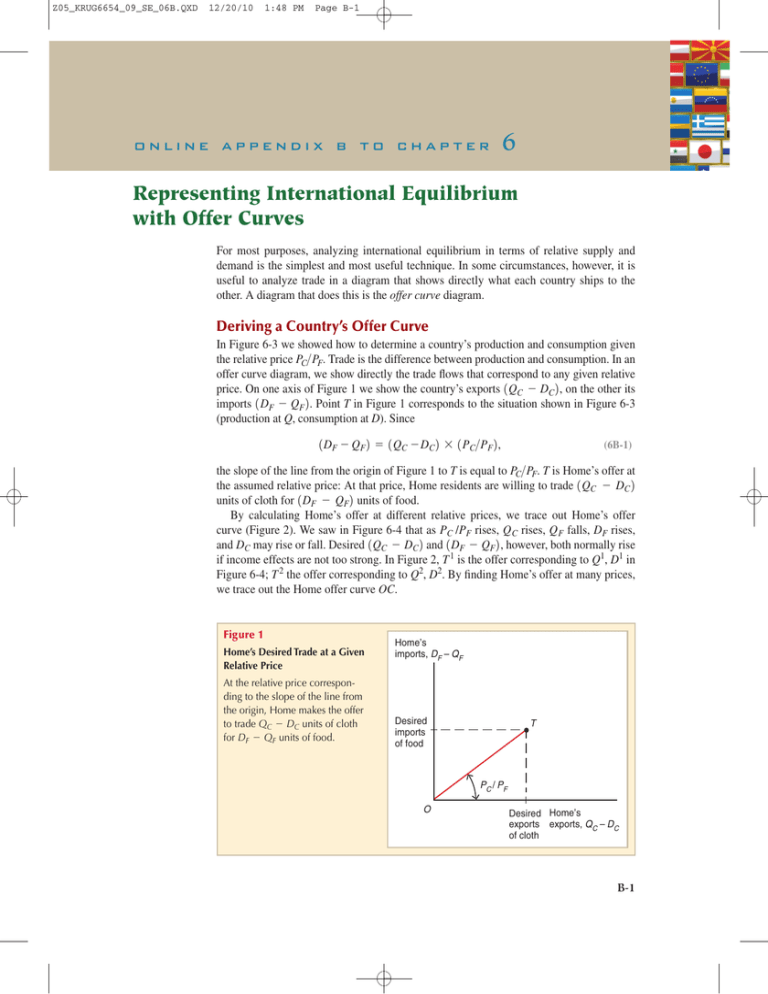
Z05_KRUG6654_09_SE_06B.QXD 12/20/10 1:48 PM Page B-1 online appendix b to chapter 6 Representing International Equilibrium with Offer Curves For most purposes, analyzing international equilibrium in terms of relative supply and demand is the simplest and most useful technique. In some circumstances, however, it is useful to analyze trade in a diagram that shows directly what each country ships to the other. A diagram that does this is the offer curve diagram. Deriving a Country’s Offer Curve In Figure 6-3 we showed how to determine a country’s production and consumption given the relative price PC>PF. Trade is the difference between production and consumption. In an offer curve diagram, we show directly the trade flows that correspond to any given relative price. On one axis of Figure 1 we show the country’s exports 1QC - DC2, on the other its imports 1DF - QF2. Point T in Figure 1 corresponds to the situation shown in Figure 6-3 (production at Q, consumption at D). Since 1DF - QF2 = 1QC - DC2 * 1PC>PF2, (6B-1) the slope of the line from the origin of Figure 1 to T is equal to PC>PF. T is Home’s offer at the assumed relative price: At that price, Home residents are willing to trade 1QC - DC2 units of cloth for 1DF - QF2 units of food. By calculating Home’s offer at different relative prices, we trace out Home’s offer curve (Figure 2). We saw in Figure 6-4 that as PC /PF rises, Q C rises, Q F falls, DF rises, and DC may rise or fall. Desired 1QC - DC2 and 1DF - QF2, however, both normally rise if income effects are not too strong. In Figure 2, T 1 is the offer corresponding to Q1, D1 in Figure 6-4; T 2 the offer corresponding to Q2, D2. By finding Home’s offer at many prices, we trace out the Home offer curve OC. Figure 1 Home’s Desired Trade at a Given Relative Price At the relative price corresponding to the slope of the line from the origin, Home makes the offer to trade QC - DC units of cloth for DF - QF units of food. Home’s imports, DF – QF Desired imports of food T PC / PF O Desired Home’s exports exports, QC – DC of cloth B-1 Z05_KRUG6654_09_SE_06B.QXD B-2 12/20/10 1:48 PM Page B-2 Online Appendix B to Chapter 6 Figure 2 Home’s Offer Curve Home’s imports, DF – QF C The offer curve is generated by tracing out how Home’s offer varies as the relative price of cloth is changed. T2 T1 O Home’s exports, QC – DC Foreign’s offer curve OF may be traced out in the same way (Figure 3). On the vertical axis we plot 1Q*F - D*F2, Foreign’s desired exports of food, while on the horizontal axis we plot 1D*C - Q*C2, desired imports of cloth. The lower PC/PF is, the more food Foreign will want to export and the more cloth it will want to import. International Equilibrium In equilibrium it must be true that 1QC - DC2 = 1D*C - Q*C2 and also that 1DF - QF2 = 1Q*F - D*F2. That is, world supply and demand must be equal for both cloth and food. Given these equivalences, we can plot the Home and Foreign offer curves on the same diagram (Figure 4). Equilibrium is at the point where the Home and Foreign offer curves cross. At the equilibrium point E, the relative price of cloth is equal to the slope of OE. Figure 3 Foreign’s Offer Curve Foreign’s exports, QF* – DF* Foreign’s offer curve shows how that country’s desired imports of cloth and exports of food vary with the relative price. F O Foreign’s imports, DC* – QC* Z05_KRUG6654_09_SE_06B.QXD 12/20/10 1:48 PM Page B-3 Online Appendix B to Chapter 6 Figure 4 Offer Curve Equilibrium World equilibrium is where the Home and Foreign offer curves intersect. Home’s imports of food, DF – QF Foreign’s exports of food, QF* – DF* Y O E B-3 C F X Home’s exports of cloth, QC – DC Foreign’s imports of cloth, DC * – QC* Home’s exports of cloth, which equal Foreign’s imports, are OX. Foreign’s exports of food, which equal Home’s imports, are OY. This representation of international equilibrium helps us see that equilibrium is in fact general equilibrium, in which supply and demand are equalized in both markets at the same time.

