Mortgage Match Editorial Style Guide
advertisement
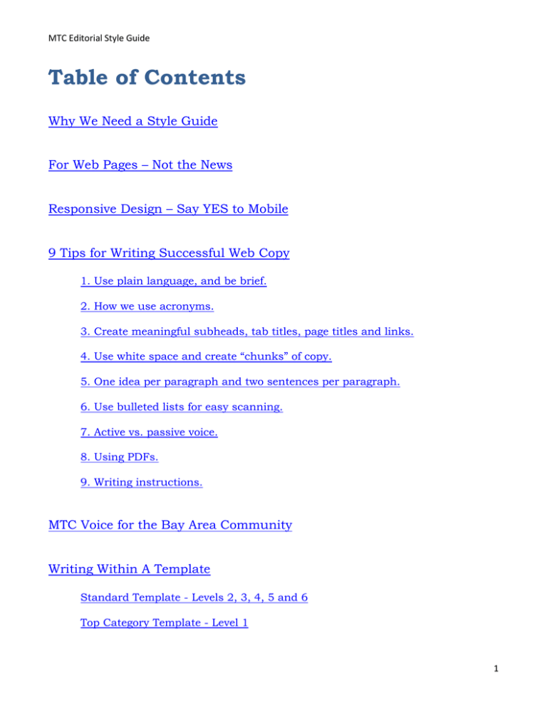
MTC Editorial Style Guide Table of Contents Why We Need a Style Guide For Web Pages – Not the News Responsive Design – Say YES to Mobile 9 Tips for Writing Successful Web Copy 1. Use plain language, and be brief. 2. How we use acronyms. 3. Create meaningful subheads, tab titles, page titles and links. 4. Use white space and create “chunks” of copy. 5. One idea per paragraph and two sentences per paragraph. 6. Use bulleted lists for easy scanning. 7. Active vs. passive voice. 8. Using PDFs. 9. Writing instructions. MTC Voice for the Bay Area Community Writing Within A Template Standard Template - Levels 2, 3, 4, 5 and 6 Top Category Template - Level 1 1 MTC Editorial Style Guide Style Particulars MTC Style Particulars Page Titles & Navigation Elements Numbers Email, Phone & Personal Information Possessive vs. Plural Possessive Use of Quotations, Boldface or Italicizing Common Nouns Serial Commas Use of Ampersands Email. Website. Internet. Continue adding MTC style particulars per your needs. 2 MTC Editorial Style Guide Why We Need an Editorial Style Guide Purpose: Establish a cohesive and consistent writing style across the website that embodies the MTC brand. Users seek value. They want simplicity. They appreciate accuracy. And they are notoriously demanding. Disappoint them, and they’ll leave. Users collectively ask, “What can this website do for me?” And then, “What has this website done for me lately?” As editors and writers, our responsibility is to present an excellent user experience for everyone. That means a consistent editorial voice and, above all, clarity. This guide establishes a cohesive writing style for the MTC website—including best practices, proven usability tenets, and responsive design. Our goal is to present the best possible content to the Bay Area community. For Web Pages – Not the News or Press Releases The standards in this guide are for your web pages: the roughly 300 pages that demand quick access, a short read, and immediate value by your users. It is not intended to dictate a style for press releases, blogs, or the news. This editorial niche often has its own set of standards, due to a different user experience. When users click on a news item, they expect a longer read. There are many standards that cross over into both experiences, but this style guide does not address these similarities. Back to TOC 3 MTC Editorial Style Guide Responsive Design – Why It’s Critical to Your Success What is Responsive Design? The responsive design approach ensures that your website is programmed to look good on any device. Whether it be a smartphone, laptop, desktop or tablet, your website should work well, and look good, on all personal devices. As writers we must create copy that is succinct, tight, clear and well written – so that it “responds” to whatever device is being used. Users need to easily navigate where they want to go, and find what they need when they get there. This is called a good user-experience. Whether users are on the phone or at their desktops – your copy touches their entire journey. Back to TOC 4 MTC Editorial Style Guide 9 Tips for Writing Successful Web Copy The following tips are based on proven usability tenets and best practices for the web. 1. Use plain language, and be brief. Don’t assume your users know what you know, because they don’t. Stay away from insider MTC language. Use words that your users use. You are reading Plan Bay Area on BART during your daily commute. A fellow passenger strikes up a conversation. He’s heard about MTC, but knows little. He wants to know more. Your friend is visiting from England. She wants to know how to get around town via public transportation. How would you tell her how to access information on the website? The language you use in these conversations is the language you should use on the website. Instead of this: Seaports to Streets: Climate Initiatives Grants have been used to test emissions-reduction strategies ranging from a Shore Power demonstration that allows ships berthed at the Port of Oakland to turn off their diesel engines and power their on-board systems through the regular power grid to cold-in-place recycling that eliminates the need to truck in hot asphalt for street and road repair projects. Write this: Climate Initiatives Grants: Grants have been used to test strategies for reducing diesel ship pollution at the Port of Oakland. Grants have also been used to test recycling measures for road repair projects, instead of trucking in hot tar! Bottom line? Give readers what they need to get the message quickly, and understand its value. Back to TOC 5 MTC Editorial Style Guide 2. How we use acronyms. There are many acronyms in use for MTC. The follow accommodates what’s best for the website, your users and your business. Back to TOC 6 MTC Editorial Style Guide 3. Create meaningful subheads, tab titles, page titles and links. Titles and subheads should be value driven. They should summarize the information that follows. Remember that users scan, looking for meaning. Users want to know quickly what information they’ll receive. If we attempt to be clever, they may feel cheated by the content that follows. They may not “get it.” Users want simplicity. Back to TOC 7 MTC Editorial Style Guide 4. Use white space and create “chunks” of copy. A chunk is usually a paragraph. Far more paragraph breaks are used in web copy than in print copy. User read 25% slower on the web. Creating white space makes it easier for users to scan and grasp the message. All the slides in this guide incorporate this tip. 5. One idea per paragraph and two sentences per paragraph. Usually. Users read in chunks of information. Make the chunks/paragraphs short, easy to access and easy to understand. This may seem like a repeat, but it deserves it’s own number. It may feel awkward to some writers, especially for print writers. Practice makes perfect. All the slides in this guide incorporate this tip. Back to TOC 8 MTC Editorial Style Guide 6. Use bulleted lists for easy scanning. Back to TOC 7. Active vs. passive voice. It’s best to write, “MTC proposes regulations that…” instead of “The regulation was proposed by MTC…” Rather than this: The cat was eaten by the dog. Use this: The dog ate the cat. Back to TOC 9 MTC Editorial Style Guide 8. Using PDFs. One goal of the new MTC website is to reduce the amount of PDFs that are posted on too many pages. Many of these PDFs are outdated. Many pages arbitrarily link to other pages, in reference to other PDFs. And the list goes on. Best practices and usability tenets dictate judicious use of PDFs. Attach a PDF to your page only when it adds value and compliments the intent, or meaning of the page—and, of course, if it’s legally required. Never, ever, post a PDF as the sole means of conveying a message. PDFs should only compliment the message on the page. And on many pages, invite users to visit the digital library to dive deeper for more information: The digital library is still in development along with the rest of the website – including your copy! But eventually, more than 35,000 PDFs and documents will “live” in the library to meet a variety of needs: archiving, research, legal, legacy, public access, etc. Back to TOC 10 MTC Editorial Style Guide 9. Writing instructions. If you send users to 511.org, recommending that they use a tool, or download an app, your instructions better be clear. Anytime you write instructions, you must run through the tasks involved and experience it for yourself. Take notes of every action along the way, and what happens. Then write copy accordingly. This may be the biggest mistake that websites make – incorrect instructions. Bad instructions play a significant factor in users throwing up their hands, and leaving! Not this: There’s App for That MTC is a lead player in the Bay Area Incident Management Task Force, which in 2015 released an iPhone app known in the App Store as Responder Incident Report. The app allows responders to snap a simple photo of an incident scene, quickly add key details and instantly send to a pre-defined group through a secure server. It automatically captures the GPS location and arrival time for each responder and participants receive customized alerts when new information is ready for viewing. If users were to try and follow the above directions, they’d fail. After trying to find the app yourself, this is what you’d write: Check Out Our App: Responder Incident Report We’re excited about our new app! MTC has designed an app to help Bay Area responders snap a photo of an accident at the scene, add key details and send to the participants that can help. Get automatic GPS location, arrival times of responders and customized alerts—all on a secure server. Go to the iTunes App Store and type “Responder Incident Report” in the search bar (upper right-hand corner). It’s extremely important to be accurate. You will curry much favor with your users. Back to TOC 11 MTC Editorial Style Guide MTC Voice for the Bay Area Community Use a voice that is appropriate for the general Bay Area public. Our language should be informative, respectful, personable—and above all—approachable. Avoid business, or insider, language. Never assume that the general public understands what you, an MTC employee, understand. They don’t. We must develop copy that is easy to grasp and absorb. Our job is to enlighten the public about the work that MTC is accomplishing – and the services we are providing – within our communities. MTC is at the “center” of all-things-transit. Yes, we network with important agencies, organizations, committees and regulators that are critical partners in the work that we accomplish… but MTC is at the helm, steering the ship. Just A Few Examples MTC is responsible for the transportation needs across nine counties and 101 cities. Every step we take builds upon decades of earlier planning. We have just begun work on Plan Bay Area 2040. A well-maintained and well-operated transportation system is crucial to the success of Bay Area growth. We call this approach “Fix It First.” Getting your feedback is important to us at MTC, and we embrace community involvement in many ways. We also negotiate agreements among numerous local agencies. Our Policy Advisory Council plays a large part in our commitment toward public participation. There is intense competition for state and federal funding programs. Find out how MTC promotes Bay Area causes in Sacramento and Washington, D.C. Save time and money when you rideshare in the carpool lane. Call 511 and say Ridesharing. Together we have a wide range of duties and a shared mission: Keep the Bay Area moving. Back to TOC 12 MTC Editorial Style Guide Writing Within a Template Successful websites use relatively few design templates. Websites that use more are difficult to navigate, and confusing and dizzy for most users. Remember, design templates are coded and programmed to respond to any device. Responsive design is key. Your web copy should fit into a template that has been designed to adapt to the myriad devices used by your audience. Back to TOC Standard Template – Levels 2, 3, 4, 5 and 6 95% of MTC web pages use one standard design template. These pages are referred to as levels 2 thru 6. (As users navigate from a level 1 page to a level 2 - and subsequently 3, 4, 5 and 6 – they are diving deeper for more information.) The standard template example on the next page introduces MTC. 13 MTC Editorial Style Guide This example is for a top-level page, using a standard template: 14 MTC Editorial Style Guide The intent of this page, again using a standard template, is to enlighten our users about the whatand-how of our efforts to combat climate change. The tabs provide additional info, but don’t get in the way of a clear message in the body copy. Short, concise, accessible, and easy to scan. 15 MTC Editorial Style Guide When users click on Adapting to Rising Tides in the navigation bar, they’ll land on this detail page (again, using a standard template): 16 MTC Editorial Style Guide Top Category Template – Level 1 Global navigation elements are the five top tabs you’ll see on every page across the website. When you click on these tabs, you’ll land on that top category – or Level 1 – page. This is an example of a top category template: [TBD – based on future development work] Back to TOC 17 MTC Editorial Style Guide MTC Style Particulars This section is placed here as only the first step toward capturing your style nuances. You will inevitably add to this page, incorporating the more common particulars used by your team. It is strongly recommended that an internal MTC writer be dedicated to the task of keeping this guide current, and adding to the foundation below. Page Titles & Navigation Elements The MTC website has many pages: Use acronyms and ampersands whenever possible to reduce lengthy menu items. Example 1: Use title case for each page title: Transit-Oriented Development For the navigation title (or element), use: TOD Example 2: Page title: Bay Bridge West Span Bike Path Navigation title: Bay Bridge Path Example 3: Page title: Local Streets and Roads Navigation title: Local Streets & Roads Back to TOC - Style Particulars Numbers [TBD by MTC Writers] Back to TOC - Style Particulars 18 MTC Editorial Style Guide Email, Phone & Personal Information Example: If you’d like to speak with someone at MTC, please contact: Denise Rodrigues Contract Compliance Office Phone: (510) 817-5897 Email: drodri@mtc.ca.gov Back to TOC - Style Particulars Possessive vs. Plural Possessive [TBD by MTC Writers] Back to TOC - Style Particulars Use of Quotations, Bolding or Italicizing Common Nouns Think about your readers. If it benefits a reader’s comprehension and ability to easily grasp the common nouns that are referenced in the same sentence, do the following: Investments made with Cap and Trade money include the “California High Speed Rail” system and a statewide “Transit and Intercity Rail” program. Dial 511. When you hear “Welcome to the Bay Area’s 511,” say Ridesharing. Use your best judgment. You’ll be fine. Back to TOC - Style Particulars 19 MTC Editorial Style Guide Serial Commas If it benefits a user’s comprehension, go ahead and use a serial comma. Would it change the meaning if you left it out? If not, then don’t use it. Back to TOC - Style Particulars Use of Ampersands General rule of thumb is only use ampersands in navigation elements (or navigation titles). Example: Page title: Local Streets and Roads Navigation title: Local Streets & Roads Back to TOC - Style Particulars Email. Website. Internet. Send me your email address. Visit our website. The Internet drives me crazy. Back to TOC - Style Particulars 20

