518 week 6 - Infographics
advertisement
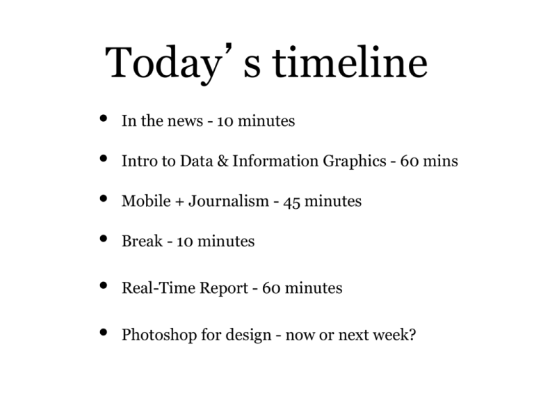
Today’s timeline • • • • In the news - 10 minutes Intro to Data & Information Graphics - 60 mins Mobile + Journalism - 45 minutes Break - 10 minutes • Real-Time Report - 60 minutes • Photoshop for design - now or next week? Review assignment(s) - Highlights from review - Highlights from Digital Footprint Graphics + Web + Data + Journalism Infographics, Data Visualization and Interactives Assistant Professor of Professional Practice Robert Hernandez email: r.hernandez@usc.edu 213.280.5187c | 323.761.9054 Office: 121c Data Journalism Source: http://www.guardian.co.uk/news/datablog/video/2013/apr/04/what-is-data-journalism-video Why are Graphics important? • Can communicate complex concepts effectively • Visualizing of info/data can reveal contextual concepts • A mashup of data, design and storytelling Why are [Web] Graphics important? • Can communicate complex concepts effectively • Visualizing of info/data can reveal contextual concepts • A mashup of data, design and storytelling • Can be presented in an interactive way • Increases engagement and ownership Defining: in·fo·gra·phic “Information graphics are visual representations of information, data or knowledge often used to support information, strengthen it and present it within a sensitive context.They are specific, context-sensitive and often times hand-crafted.” • Can be static, animated or interactive. Source: Benjamin Wiederkehr, Editor of Datavisualization.ch http://www.quora.com/What-is-the-difference-between-a-data-visualization-and-an-infographic Defining: da·ta vi·su·al·i·za·tion “Data visualizations are visual displays of measured quantities by means of the combined use of a coordination system, points, lines, shapes, digits, letters quantified by visual attributes.They are general, context-free and often times created automatically.” • Can be static, animated or interactive. Source: Benjamin Wiederkehr, Editor of Datavisualization.ch http://www.quora.com/What-is-the-difference-between-a-data-visualization-and-an-infographic Defining: in·ter·ac·tiv·ity “Providing output based on input from the user. This output feeds back into the user's decision process for subsequent interaction. Implying that the user of the software can exert some control over the software, and not just be a passive page-turner recipient.” • Can this be done in other media? NO! Only Web Source: Don Wittekind, assistant professor at the UNC at Chapel Hill Infographic Examples Infographic Examples Source: http://thumbnails.visually.netdna-cdn.com/infographics-process_509e119959153.png Infographic Examples Source: GOOD | http://www.good.is/post/transparency-what-is-the-easiest-way-to-power-a-lightbulb/ Infographic Examples Source: http://www.mediabistro.com/10000words/files/2010/07/shouldilearnprogramming.png Infographic Examples Source: The Oatmeal | http://theoatmeal.com/comics/misspelling Infographic Examples Source: foursquare | https://foursquare.com/infographics/10million https://foursquare.com/2010infographic Infographic Examples Source: http://www.designerinfographics.com/southern-right-whales-infographic.jpg Infographic Examples Source: WIRED | http://www.wired.com/design/2012/07/you-suck-atinfographics/?utm_campaign=Previous&utm_source=Contextly Infographic Examples with light interactivity Source: NYTimes | http://elections.nytimes.com/2012/results/president/scenarios Infographic Examples Source: Tomas Nilsson | http://www.youtube.com/watch?v=-LF5M9nlFQs Infographic Examples Source: Tomas Nilsson | http://www.youtube.com/watch?v=-LF5M9nlFQs Data Viz Examples Source: Information is Beautiful | http://www.informationisbeautiful.net/visualizations/mountainsout-of-molehills/ Data Viz Examples Source: Information is Beautiful | http://www.informationisbeautiful.net/visualizations/the-billiondollar-o-gram-2009/ Data Viz Examples Source: Information is Beautiful | http://www.informationisbeautiful.net/visualizations/the-billiondollar-o-gram-2009/ Data Viz Examples Source: NYTimes | http://www.nytimes.com/interactive/2009/07/31/business/20080801-metricsgraphic.html Data Viz Examples Source: NYTimes | http://www.nytimes.com/interactive/2012/08/09/sports/olympics/new-olympicstars-of-twitter.html?hp Data Viz Examples Source: Google | http://workshop.chromeexperiments.com/projects/armsglobe/ Data Viz Examples Source: http://www.nytimes.com/interactive/2010/06/29/magazine/rivera-pitches.html?_r=2& Data Viz Examples Source: http://www.nytimes.com/interactive/2012/08/05/sports/olympics/the-100-meter-dash-one-raceevery-medalist-ever.html?_r=0 Data Viz Examples Source: BBC and Hans Rosling | http://www.youtube.com/watch?v=jbkSRLYSojo Data Viz Examples Source: BBC and Hans Rosling | http://www.youtube.com/watch?v=jbkSRLYSojo [ BREAK] Please return in 10 minutes Assignment #1 Create infographic on neighborhood in district (Photoshop) Must have: Intro text, Pull quote, 2 points of interest, 1 chart/graphic, Photos, Map and Source/Credits. Different neighborhoods. FTP the image (jpg or png) onto your server (ascjweb.com - /graphic/). THEN, post a link to your assignment to this week’s comments. Deadline: Thursday, Feb 27 9AM Examples Specs to make one Specs to make one Title & source [ Intro text ] [ Map from Google Maps ] [ Chart(s) ] Canvas is 1024x768 Photos/Points of interest [ Pullquote ] Graphic Resources • Mindy McAdams' tutorial on Data http://www.jtoolkit.com/data/ 10,000 Words Blog: Databases http://www.mediabistro.com/10000words/category/data base 10 Awesome Free Tools To Make Infographics http://www.makeuseof.com/tag/awesome-free-toolsinfographics/ • Gapminder http://www.gapminder.org/ • WeePlaces http://www.weeplaces.com/ Graphic Resources • Nathan Yau's FlowingData http://flowingdata.com/ Information Is Beautiful http://www.informationisbeautiful.net/ Chart Porn http://chartporn.org/ • Data Visualization http://datavisualization.ch/ • Coolinfographics.com http://www.coolinfographics.com/ Assignment 2: Start working on Midterm Multimedia / Story Package 1 Minimum 800 words and one two-minute Webby element. Both must relate to your beat (if you have one) and located within your district. More details: http://elprofe.me/usc/2014/spring/518/midterm/ Post the URL to blog post’s comments. Deadline: Thursday, March 13 9AM Assistant Professor of Professional Practice Robert Hernandez email: r.hernandez@usc.edu twitter: @webjournalist 213.280.5187c | 323.761.9054 Office: 121c Interactivity Examples Source: Discovery | http://dsc.discovery.com/convergence/titanic/technology/technology.html Interactivity Examples Source: El Mundo | http://www.elmundo.es/elmundo/2005/graficos/abr/s2/casa_25.html Interactivity Examples Source: Sun-Sentinel| http://www.sun-sentinel.com/broadband/theedge/sfl-edge-tcanemaker,0,4142989.flash Interactivity Examples Source: BBC| http://news.bbc.co.uk/2/shared/spl/hi/uk/06/electricity_calc/html/1.stm Interactivity Examples Source: Marketplace | http://www.marketplace.org/topics/economy/budget-hero Interactivity Examples Source: KQED | http://blogs.kqed.org/lowdown/2013/11/12/traffic-waves
