Elements of Art – Grade 10 Photography
advertisement
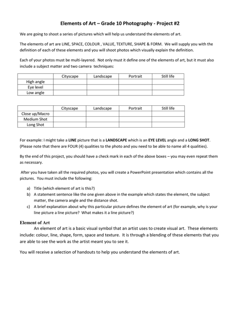
Elements of Art – Grade 10 Photography - Project #2 We are going to shoot a series of pictures which will help us understand the elements of art. The elements of art are LINE, SPACE, COLOUR , VALUE, TEXTURE, SHAPE & FORM. We will supply you with the definition of each of these elements and you will shoot photos which visually explain the definition. Each of your photos must be multi-layered. Not only must it define one of the elements of art, but it must also include a subject matter and two camera techniques: Cityscape Landscape Portrait Still life Cityscape Landscape Portrait Still life High angle Eye level Low angle Close up/Macro Medium Shot Long Shot For example: I might take a LINE picture that is a LANDSCAPE which is an EYE LEVEL angle and a LONG SHOT. (Please note that there are FOUR (4) qualities to the photo and you need to be able to name all 4 qualities). By the end of this project, you should have a check mark in each of the above boxes – you may even repeat them as necessary. After you have taken all the required photos, you will create a PowerPoint presentation which contains all the pictures. You must include the following: a) Title (which element of art is this?) b) A statement sentence like the one given above in the example which states the element, the subject matter, the camera angle and the distance shot. c) A brief explanation about why this particular picture defines the element of art (for example, why is your line picture a line picture? What makes it a line picture?) Element of Art An element of art is a basic visual symbol that an artist uses to create visual art. These elements include: colour, line, shape, form, space and texture. It is through a blending of these elements that you are able to see the work as the artist meant you to see it. You will receive a selection of handouts to help you understand the elements of art. Cityscape Landscape A cityscape is the urban equivalent of a landscape. In the visual arts a cityscape (urban landscape) is an artistic representation, such as a painting, drawing, print or photograph, of the physical aspects of a city or urban area. Landscape The pictorial aspect of a country. A space, indoor or outdoor and natural or man-made (as in 'designed landscape') A portion of land or territory which the eye can comprehend in a single view, including all the objects it contains. A picture representing a scene by land or sea, actual or fancied, the chief subject being the general aspect of nature, as fields, hills, forests, water. etc. High Angle The opposite of the low-angle shot is the high-angle shot. The photograph is taken from above the subject, so the image we see seems to be smaller than its surroundings. High-angle photography can be used to emphasize space and distance. Portrait A portrait is a painting, photograph, or other artistic representation of a person. Portraits are often simple head shots or mug shots and are not usually overly elaborate. The intent is to show the basic appearance of the person, and occasionally some artistic insight into his or her personality. Eye Level When a photographer places the Camera at eye level with the subject, we the viewers see the shape and proportions of the subject as we normally would. Still life A still life is a work of art depicting an arrangement of inanimate objects, typically commonplace objects which may be either natural (flowers, game, sea shells and the like) or man-made (drinking glasses, foodstuffs, pipes, books and so on). Low Angle The camera can be placed below the subject, so the viewer will have a sense of looking up at it. This is called the low-angle shot: it makes the subject seem "larger than life." In some extreme examples the subject is so distorted that it appears to loom over its surroundings Close up Medium Shot Long Shot Generally speaking, close-ups invite a sense of shared feeling and intimacy, because the subject is isolated. If the closeup is of an individual, the viewer's attention is focused on the body language and facial expression As you might expect, there is a middle position: the medium shot. The medium shot is popular in sports photography and advertising because it allows the viewer to see all of the main subject and to recognize at least some of the background detail. On the other hand, long shots or wideangle shots can create a sense of objectivity: there may be more detail to look at, the objects in the picture may be small, and the apparent distance between subject and camera can create a less-intimate feeling. In advertising, a photographer may choose a long shot to link the product with a certain lifestyle; the long shot allows the photographer to place the product in a particular setting and to show you, the consumer, the details of that setting. Line In geometry we see lines as one-dimensional shape and several lines can connect to make threedimensional shapes. Virtually every photograph has lines in it. Lines can be straight or curved. Lines are defining borders between components of the photo. Lines do much more than just divide up a picture. Lines all suggest moods and rhythm, create patterns and indicate directions and structure. Lines are not passive. They can suggest distance and depth if they also show perspective. They are a strong visual force that pulls the viewer’s eye around a photograph. They suggest movement and help to focus the viewer’s attention on certain parts of a photograph. There are three main characteristics of lines in photography” Pattern – the lines themselves interact in some interesting way that is more important than any other element in the photo. These lines suggest repetition. Direction – line can help the viewer’s eye travel around a picture. Without directing lines, the overall image can simply seem like chaos. Structure – line divides a photo into smaller areas, providing a skeleton to support the other elements and link them together. Think of lines as being the spine of the photo – just like your spine supports your body, arms, legs and head, lines in photos support the various parts of the photo. Your PP Presentation must include 2 LINE pictures that have all three qualities of line - Pattern, Direction and Structure. ------------------------------------------------------------------- Value In photography value refers to the range of light in the photograph – from black through shades of grey to white. As a general rule, the more CONTRAST a photo has, or the wider the range between it’s darkest and lightest elements, the greater its visual impact will be. If everything in a photo is either black or white, with no greys, it will not have a lot of impact. It isn’t something that the eye wants to keep looking at. In addition to a good balance of black and white, it’s desireable to have a range of greys to define shape and provide shading. When taking a photo make sure that your light is correct. Too little light will result in a dark “muddy” print. Too much light will cause highlights (white areas) to be washed-out (so white that no details are visible). Your PP Presentation must include 2 VALUE pictures (these must be b/w) Texture Texture refers to how things feel or how they look like they might feel if touched. A photograph is two dimensional. It reproduces a three-dimensional image onto a flat surface. A photographer has to use visual “tricks” to create the illusion of three-dimensional space. Flattened texture is simply pattern, and pattern is a combination of lines. For example, a brick wall might LOOK like it has texture but the photograph is really a flat object. Line and texture are very similar. The difference between them is the use of light. Texture is more sensitive than light to shifts in lighting. Shooting early or late in the day draws out the shadows and creates variations on surfaces, adding more texture. Texture holds the viewer’s eye longer than line. Your PP Presentation must include 2 or more contrasting texture photos arranged in a diptych or triptych (2 or more pictures placed side by side via Photoshop) ------------------------------------------------------------------- Shape & Form Shape is an area clearly set off by one or more of the other five visual elements of art. Geometric shapes are precise shapes that look as if they were made with a ruler or other drawing tool. The square, the triangle, the circle, the rectangle and the oval are the five basic shapes. Organic shapes are not regular or even. Their outlines curve to make free-form shapes. Organic shapes are often found in nature. Form is an object with three dimensions. Forms have length and width and depth. Shape helps convey the nature of a subject. The functions of space can be grouped into three categories: Mass (the amount of space a shape fills), Proportion (how the mass of one object compares to that of another) and relation (how the objects interact visually and physically with each other). Your PP Presentation must contain 2 Shape & Form photos. One of these photos must be Organic in nature and the other must be a still life. Colour Colour is what the eye sees when sunlight or some other light bounces off an object. There are three properties/traits of colour. Hue is a colour’s name. Red, yellow and blue are PRIMARY HUES. These three are called Primary Hues because they can be used to mix all the other colours but cannot themselves be created by mixing any other colours. SECONDARY HUES are green, orange and violet. INTERMEDIATE HUES are created by mixing one primary hue and one secondary hue. Intermediate colours have compound names such as Yellow-Orange, Yellow-Green, Blue-Green, etc. Warm Colours are red, orange and yellow. Cool Colours are green, blue and purple. Monochromatic photos are photos which have only one type of colour in them but there may be many different shades of that colour. Your PP Presentation must include 1 Monochromatic photo, either 1 warm or cool photo, and 1 macro photo which has been turned into a tile (we will show you how to create this in Photoshop) Space Space is the distance or area between, around, above, below and within things. Space is empty until objects fill it. All objects take up space. Artists have developed some techniques that imply space: OVERLAPPING – having shapes overlap one another SIZE – Making distant shapes smaller than closer ones. FOCUS – Adding more detail to closer objects, less detail to distant objects. PLACEMENT – Placing distant objects higher up in the picture, closer ones lower down. INTENSITY & VALUE – Using colours that are lower in intensity and lighter in value for objects in the distance. LINEAR PERSPECTIVE – Slanting lines of buildings and other objects so they seem to come together in the distance. Every object in a photo has two shapes – the first shape is obvious, the space an object takes up is called POSITIVE SPACE. The space around an object is called NEGATIVE SPACE. Shape is a careful composition of the two. Making negative space interesting is the difference between a snap shot and a photograph. Your PP Presentation will have the following space photos: One photo that combines Overlapping and Size and Focus and linear perspective. One photo that combines Placement and Intensity and Value. One photo that shows the difference between positive and negative space.
