Perception - Faculty Web Server Directory Listing
advertisement
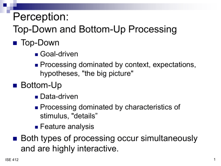
Perception: Top-Down and Bottom-Up Processing Top-Down Goal-driven Processing dominated by context, expectations, hypotheses, "the big picture" Bottom-Up Data-driven Processing dominated by characteristics of stimulus, "details” Feature analysis ISE 412 Both types of processing occur simultaneously and are highly interactive. 1 Some examples Problem-solving Wheel of Fortune Crossword puzzles Design ISE 412 Hearing: conversation, listening to music, etc. 2 An example … Listen to the song and write down the words as you hear them. To discuss … What were doing during “bottom-up” processing (with and without visual cues? What ISE 412 were you doing during “top-down” processing? 3 Perception of print Feature analysis: Bottom-up, we perceive features of letters, letters, words Involves pattern matching Top-down, we use context of surrounding letters and words to limit alternative interpretations Examples: Sawple Sample "The majority of people who take this class are Ixx majors." ISE 412 4 Context-Data Tradeoff Assuming limited display size for text, trade off context and data quality: Many words: High contextual redundancy (easy to comprehend) Poor data quality (hard to read) Few words: Good data quality (easy to read) Low contextual redundancy (hard to comprehend) Example: weather alerts on a heads-up display WEATHER ISE 412 Will encounter bad weather 5 Creating context: Redundancy gain ISE 412 The information is presented in more than one way. If the viewer is not able to process the information in one mode (e.g., color blind) can rely on another. Reaction time is faster if information is presented redundantly. Promotes top-down processing. 6 Object perception Objects are perceived holistically Empirical evidence on card-sorting tasks: objects categorized more quickly and accurately than "separate" displays such as numbers or words ♣ ♣ 4 of Clubs Carrot ♣ ♣ ISE 412 7 Advantages & disadvantages … Advantages Disadvantages ISE 412 8 Object perception Wickens et al. studies: object displays facilitate performance on information integration tasks separable ISE 412 Wt., tons 3.4 3.8 4.1 2.2 2.6 2.9 2 2.7 1.9 3.4 8 gpm GPM, y 5.5 5.9 6.5 3.3 3.6 4.6 2.9 3.6 3.1 4.9 6 4 2 0 0 1 2 3 4 5 Weight, tons displays support diagnosis tasks 9 Examples … 4 A B Easy Difficult 0 2 1 3 # Errors Phone 2 Difficult 2 Difficult 1 Difficult Easy C 0 3 0 Easy A Easy C B Phone 4 4 3 3 Total Errors Total Errors 3 2 2 2 2 1 1 1 0 0 0 A Easy A Difficult B Easy B Difficult Phone / Dialing Difficulty ISE 412 C Easy C Difficult A Easy 0 A Difficult B Easy B Difficult C Easy C Difficult Phone / Dialing Difficulty 10 Implications for display design Optimize bottom-up processing size, contrast, font (for text), appropriate upper/lower case raw data on object displays Optimize top-down processing avoid abbreviations & acronyms whenever possible provide context (more words in text, recognizable object displays) restrict “vocabulary” (text and picture) and optimize distinction between words/pictures ISE 412 Evaluate tradeoffs Usability testing in context 11 Some fun examples: http://exp.kyb.tuebingen.mpg.de/web-experiment/list.html http://www.grand-illusions.com/index.htm ISE 412 12
