Principles of Design: Art Reference Sheet
advertisement
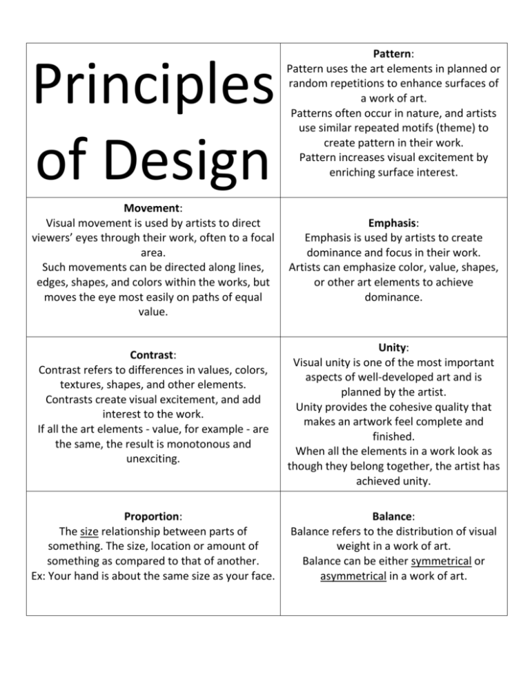
Principles of Design Movement: Visual movement is used by artists to direct viewers’ eyes through their work, often to a focal area. Such movements can be directed along lines, edges, shapes, and colors within the works, but moves the eye most easily on paths of equal value. Contrast: Contrast refers to differences in values, colors, textures, shapes, and other elements. Contrasts create visual excitement, and add interest to the work. If all the art elements - value, for example - are the same, the result is monotonous and unexciting. Proportion: The size relationship between parts of something. The size, location or amount of something as compared to that of another. Ex: Your hand is about the same size as your face. Pattern: Pattern uses the art elements in planned or random repetitions to enhance surfaces of a work of art. Patterns often occur in nature, and artists use similar repeated motifs (theme) to create pattern in their work. Pattern increases visual excitement by enriching surface interest. Emphasis: Emphasis is used by artists to create dominance and focus in their work. Artists can emphasize color, value, shapes, or other art elements to achieve dominance. Unity: Visual unity is one of the most important aspects of well-developed art and is planned by the artist. Unity provides the cohesive quality that makes an artwork feel complete and finished. When all the elements in a work look as though they belong together, the artist has achieved unity. Balance: Balance refers to the distribution of visual weight in a work of art. Balance can be either symmetrical or asymmetrical in a work of art.
