Hamlet fever chart - hilliardsclass.com
advertisement
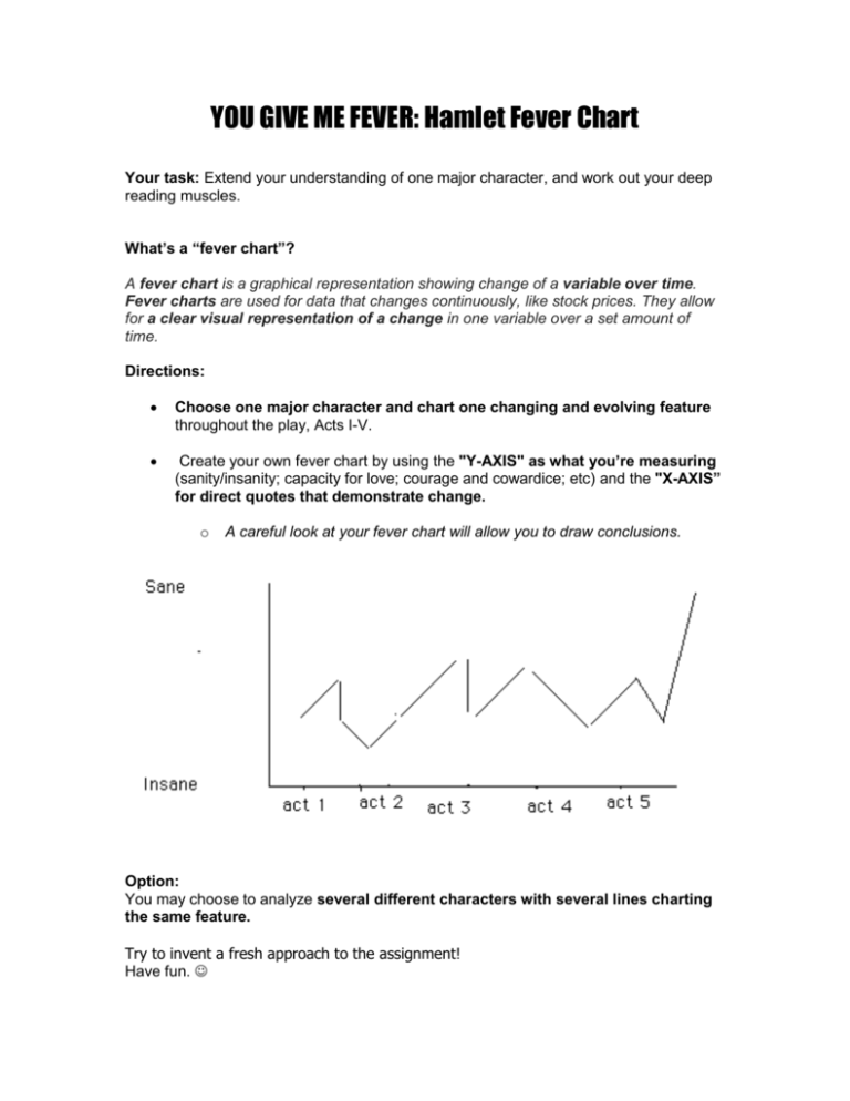
YOU GIVE ME FEVER: Hamlet Fever Chart Your task: Extend your understanding of one major character, and work out your deep reading muscles. What’s a “fever chart”? A fever chart is a graphical representation showing change of a variable over time. Fever charts are used for data that changes continuously, like stock prices. They allow for a clear visual representation of a change in one variable over a set amount of time. Directions: Choose one major character and chart one changing and evolving feature throughout the play, Acts I-V. Create your own fever chart by using the "Y-AXIS" as what you’re measuring (sanity/insanity; capacity for love; courage and cowardice; etc) and the "X-AXIS” for direct quotes that demonstrate change. o A careful look at your fever chart will allow you to draw conclusions. Option: You may choose to analyze several different characters with several lines charting the same feature. Try to invent a fresh approach to the assignment! Have fun. RUBRIC Not Attempted (0) Fever chart tracks one/several characters and a changing variable. “Y AXIS” clearly displays what you’re charting – a feature of a character that changes throughout the play. “X AXIS” clearly displays quotes from the text that demonstrate change. Act and scene numbers are accurately cited. Chart accounts for all five acts of the play. Chart shows clear evidence of intellectual time and effort. TOTAL: Attempted (1-3) Achieved (4-5)
