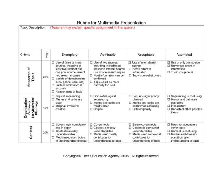
Rubric for Multimedia Presentation
(Outline or
Storyboard for
Planning)
Content
Organization
Research of
Topic
Criteria
weight
Task Description:
20%
15%
20%
(Teacher may explain specific assignment in this space.)
Exemplary
Admirable
Acceptable
Use of three or more
sources, including at
least two Internet and
one print source; use of
two search engines
Variety of domain name
suffix (.com, .edu, .net)
Factual information is
accurate
Narrow focus of topic
Use of two sources,
including, including at
least one Internet source;
use of one search engine
Most information can be
confirmed
Topic could be more
narrowly focused
Use of one Internet
source
Some errors in
information
Topic somewhat broad
Use of only one source
Numerous errors in
information
Topic too general
Logical sequencing
Menus and paths are
clear
Original; inventive;
creative
Somewhat logical
sequencing
Menus and paths are
mostly clear
Original
Sequencing is poorly
planned
Menus and paths are
sometimes confusing
Little originality
Sequencing is confusing
Menus and paths are
confusing
Inconsistent
Rehash of other people’s
ideas
Covers topic completely
and in depth
Content is readily
understandable
Media used contributes
to understanding of topic
Covers topic
Content is mostly
understandable
Media used mostly
contributes to
understanding of topic
Barely covers topic
Content is somewhat
understandable
Media used somewhat
contributes to
understanding of topic
Does not adequately
cover topic
Content is confusing
Media used does not
contributing to
understanding of topic
Copyright © Texas Education Agency, 2006. All rights reserved.
Attempted
Graphic Design
Mechanics
(optional)
Teamwork
25%
10%
Effective combination of
multimedia and
persuasive design
elements
Excellent use of
navigational tools and
buttons
Graphics effectively
entice audience;
accurately convey
message
Good combination of
multimedia and design
elements
Adequate navigational
tools and buttons
Visuals and images are
attractive; adequately
conveys message
Some use of multimedia
and design elements
Some buttons and
navigational tools work
properly
Use of visuals and
images is limited;
message is conveyed
0-1 media used
Buttons and navigational
tools are absent or
confusing
Use of visuals and
images is confusing or
absent; message is
confusing
Correct grammar,
usage, mechanics, and
spelling
All sources are correctly
cited
Few grammar, usage,
mechanics, or spelling
errors
Most sources are
correctly cited
Several grammar, usage,
mechanics, or spelling
errors
Some sources are
incorrectly cited
Obvious grammar,
usage, mechanics, or
spelling errors
Sources are not cited
Work load is divided and
shared equally
Some members
contribute
Few members contribute
One or two people do all
of the work
10%
Assignment Score ______________
+
Beyonder/Bonus ______________
=
Final Score ________________
Copyright © Texas Education Agency, 2006. All rights reserved.
