Presenting Data in Tables and Graphs

UCLA C
ENTER
F
OR
H
EALTH
P
OLICY
R
ESEARCH
Technical Assistance Series
Article #3: Presenting Data in Tables and Graphs
December 2004
What Are Tables and Graphs?
Tables and graphs are visual ways to present data. Tables present data as rows and columns of information, and are best used when your audience needs detailed information. Graphs present data in a picture form, and are best used to summarize data or to show your audience the “big picture.” Both tables and graphs help people to understand what the data says, and to see the patterns behind the data.
When Should You Use Tables?
Use tables when:
•
You want to present detailed information about a topic
•
Your audience is interested in the details
•
The data can be clearly organized into meaningful columns and rows
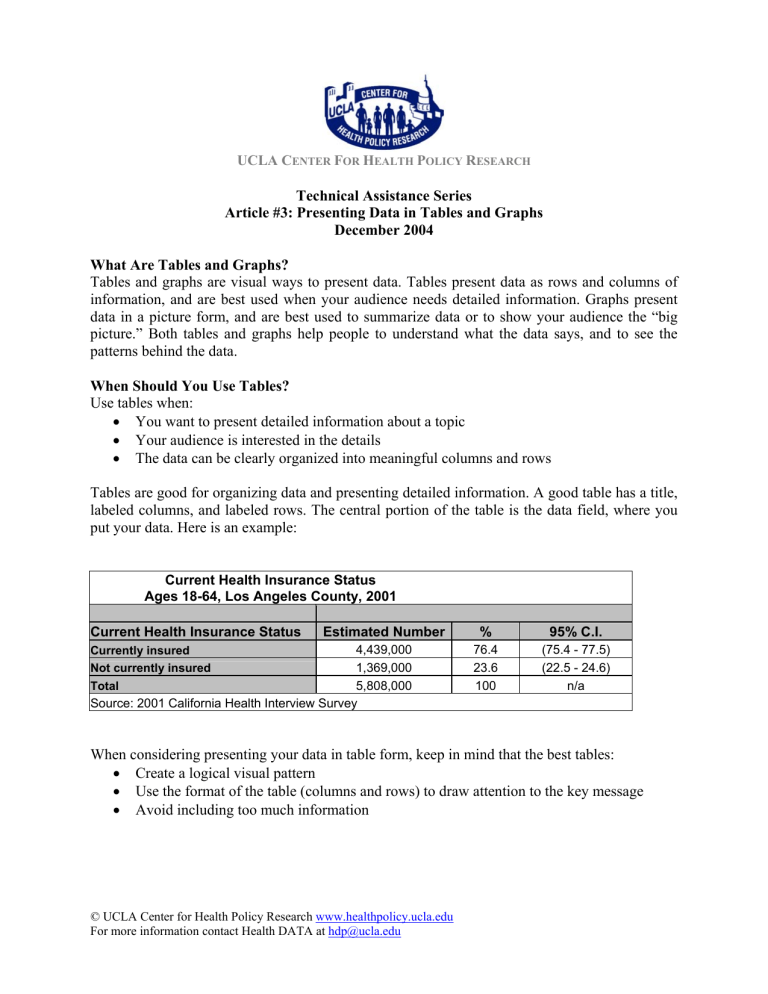
Tables are good for organizing data and presenting detailed information. A good table has a title, labeled columns, and labeled rows. The central portion of the table is the data field, where you put your data. Here is an example:
Current Health Insurance Status
Ages 18-64, Los Angeles County, 2001
Current Health Insurance Status Estimated Number % 95% C.I.
Currently insured
Not currently insured
4,439,000
1,369,000
76.4
23.6
(75.4 - 77.5)
(22.5 - 24.6)
Total 5,808,000 100 n/a
Source: 2001 California Health Interview Survey
When considering presenting your data in table form, keep in mind that the best tables:
•
Create a logical visual pattern
•
Use the format of the table (columns and rows) to draw attention to the key message
•
Avoid including too much information
© UCLA Center for Health Policy Research www.healthpolicy.ucla.edu
For more information contact Health DATA at hdp@ucla.edu
When Should You Use Graphs?
Use graphs when:
•
You want to present an overview of the patterns in your data
•
Your audience is interested in the “big picture”
•
You want to maximize understanding and interest in the data
Graphs present information in a clear and simple way, making it easy for people to quickly understand the “big picture.” For this reason, graphs are often used in articles and reports, in advertising, and on the evening news. Line graphs, bar graphs, and pie graphs are most commonly used for data, and can be created easily using many spreadsheet programs.
Line Graphs are used to show how something changes over time. They have an x-axis
(horizontal axis) and a y-axis (vertical axis). Usually, the x-axis has numbers for the time period, and the y-axis has numbers for what is being measured. Line movement, up and down, is easy to understand and interpret.
Here is an example of a line graph that was used to show results from a research report on health insurance from the 2001 California Health Interview Survey (ER Brown, N Ponce, T Rice, SA
Lavarreda.
The State of Health Insurance in California: Recent Trends, Future Prospects . Los
Angeles, CA: UCLA Center for Health Policy Research, 2001). The full report is available at: http://www.healthpolicy.ucla.edu/pubs/publication.asp?pubID=29
© UCLA Center for Health Policy Research www.healthpolicy.ucla.edu
For more information contact Health DATA at hdp@ucla.edu
Bar Graphs are used to show how something changes over time or to compare items. They have an x-axis (horizontal) and a y-axis (vertical). Typically, the x-axis has the categories being measured, and the y-axis has a scale for the numbers in each category. Bar graphs are good when you are plotting data that has really big changes from year to year, or that has big differences between categories.
Here is an example of a table that was used to show results in a research report about diabetes from the 2001 California Health Interview Survey (AL Diamant, SH Babey, ER Brown, N
Chawla. Diabetes in California: Findings from the 2001 California Health Interview Survey . Los
Angeles: UCLA Center for Health Policy Research, 2003). The full report is available at: http://www.healthpolicy.ucla.edu/pubs/publication.asp?pubID=68
© UCLA Center for Health Policy Research www.healthpolicy.ucla.edu
For more information contact Health DATA at hdp@ucla.edu
Pie Graphs (also called pie charts) are used to show percentages of a whole. They represent a
“snapshot”: the pieces that make up the whole at a set point in time. Pie graphs do not show changes over time. An example of data that you could present in a pie graph is the race/ethnicity of community residents in a particular calendar year. When making a pie graph, keep in mind that pie graphs are clearest with three to six categories, or “slices.”
Here is an example of a pie chart that was used to show results from a research report on hunger in Los Angeles County from the 2001 California Health Interview Survey (CA DiSogra, W Yen,
M Flood, and A Ramirez. Hunger In Los Angeles County Affects Over 200,000 Low-Income
Adults, Another 560,000 At Risk. Los Angeles: UCLA Center for Health Policy Research, 2003).
The full report is available at: http://www.healthpolicy.ucla.edu/pubs/publication.asp?pubID=92
Additional Resources for Data Presentation:
University. http://www.deakin.edu.au/~agoodman/sci101/chap12.php
BC. http://www.bettycjung.net/Graphing.htm
3. Rutchik H. National Energy Information Administration. EIA Guidelines for Statistical
Graphs.
http://www.eia.doe.gov/neic/graphs/preface.htm
4. Zawitz MW. Bureau of Justice Statistics, Washington Statistical Society Methodology
Seminars. Data Presentation: A Guide To Good Graphics.
http://www.science.gmu.edu/~wss/methods/zawitzg.html
5.
Zawitz MW. Bureau of Justice Statistics, Washington Statistical Society Methodology
Seminars. Data Presentation: A Guide To Good Tables.
http://www.science.gmu.edu/~wss/methods/zawitzt.html
© UCLA Center for Health Policy Research www.healthpolicy.ucla.edu
For more information contact Health DATA at hdp@ucla.edu


