Graphing Practice Name: AP Biology Summer Packet DUE DATE
advertisement
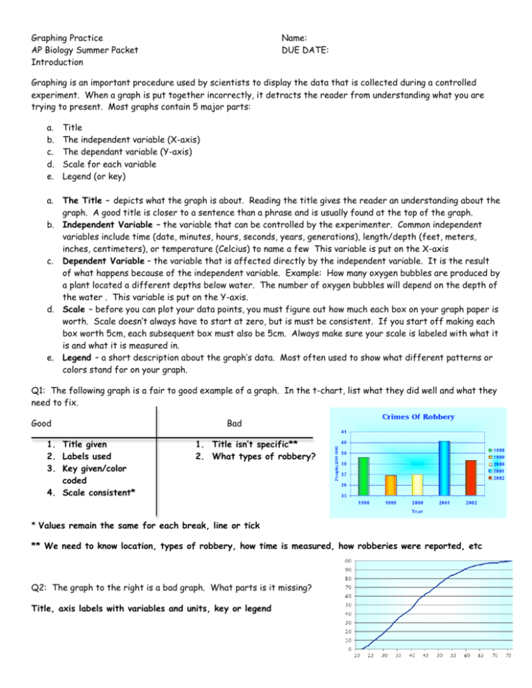
Graphing Practice AP Biology Summer Packet Introduction Name: DUE DATE: Graphing is an important procedure used by scientists to display the data that is collected during a controlled experiment. When a graph is put together incorrectly, it detracts the reader from understanding what you are trying to present. Most graphs contain 5 major parts: a. b. c. d. e. Title The independent variable (X-axis) The dependant variable (Y-axis) Scale for each variable Legend (or key) a. The Title – depicts what the graph is about. Reading the title gives the reader an understanding about the graph. A good title is closer to a sentence than a phrase and is usually found at the top of the graph. b. Independent Variable – the variable that can be controlled by the experimenter. Common independent variables include time (date, minutes, hours, seconds, years, generations), length/depth (feet, meters, inches, centimeters), or temperature (Celcius) to name a few This variable is put on the X-axis c. Dependent Variable – the variable that is affected directly by the independent variable. It is the result of what happens because of the independent variable. Example: How many oxygen bubbles are produced by a plant located a different depths below water. The number of oxygen bubbles will depend on the depth of the water . This variable is put on the Y-axis. d. Scale – before you can plot your data points, you must figure out how much each box on your graph paper is worth. Scale doesn’t always have to start at zero, but is must be consistent. If you start off making each box worth 5cm, each subsequent box must also be 5cm. Always make sure your scale is labeled with what it is and what it is measured in. e. Legend – a short description about the graph’s data. Most often used to show what different patterns or colors stand for on your graph. Q1: The following graph is a fair to good example of a graph. In the t-chart, list what they did well and what they need to fix. Good 1. Title given 2. Labels used 3. Key given/color coded 4. Scale consistent* Bad 1. Title isn’t specific** 2. What types of robbery? * Values remain the same for each break, line or tick ** We need to know location, types of robbery, how time is measured, how robberies were reported, etc Q2: The graph to the right is a bad graph. What parts is it missing? Title, axis labels with variables and units, key or legend ***PAGE TWO DELETED FROM ANSWER SHEET AS THERE ARE NO QUESTIONS ON THAT PAGE*** Ready? Lets Graph! Experiment 1 – Use the following data to create an appropriate graph and answer the questions. (graph “paper” on next page) Q3: What is the dependent variable? Why did you pick that answer? Bubbles per minute – the amount of bubbles produced will depend on how deep the pant is in the water. The variable that DEPENDS on another variable is the dependent variable. Q4: What is the independent variable? Why did you pick that answer? Depth (in meters) Bubbles per minutes Plant A Bubbles per minute Plant B 2 5 10 29 36 45 21 27 40 16 25 30 32 20 10 50 34 20 The depth in meters – you are controlling the depths at which you place the pants and observing what happens to the number of bubbles. Typically the variable you have control over is the independent variable. Q5: What type of graph would be best for this data? Why did you pick that answer? Line – we are measuring the change in bubble production over time. (Why not a bar? – There are some gradual changes that may be lost depending on our scale. Also, lines are often more simple to read and less confusing) Q6: What title would you give this graph? Sample: Bubble production of Plant A and B at varying depths. Sample: Bubble production per minute from Plant A and B at varying depths measured in meters. Sample: Impact of depth on bubble production per minute of Plant A and B. Q7: What information would you include in the legend of your graph? Which line pattern or color corresponds to which plant Q8: What will you label the X-axis with? Bubbles (per minute) OR Bubbles (per min) Q9: What will you label the Y-axis with? Depth (in meters) OR Depth (m) Note: we often put units in parenthesis after the label Take note: 1. Notice how the scales stay consistant. On the x-axis there is always 5 meters between tick marks and on the y-axis there is always 10 bubbles per min between the tick marks? 2. The title is complete – it gives us as much information as possible in a sentence. Titles should NEVER be just a word or phrase. Experiment 2: Use the following data to create an appropriate graph and answer the questions. (questions on next page) Diabetes is a disease affecting insulin producing glands of the pancreas. If there is not enough insulin being produced by these cells, the amount of glucose in the blood will remain high. A blood glucose level above 140 for an extended period of time is not normal. This disease, if not brought under control, can lead to severe complications and even death. Time after eating (in hours) Glucose in mg/dL Person A Glucose in mg/dL Person B 0.5 1 1.5 2 2.5 3 4 170 155 140 135 140 135 130 180 195 230 245 235 225 200 Take note: 1. Notice on the Y-axis how we didn’t start at 0. We can cut excess portions of the graph out (in this case 0 – 100 mg/dL) since there are no data points in that area. We want our graph to take up as much of our graphing space as possible. Q10: Which individual would you potentially diagnose as a diabetic? Person B Q11: What evidence do you have that supports your answer to #10? Their glucose level remains abover 140 for the entire trial. Q12: If the time period was extended to 6 hours, what would be the expected blood glucose level for Person A 125 – 130 Person B 150 – 170 (asume they do not eat again) Summary of both graphs. Q13: What conclusion can you make about the data and graph for experiment 1? Sample: Plant A’s optimal (best production) depth is 10m, while Plant B’s optimal depth is 16m. Q14: What evidence did you use to support your conclusion? I used the maximum point (peak) for the set of data on the line graphs I created. Q15: What conclusion can you make about the data and graph for experiment 2? Person A metabolizes glucose at a normal rate while Person B is slow to metabolize glucose and may be diabetic. Q16: What evidence did you use to support your conclusion? The lines platted on the graph and the background information procided in the paragraph. Q17: What other type of graph could you have created for experiment 1? For experiment 2? I could have used a bar graph for both experiments, but the data may have gotten lost due to small changes in experiment 1. The bar graph for experiment 2 would have given me a better side-by-side comparision for each time interval. I would be able to see differences between Person A and B at each interval more easily than on the line. Interpretting Graphs In addition to being able to draw a graph based on data collected, you will also need to interpret data given to you in graph form. Answer the following questions based on the graphs presented. NOTE – most of these are NOT examples of great graphs, they are for interpretation practice only! Identify the graph that matches each of the following stories: 1. iv I had just left home when I realized I had forgotten my books so I went back to pick them up. 2. ii Things went fine until I had a flat tire. 3. i I started out calmly, but sped up when I realized I was going to be late. The graph at the right represents the typical day of a teenager. Answer these questions: 4. 13 What percent of the day is spent watching TV? *add up all the other %’s and subtract from 100 5. 7.9 How many hours are spent sleeping? 0.33*24 hours 6. What activity takes up the least amount of time? Studying 7. What activity takes up a quarter of the day? Going to school 8. What two activities take up 50% of the day? Sleeping and Talking on the Phone (17% + 33%) 9. What two activities take up 25% of the day? Eating and Talking on the Phone (17% + 8%) Answer these questions about the graph on the right: 10. How many total miles did the car travel? 250 – from C to D we travel 40 miles which must be added to the 210 calculated as the difference from A to E 11. Describe the motion of the car between hours 5 and 12? The car was stopped (the # of miles didn’t increase) 12. What direction is represented by line CD? Traveling back towards where you started. 13. How many miles were traveled in the first two hours of the trip? 20 The bar graph at right represents the declared majors of freshman enrolling at a university. Answer the following questions: 14. What is the total freshman enrollment of the college? 1,100 – 1,125 (based on your estimates) 15. What percent of the students are majoring in physics? 12.4% - 12.7% (# of physics students/total number of students OR 140/1,110) 16. How many students are majoring in economics? 335 - 340 17. How many more students major in poly sci than in psych? 10 - 15 Answer these questions about the graph: 18. How much rain fell in Mar of 1989? 5.5 – 5.7 inches 19. How much more rain fell in Feb of 1990 than in Feb of 1989? 2 inches 20. Which year had the most rainfall? 1989 – if you look at the MONTH with the greatest rainfall 1990 – if you add up all the months (about 29 for 1990 and about 25 for 1989) 21. What is the wettest month on the graph? April 1989 or June 1990
