Making Learning Real
with Problem-Based Case
Learning
www.makinglearningreal.org
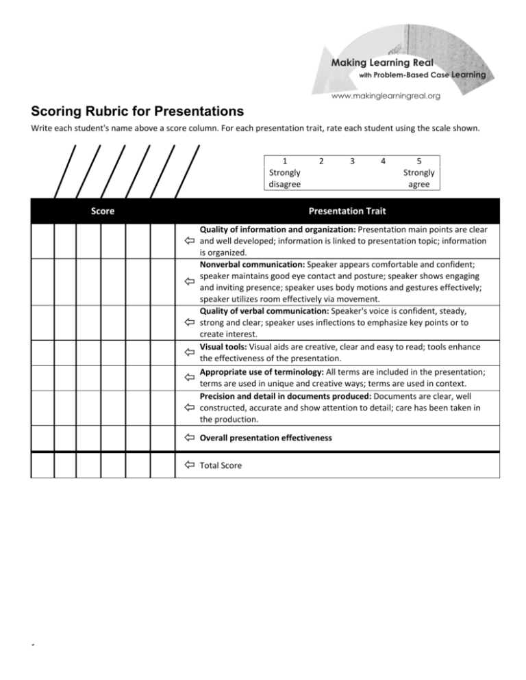
Scoring Rubric for Presentations
&
%
#
%
'
!
)
*
+
!
'
(
$
$
"%
$
!
$
$
!
!$
"!
%
&#
!#
$
"!
%
#
!
$
%
$
!$
%
#
#
$
%
5
–
Excellent
Information
Quality
and
Organization
• Main
points
are
very
clear
and
very
detailed
• Information
is
directly
linked
to
presentation
topic
• Information
is
very
organized
• Main
points
are
clear
and
detailed
• Information
is
linked
to
presentation
topic
• Information
is
well
organized
• Main
points
are
somewhat
clear
but
could
use
more
detail
• Most
information
is
linked
to
the
presentation
topic
• Information
is
organized
• Main
points
are
not
clear
and
lack
significant
detail
• Some
information
is
linked
to
the
presentation
topic
• Information
is
loosely
organized
• Presentation
lacks
main
points
and
related
details
• Information
lacks
connection
to
the
presentation
topic
• Information
is
not
organized
• Speaker
appears
very
comfortable
and
confident
• Speaker
consistently
faces
the
audience
and
maintains
good
eye
contact
• Speaker
consistently
appears
to
be
engaging
with
the
audience
• Speaker
uses
body
motions
and
gestures
very
effectively
• Speaker
utilizes
the
room
very
effectively
via
movement
• Speaker
appears
fairly
comfortable
and
confident
• Speaker
generally
faces
the
audience
and
maintains
good
eye
contact
• Speaker
generally
appears
to
be
engaging
with
the
audience
• Speaker
uses
body
motions
and
gestures
well
• Speaker
utilizes
much
of
the
room
via
movement
• Speaker
appears
generally
at
ease
and
confident
• Speaker
sometimes
faces
the
audience
and
maintains
eye
contact
• Speaker
sometimes
appears
to
be
engaging
with
the
audience
• Speaker's
body
motions
and
gestures
neither
support
nor
detract
from
presentation
• Speaker
moves
about
some
of
the
room
• Speaker
appears
uneasy
and
somewhat
insecure
• Speaker
rarely
faces
the
audience
or
makes
eye
contact
• Speaker
rarely
appears
to
be
engaging
with
the
audience
• Speaker
uses
few
body
motions
or
gestures
or
has
gestures
or
movements
that
distract
the
audience
• Speaker
is
mostly
stationary
• Speaker
appears
very
uneasy
and
insecure
• Speaker
faces
away
from
the
audience
or
makes
no
eye
contact
• Speaker
appears
disengaged
from
the
audience
• Speaker
lacks
any
body
motions
or
gestures
or
demonstrates
consistently
distraction
body
motions
or
gestures
• Speaker
is
completely
stationary
• Speaker’s
voice
is
very
confident,
steady,
strong,
and
clear
• Speaker
consistently
uses
inflections
to
emphasize
key
points
or
to
create
interest
• Speaker's
talking
pace
is
consistently
appropriate
• Speaker’s
voice
is
steady,
strong
and
clear
• Speaker
often
uses
inflections
to
emphasize
key
points
and
create
interest
• Speaker's
talking
pace
is
mostly
appropriate
• Speaker’s
voice
is
generally
steady,
strong
and
clear
• Speaker
sometimes
uses
inflections
to
emphasize
key
points
and
create
interest
• Speaker's
talking
pace
is
appropriate
• Speaker’s
voice
is
frequently
too
weak
or
too
strong
• Speaker
rarely
uses
inflections
to
emphasize
key
points
and
create
interest
or
speaker
sometimes
uses
inflections
inappropriately
• Speaker's
talking
pace
is
often
too
slow
or
too
fast
• Speaker’s
voice
is
consistently
too
weak
or
too
strong
• Speaker
fails
to
use
inflections
to
emphasize
key
points
and
create
interest
or
speaker
often
uses
inflections
inappropriately
• Speaker's
talking
pace
is
consistently
too
slow
or
too
fast
Quality
of
Verbal
Communication
Traits
Nonverbal
Communication
Scoring Rubric for Presentations – Instructions
Instructions
–
1
4
–
Very
Good
3
–
Adequate
2
–
Limited
1
–
Poor
Scoring Rubric for Presentations – Instructions
Overall
Presentation
Effectiveness
Precision
and
Detail
in
Documents
Produced
Appropriate
Use
of
Vocabulary
Visual
Tools
Traits
5
–
Excellent
4
–
Very
Good
3
–
Adequate
2
–
Limited
1
–
Poor
• Visual
aids
are
very
creative,
clear,
and
easy
to
read
• Presentation
is
consistently
enhanced
by
the
visual
tools
• Visual
aids
are
usually
creative,
clear,
and
easy
to
read
• Presentation
is
often
enhanced
by
the
visual
tools
• Visual
aids
are
reasonably
creative,
clear,
and
easy
to
read
• Presentation
is
sometimes
enhanced
by
the
visual
tools
• Visual
aids
have
limited
creativity
or
clarity
or
are
sometimes
difficult
to
read
• Presentation
is
not
enhanced
by
the
visual
tools
• Visual
aids
demonstrate
no
creativity
or
clarity
and
are
often
difficult
to
read
• Presentation
is
weakened
by
the
visual
tools
• All
terms
are
included
in
the
presentation
• Used
in
unique
and
creative
ways
• Used
in
context
• All
terms
are
included
in
the
presentation
• Used
effectively
• Used
in
context
• Most
terms
are
included
in
the
presentation
• Generally
used
appropriately
• Generally
used
in
appropriate
context
• Several
terms
are
included
in
the
presentation
• May
or
may
not
be
used
appropriately
• May
lack
context
• Documents
are
clear,
well
constructed,
accurate
and
show
attention
to
detail
• Extra
care
has
been
taken
in
the
production
• Clearly
evident
that
documents
are
correct,
detailed
and
accurate
• Care
has
been
taken
in
the
production
• Evident
that
documents
are
correct
and
show
a
general
attention
to
detail
and
accuracy
• General
care
has
been
taken
in
production
• Documents
may
have
some
errors
and
show
some
detail
• Some
care
has
been
taken
in
production
• Few
or
no
terms
are
included
in
the
presentation
• May
or
may
not
be
used
appropriately
• Lacks
context
• Documents
have
numerous
errors
and
lack
detail
• Little
care
taken
in
the
production
• This
was
an
exceptional
presentation
and
extremely
effective
• I’d
give
you
a
10
• This
was
a
very
good
presentation
and
very
effective
• I’d
give
you
an
8
or
9
• This
presentation
was
good
and
effective
• I’d
give
you
a
6
or
7
• This
presentation
was
average
and
somewhat
effective
• I’d
give
you
a
3,
4
or
5
©
2009
Nashville
State
Technical
Community
College
and
WGBH
Educational
Foundation.
All
Rights
Reserved.
Instructions
–
2
• This
presentation
was
weak
and
not
effective
• I’d
give
you
a
0,
1,
or
2
