Eight Suggestions for Displaying Data Starting Your Chart
advertisement
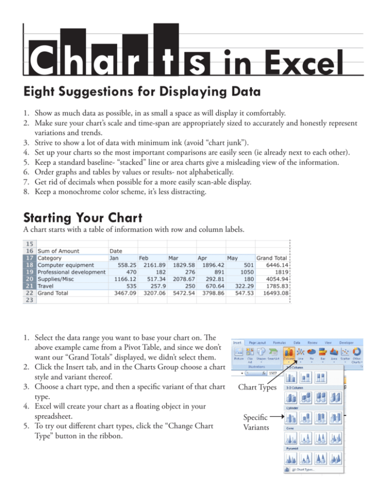
C h a r t s in Excel Eight Suggestions for Displaying Data 1. Show as much data as possible, in as small a space as will display it comfortably. 2. Make sure your chart’s scale and time-span are appropriately sized to accurately and honestly represent variations and trends. 3. Strive to show a lot of data with minimum ink (avoid “chart junk”). 4. Set up your charts so the most important comparisons are easily seen (ie already next to each other). 5. Keep a standard baseline- “stacked” line or area charts give a misleading view of the information. 6. Order graphs and tables by values or results- not alphabetically. 7. Get rid of decimals when possible for a more easily scan-able display. 8. Keep a monochrome color scheme, it’s less distracting. Starting Your Chart A chart starts with a table of information with row and column labels. 1. Select the data range you want to base your chart on. The above example came from a Pivot Table, and since we don’t want our “Grand Totals” displayed, we didn’t select them. 2. Click the Insert tab, and in the Charts Group choose a chart style and variant thereof. 3. Choose a chart type, and then a specific variant of that chart type. 4. Excel will create your chart as a floating object in your spreadsheet. 5. To try out different chart types, click the “Change Chart Type” button in the ribbon. Chart Types Specific Variants Anatomy of a Chart Vertical Axis- Values Plot Area Chart Area Gridlines “Series” Legend “Series” Elements Horizontal Axis Note which parts of our table were used for the different chart elements: “Series” Elements Vertical Axis- Values Horizontal Axis 2 Excel Charting, Mac - Asha Kinney - 2010 Chart Formatting Now that your chart is created, you can use the Chart Tools tabs in the Ribbon- Design, Layout, and Format- to adjust the look and layout of your chart. Design Tab 1 2 3 4 5 6 1. Change Chart Type- Choose a different chart type (pie, bar, line, etc). 2. Switch Row/Column- Allows you change what appears as your main horizontal axis values (ie have months and categories switch places in our example). 3. Select Data- To change the data range your chart is based on, and add or remove series values. 4. Chart Layout- Lets you pick from pre-formatted chart layouts. 5. Chart Styles Choose a color scheme. 6. Move Chart- Move your chart to a new worksheet, or in to an existing one. Layout Tab 1 2 3 4 5 6 7 1. Current Selection Group- Adds special formatting and styles to specific chart elements. Choose the element you want to fomat from the drop-down menu, then click “Format Selection”. 2. Insert Group- Add shapes, text, or a picture to your chart. 3. Labels Group- Add and remove labels and titles for different parts of your chart. To edit a title, double click on the text of the title. 4. Axes Group- Format your vertical and horizontal Axes, choose where you want them, if you want them, and how you want #’s on the vertical axis to display. 5. Background- Choose color for your background and different 3-D effects. 6. Analysis Group- You can add a “trendline” to illustrate the general trend of one of your series values. 7. Properties Group- Re-name the Chart Format Tab Choose an element from the drop-down menu in the current selection box, the use the rest of the ribbon to add outlines, color fills, text styles, to that particular element. Remember- Changes you make here apply only to the Chart element you have selected at the time. Excel Charting, Mac - Asha Kinney - 2010 3 Chart Types Here are some chart examples, all using the data range from page 1. Line Chart- Useful for seeing trends over time. Stacked Line Chart- Shows each value added onto the one below it. Makes gauging actual changes in each category very tricky, and can be very misleading. (Compare to regular line chart @ left) Clustered Column Chart- shows individual category values for each horizontal section. Stacked Column Chart- shows each category as section of total value. Pie charts are considered sort of useless because they display such a small amount of data. This information could just as easily be shown in a small table: March 5472.54 April 3798.86 January 3467.09 February 3207.06 May 547.53 4 A chart with a table added. Excel Charting, Mac - Asha Kinney - 2010 Moving Your Chart You can grab and drag the edge of your chart to move it around within your spreadsheet, or you can move it to it’s own sheet. To move to a new worksheet: Right Click > Move Chart... and choose “New Sheet”. This will create a full-page version. It will still be linked to the original data and will automatically update as necessary. Saving as a Picture Useful for using a chart in other applications. Right Click > Save as Picture. We recommend choosing JPG file format. Resources and References on Displaying Data: www.edwardtufte.com - Edward Tufte is the author of some fabulous books on the theory of displaying data. www.informationisbeautiful.net - a cool blog with examples of creative and interesting displays of data. For More Help with Excel: Microsoft’s Office Help PagesStep-by-step instructions, videos, and courses on lots of Excel functions and features. http://office.microsoft.com/en-us/help/ Borrow a copy of “Excel for Dummies” from Asha. Excel Charting, Mac - Asha Kinney - 2010 5

