The User-Centered Design of York University's Mobile Web Presence
advertisement
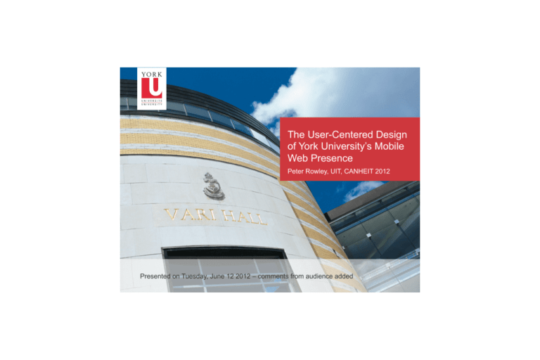
The User-Centered Design of York University’s Mobile Web Presence Peter Rowley, UIT, CANHEIT 2012 1 Presented on Tuesday, June 12 2012 – comments from audience added The User-Centered Design of York University’s Mobile Web Presence Experience Peter Rowley, UIT, CANHEIT 2012 2 Tuesday June 12, 2012 – includes comments from CANHEIT audience Agenda • Introduction • Needs Assessment (2010-11) • Implementation (summer 2011) • Overview of Service • Usage • Future • Lessons Learned 3 Introduction • Why did or would you “do mobile”? Answers from audience: - Keep up with trend / growing demand - Reputational - Emergency communications 4 Needs Assessment • Based on the anticipated rapid growth of smartphone use, UIT’s 2010-11 plan included a mobile version of the student portal and work started in fall 2010 • Building on the tradition of user-centered design of the desktop student portal, we set out to assess mobile needs, first for students • and later for staff 5 Needs Assessment - Devices • Which devices do/would you want to support on your campus? • Blackberry • iPhone • Android • Others? Answers from audience: all of first three, no others 6 Needs Assessment - Devices • Survey of students ran from Nov 2010 – Jan 2011 • A total of 1000 responses • Reasonably representative with respect to year and whether or not in residence • The impending rapid growth of smartphones was confirmed, with 40% intending to buy a new device in 2011: • • • • • 7 Blackberry 44% iPhone 29% Android 16% Windows 7 4% Regular phone 5% Needs Assessment – Devices 75% visit websites on their device 78% download apps to their device How many apps do they regularly use? 8 3 or fewer 24% 4 – 10 52% 10 – 20 14% More than 20 10% Needs Assessment – iPhone 98% visit websites on their device 99% download apps to their device How many apps do they regularly use? 9 3 or fewer 9% 4 – 10 53% 10 – 20 21% More than 20 17% Android results are similar Needs Assessment - Devices • Based on usage patterns, either web sites or applications could be used to deliver required content and tools • Whatever is created will require marketing to be adopted • As fewer apps are used, it may be harder for an app to be adopted than a web site • It is also harder to develop apps (new technologies, device-specific) and harder to distribute (app stores) 10 Needs Assessment - Services • Which mobile services are or would be most important for your students? Answers from audience: - transit, course schedule, grades, site-wide search - student’s social calendar 11 Needs Assessment - Services 12 My class schedule 82% Exam schedule 71% Find a free computer in lab 38% Moodle for my courses 67% 38% Student account balance 55% Library account balance, holds, checkouts Student portal 51% Instructor office hours 37% Campus maps 46% 33% Book a library study room 46% Hours for York retailers and restaurants YU card account balance 46% Events on campus 27% Library catalogue search 41% My to-do list 23% Security alerts 40% Staff/faculty directory 21% University news 19% Sport York news and events 12% Ratings are percentages of respondents who ranked the service important or very important Needs Assessment - Services • Most popular services requested in free-form comments • • • • • • • • 13 Enroll in courses Drop courses Course timetables Course websites Grades Important dates Course book lists Exam schedule changes Needs Assessment - Services • Other requests from free-form comments • • • • • • • • • • 14 Central e-mail Google maps with building details and directions Library hours Pay fees and fines Contact Go Safe (campus escort) Gym hours Live chat with student services rep Find a computer lab Check room codes for graduate reading room Bookstore search Needs Assessment - Services • Mobile is not just web, SMS is important too • Which events should generate an SMS for your students? Answers from audience: - Class cancellation, security incident - space open in a class, communications from other students 15 Needs Assessment - Services Events which should generate an SMS message Class cancellations 80% Weather alerts (campus closing) 69% Release of grades 67% Release of exam schedule 64% Security alerts 46% Library book on hold now available 38% Overdue tuition fees 36% YU Card balance below $5 23% Don’t send me anything ever 8% Some students noted a desire to indicate which events to receive by text message and which by e-mail 16 Needs Assessment - Devices • Similar survey carried out for staff • 266 responses • Some evidence that students participated in the staff survey • Device preference is similar except: • iPhone 32% for staff, 27% for students • iPad 3% for staff, 0.4% for students • 38% planned to buy a new device in 2011, with their preferences reflecting more interest in iPhone and iPad than students, as above 17 Needs Assessment - Services York e-mail 73% Directory 64% Campus maps 58% Security alerts 57% Transit info (bus, etc.) 48% Important Dates 46% Campus events 43% YU Card balance 35% University news 35% Library catalogue 35% Your To Do list 34% Library account balance, holds, etc 33% Hours for York retail outlets and restaurants 29% Learning and development opportunities 16% Classroom equipment ordering 12% Sport York news & events 12% 18 Needs Assessment - Services • Most popular suggestions from free-form text comments • • • • • • • 19 Weather emergency Class lists Moodle access Calendaring (Lotus Notes integration) Important dates Transit info, particularly re subway construction Detailed campus map with room info Needs Assessment - Services Events that should result in an SMS message being sent 20 Message Staff requesting Students requesting Weather alerts 80% 69% Security alerts 60% 46% Library book on hold now available 31% 38% YU Card balance below $5 15% 23% Don’t send me anything ever 17% 8% The story continues… • We were “just slightly ahead of our time” when a request from the Board of Governors arrived – establish a mobile web presence • The effort to add mobile access to the student portal was expanded to include mobile-friendly versions of: • The home page of the main web site, www.yorku.ca • The captive portal login to campus WiFi • The login to campus single sign-on (Passport York) • Campus maps, directory, and events • Scope became the mobile experience, not just the mobile web 21 • Fully addressing the mobile experience awaits full deployment of 802.1x access to WiFi Launch – Summer 2011 • www.yorku.ca • Central development • HTML5/CSS3 with jQuery Mobile (we used beta; now at version 1.0.1) – no native apps • Liferay 5.2.8 portal • Navigation to existing mobile-friendly sites • Future students (Drupal-based) • Library (did new development) • Development and sharing of mobile style guide to coordinate cross-campus mobile web look and feel 22 Overview 23 Overview 24 Overview 25 Overview 26 Usage – Visits Average visits per day to home page October 2011 1,100 January 2012 2,400 All of Jan 2012 27 75,000 82% are return visitors Usage – Relative to desktop • The proportion of usage that is mobile is growing slowly • For example, for the Student Portal • October 2011 • 8,905 out of 92,705 = 9.6% • January 2012 • 18,400 out of 182,800 = 9.9% 28 Usage – Devices (January 2012) Which device would you expect to be first? Answers from audience: - Slight edge for Android as first - iPhone a close second - Blackberry third 29 Usage – Devices (January 2012) iPhone OS Blackberry OS Android 62.8% 18.1% 17.4% iPhone breakdown: 50% iPhone 4 6.4% iPod touch 6.3% iPhone 3GS Similar results for March 2012, with 19% Android 77% version 2.3.3 8% ver 3.1, 8% ver 4.03, 3% ver 2.1 30 Blackberry usage rose in fall, slow decline now Usage – Browsers (January 2012) Safari Android Blackberry 9xxx 77.7% 16.3% 2.6% A reasonable strategy is to develop for Safari and if the service takes off, test on Android also 31 Usage - Services • Due to implementation architecture, analytics services are not counting service requests accurately • Multiple pages are loaded all at once • Results in artificially high bounce rates since needs can be satisfied completely within the first page load 32 Coordinating Across Campus • The initiative was an opportunity to create and sustain a coordinated cross-campus mobile web presence • Basic steps toward that goal were achieved • A framework for future coordination was established • Mobile web working group • Cross-campus committee open to all Faculties, administrative units, interested parties • Led by Marking & Communication and IT • Eleven areas for potential collaboration / standards 33 Eleven Possible Areas of Collaboration • Device support • Implementation technologies • Content management • Appearance • Navigation • Search • Authentication • Personalization 34 Eleven Possible Areas of Collaboration • Distribution • Analytics • Accessibility Of all these, content management, appearance/navigation, and analytics have, to date, generated the most interest across campus. 35 Areas of Collaboration • Appearance and Navigation • UIT and Marketing and Communication created a mobile look and feel, initially for the student portal • Adapted for other central sites (main site, directory, events, etc.) • Borrowed and adapted for library sites • Content management • Sharing of templates for Drupal, Wordpress, and jQuery Mobile • Distribution of mobile style guide and supporting CSS file 36 Areas of Collaboration • Analytics • Everyone initially used Google Analytics yet found it wanting • York “best practice” became the use of both Google Analytics and Percent Mobile • GA may have caught up 37 Future Areas • Some areas have not been pursued yet, awaiting resources • Search: allow mobile users to find web sites and apps by keyword and other search (e.g. location) • Personalization: allow cross-site personalization, e.g. by audience (student, staff, alumni, public), location, etc. • Distribution: organize the distribution of access to web sites, particularly mobile applications 38 Lessons Learned • There won't be a lot of traffic, at least not to start, so discover user needs to drive impactful functionality • Those needs will reflect their unique situations • Mobile user needs are not the same as for desktop • Mobile web sites can be good solutions to mobile needs • Typical mobile architectures can complicate gathering usage statistics • If you are ahead of your campus, particularly on look and feel, you have a better chance for a cross-campus integrated experience 39 Ndj`JEdgiVaBdW^aZH^iZHinaZ<j^YZ NDG@JC>K:GH>IN BD7>A:L:7H>I: HINA:<J>9: © 2011 York University | York University Mobile Web Site Style Guide 40 August 2011 Ver 1.0 | Questions? markcomm@yorku.ca Ndj`JEdgiVaBdW^aZH^iZHinaZ<j^YZ I67A:D;8DCI:CIH This document outlines the graphic standards for the mobile view of my.yorku.ca. It is intended to be used as a guide for all York University mobile sites. (%' CSS )%' Colours *%' Fonts +%' Buttons ,%' Page Structure Essentials -%' Content Modules .%' Navigation © 2011 York University | York University Mobile Web Site Style Guide 41 August 2011 Ver 1.0 | Questions? markcomm@yorku.ca 42 Thanks! • Contact me prowley@yorku.ca • Mobile Style Guide www.yorku.ca/prowley/MSG.pdf Questions? 43
