New Wayfinding Standards
advertisement
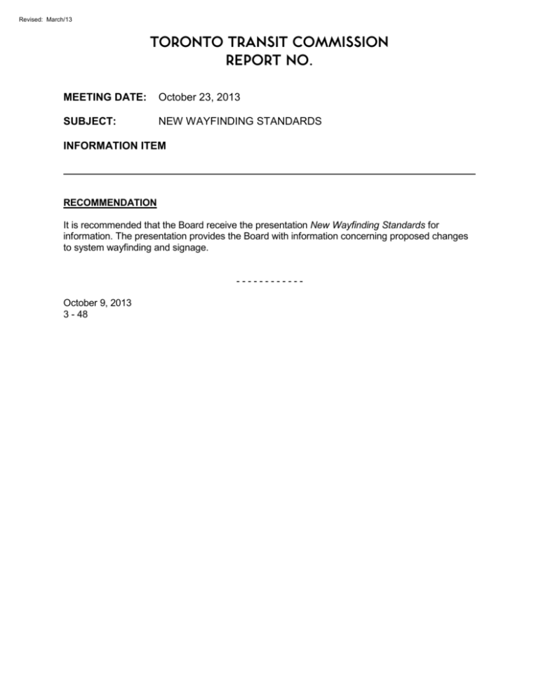
Revised: March/13 TORONTO TRANSIT COMMISSION REPORT NO. MEETING DATE: October 23, 2013 SUBJECT: NEW WAYFINDING STANDARDS INFORMATION ITEM RECOMMENDATION It is recommended that the Board receive the presentation New Wayfinding Standards for information. The presentation provides the Board with information concerning proposed changes to system wayfinding and signage. -----------October 9, 2013 3 - 48 NEW WAYFINDING STANDARDS PRINCIPLES TTC Customer Information objectives; • Bring simple, non-fussy approach • Clean and direct • Connect customer touch points in a cohesive manner • Bring simplicity and clarity to customer journeys • Promote consistency • Improve system maps • Improve system accessibility 10/23/2013 2 10/23/2013 3 10/23/2013 4 10/23/2013 5 INFORMATION - CONNECTING ALL THE TOUCH POINTS Customer Information involves a number of elements: • • • • • Pre-journey planning tools Information systems Schedules Self-navigation aides Staff interactions Mobile Apps Ride Guide System Maps TTC.ca These are all connected Audible Announcements Information Screens Subway Maps 10/23/2013 Signage Staff Social Media 6 INFORMATION - CONNECTING ALL THE TOUCH POINTS • We are building on these connections to create a complete customer experience. One that: • • • • 10/23/2013 Is positive, customer-focussed and friendly; Delivers service efficiently and cost-effectively; Provides information promptly and clearly when delays occur; Is accessible to all. 7 SIMPLIFICATION AND CLARITY • Steps are being taken to simplify information delivery throughout the system; • • • • 10/23/2013 Clear and simple information on maps and signage; Clarity and prominence at TTC system access points; Current schedules and updates delivered digitally via station video monitors, apps and social media. Update to Wayfinding Standards 8 SIMPLIFICATION AND CLARITY • Our system has evolved but our core values remain unchanged: Service, Courtesy and Safety 10/23/2013 9 OPPORTUNITIES TO SIMPLIFY • Example: Subway Route Names – we use many terms to say the same thing; • • • • Examples: YUS Route Yonge Subway Spadina Trains Yonge-University-Spadina Line This problem will get worst as the YUS extends into Vaughan. 10/23/2013 10 CURRENT SUBWAY IDENTIFICATION 10/23/2013 11 NEW STOP POLES 10/23/2013 12 NEW SUBWAY IDENTIFICATION • Numeric codes offer several advantages; • Simple and accessible to customers with language or cognitive barriers; • Provides an easy reference for all customers to remember; • Conducive to mobile technologies; • Future-friendly – Will not need to be changed when lines are extended and Establishes a plan today for future line names; • Can be implemented cost-effectively. 10/23/2013 13 NEW STOP POLES Communicates on four levels; 10/23/2013 14 NEW STOP POLES 10/23/2013 15 HONOURING TTC TRADITION • The TTC’s historic Subway Font will be used on more signage - at station entrances, fares booths and track level signage. 10/23/2013 16 Signs that are highly visible 10/23/2013 17 Signs that are highly visible 10/23/2013 18 10/23/2013 19 Bringing prominence to our entry points 10/23/2013 20 Bringing prominence to our entry points 10/23/2013 21 Bringing prominence to our entry points 10/23/2013 22 Bringing prominence to our entry points 10/23/2013 23 NOT JUST STATION “SIGNS” 10/23/2013 24 10/23/2013 25 10/23/2013 26 10/23/2013 27 10/23/2013 28 MAPS - OPPORTUNITIES TO SIMPLIFY • Pilot on 94 Wellesley • • • • Suitable for some location Positive reception but not universally appropriate Tweaking being done Doesn’t obviate need for a system map • System map to be used in many places • • • • • 10/23/2013 Ride guide Subway concourses Tourist information Many bus shelters short term Some bus shelters long term 29 RIDE GUIDE CLOSE UP 30 COLOUR? 31 FREQUENCY? 32 CONCLUSION • Pilot study – Bloor-Yonge & St. George Stations • • • • Pre & Post installation interviews Designed for quick and cost effective implementation Future projects – elevators, second exits, TYSSE Roll out printed products in early in New Year • Not about change for change sake • • • • Simplification of brand and return to roots Simplification of all information touch points Connect all information points in cohesive manner Ensuring fit for present and future 10/23/2013 33 Thank you 10/23/2013 34

