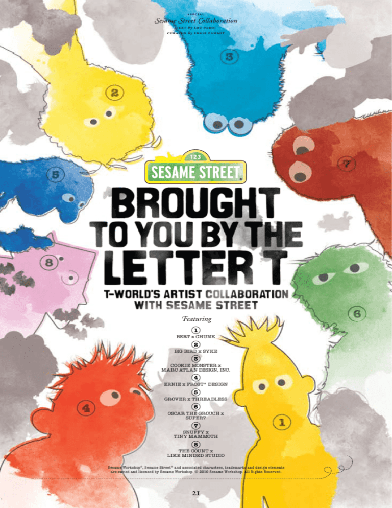
speci a l
Sesame Street Collaboration
te xt by lou pa r di
cur ated by eddie z a mmit
Featuring
1
BERT x CHUNK
2
BIG BIRD x SYKE
3
COOKIE MONSTER x
MARC ATLAN DESIGN, INC.
4
ERNIE x FROST* DESIGN
5
GROVER x THREADLESS
6
OSCAR THE GROUCH x
SUPER7
7
SNUFFY x
TINY MAMMOTH
8
THE COUNT x
LIKE MINDED STUDIO
Sesame Workshop®, Sesame Street® and associated characters, trademarks and design elements
are owned and licensed by Sesame Workshop. © 2010 Sesame Workshop. All Rights Reserved.
21
Lights, cameras, action!
Big Bird launches into another
monologue, and tucked away
behind the cameras, directors,
child psychologists and gophers
is one Eddie Zammit, founder
of T-world. How the hell did
he get to Sesame Street?
22
It all started in May 2008. Eddie was
heading out on a world T-shirt hunting
tour and thought he’d stop by Sesame
Street. ‘If you don’t ask, you don’t get’
is his motto, and he put in a call to a
Sesame Street-connected friend. “You
have no chance of getting on the set,”
said Amy Freeman. “It’s easier to get into
the Pentagon,” she added, explaining
that you really need to have a very good
reason to visit.
Being the determined type, Eddie set
to work on a very good reason to visit.
He drafted up some proposals, one
of which was a collaboration between
eight streetwear designers and Sesame
Street. The designers would interview
eight Sesame Street muppets and
create a custom-made T-shirt design to
put the ‘street’ back in Sesame Street.
Astoundingly, Sesame Street asked
to meet him, and in June 2008, Eddie
wandered into their office in New York city.
Not quite 123 Sesame Street, but closer.
The meeting went well, until Eddie
dissolved into fits of giggles (not
uncommon). “I really only put the project
forward to get on the set of Sesame
Street,” he confessed to his new friends.
The next day Eddie made his first visit to
Sesame Street and Brought to you by the
letter T: T-world’s artist collaboration with
Sesame Street was born.
What may have started as a ploy to
find the world’s favourite street has
become a passion. Sesame Street
is more than a street, more than
entertainment, and more than education.
The universal appeal of Sesame Street,
where ordinary and extraordinary
characters exist in an urban environment,
brings people a universal experience.
Rich or poor, anyone with a TV can tune
in. Sesame Street is educational, it’s fun
and it keeps it as real as it can with an
8’2” talking canary present. Sesame
Street isn’t a fairytale; but that doesn’t
mean dreams don’t come true.
Big Bird represents the psychological
age of a six-year-old?
Brought to you by the letter T:
T-world’s artist collaboration with
Sesame Street has been a team
effort spanning over a year. First,
the right artists had to be found for
each character. Beci Orpin of Tiny
Mammoth was an obvious choice
for Snuffy; it seemed Romanian
typographer Luca Ionescu could
share a bloodline with The Count;
and renowned packaging designer
“You have no chance of getting
on the set. It’s easier to get into
the Pentagon.”– amy freeman
First airing on 10 November
1969, Sesame Street now educates
and entertains children in over 140
countries around the world. More than
11 million people watch the show in
an average week. Sesame Street’s
pithy segments, catchy songs and
engaging characters have enchanted
and educated us for 40 years. Behind
every character is a unique story,
unique lessons to share, and a unique
personality. Would you have guessed
that Bert was designed to let kids
know it’s okay to be boring? Or that
23
Marc Atlan couldn’t be overlooked for
the famished Cookie Monster. Add
Chunk’s Richard Sanders to interpret
Bert, Frost* Design’s Vince Frost to
play with Ernie, fauna fan Tri Vo from
SYKE to pencil Big Bird, and Brian
Flynn from Super7 to get the trash on
Oscar, and you’re ready to go.
Having interviewed their new
friends, each artist created a unique
design reflecting the muppets’ unique
psychology. To check out what they
created, just turn the page (don’t mind
the monsters).
London designer Richard Sanders, of
Chunk, has taken one of Bert’s favourite
pastimes and made it tops.
As one half of the Abbott and Costello
of the muppet world, Bert plays straight
man to Ernie’s funny man. So many of
Ernie’s gags are all the funnier for Bert’s
responses. It’s not hard to imagine
why Ernie tries to get under Bert’s skin
– a frustrated Bert is just deliciously
entertaining. But there’s more to Bert
than meets the eye.
“It was quite a challenge
doing Bert as his
interests and hobbies
are pretty dull.”
– richard sanders
Bert’s muppeteer, Frank Oz, spent
a year working with him before accepting
Bert’s strength – he’s boring. A great
example to kids that being the life of the
party isn’t everything, Bert is content with
his favourite things: Ws, pigeons, brass
band music, oatmeal, boring songs,
watching weather forecasts on TV,
argyle socks and the colour grey.
Chunk is known for its T-shirt designs,
parodies and innovative work with
licensed characters. It’s no stranger
to hand-stitched stars. Richard’s got his
own insights on his new friend. “He’s
quite a complex character. At first glance
he comes across as being pretty dull but
24
actually I think he’s just misunderstood.
He’s very particular about what he
likes and he does things his way only,
to him it’s the best way. I like that,”
he says. The Bert’s Bottle Tops T-shirt brings
together Bert’s favourite things with
a Chunk twist. Uh-oh. Hopefully we
haven’t made Bert cool; that would
be uncool. “It was quite a challenge
doing Bert as his interests and
hobbies are pretty dull (no, really
dull!),” says Richard. “Finding a
subject that would work on a T-shirt
that people would want to wear
became somewhat difficult. Eventually
I thought of doing bottle caps,
because Bert absolutely adores them
and for me, they look pretty retro-cool.
It gave me an opportunity of putting
something of a twist/parody on the
top. Every bottle top contains a
personality trait, hobby or thing that
Bert’s into. As a theme to bind them
all I chose familiar-looking soft drinks,
the kind everyone loved as a child
growing up, so it had a nostalgic feel
attached to it like when we used to
watch Sesame Street.” We can’t wait to see Bert’s reaction
to Richard’s work. We think it might
inspire one of Bert’s famous pigeon
dances – tops! LP
www.chunkclothing.com
25
Richard Sanders
pops a soda with Bert
Richard Sanders (RS): Where did
you grow up?
Bert (B): On Sesame Street.
RS: What country would you like
to visit?
B: Canada.
RS: What are you scared of?
B: My oatmeal getting cold, losing a
bottle cap from my collection, a world
without paperclips.
RS: What’s your favourite book?
B: War and Peace.
RS: Which do you prefer,
dogs or cats?
B: Pigeons.
RS: What’s your favourite type
of weather?
B: Overcast skies.
RS: What’s your favourite sport?
B: Checkers, pinochle, tiddlywinks.
RS: Who is your favourite band?
B: A rubber band.
bert and ernie in the 70’s.
Tri Vo and Big Bird find
beauty in the everyday.
Tri and Big Bird shoot
the breeze…
Tri Vo (TV): Big Bird, what do you like
to do best on Sesame Street?
Big Bird (BB): I love to play with my
best friend Snuffy! We do everything
together. One time I took him to the
park to teach him to rollerskate and
we had a blast. Can you imagine a
snuffleupagus on rollerskates?
TV: What are your three most
prized possessions?
BB: Radar my teddy bear, my nest
and my picture of Mr Looper,
I mean Hooper.
TV: What is your favourite colour?
BB: Yellow!
TV: What was your last
dream about?
BB: The three little kittens who lost
their mittens, but I woke up before
they found them.
TV: If you wore clothes what would
you wear?
BB: Pyjamas!
TV: What are your favourite
memories of Mr Hooper?
BB: He used to tell me stories and
make me birdseed sundaes, and
he made a really nice brisket.
Australia’s Tri Vo has been a designer
for his own label SYKE for 11 years.
His usual influences are
Japanese art, street
culture and finding
beauty in the everyday.
For this T-shirt though,
it’s Big Bird.
Big Bird shares Tri’s
attraction for finding wonder
in what some may overlook.
“I’m too tall to be short,” he muses in
one episode. It’s his knack for stating
the obvious in the most creative way
that has endeared Big Bird to hordes
of children.
Tri remembers Big Bird from his
childhood. “Big Bird to me was the
most brash and vibrant-looking puppet
on Sesame Street, although in contrast
he had a rather subdued character,”
says Tri. Until now, though, he’d never
known what type of bird Big Bird
was. “I only just realised that he is of
the canary variety,” he says, which is
understandable, considering Big Bird’s
towering 8’2” frame.
When it came to designing a tee with
Big Bird, Tri decided to design something
reflecting Big Bird’s ‘inner thoughts’.
Drawing from his interview with Big Bird,
Tri focused on Big Bird’s teddy, Radar,
shopkeeper Mr Hooper
(or Mr Looper as
Big Bird sometimes
called him) and Big
Bird’s best friend,
Snuffy (who could
only be seen by Big Bird and children
for 14 years of the program).
In 1982, the actor who played
Mr Hooper, Will Lee, died. Rather than
re-cast the role, Sesame Street took the
opportunity to teach children about death.
The episode was aired on Thanksgiving
Day in 1983. Sesame Street scheduled
it for this day so that parents would be
home with their children to discuss it.
The portrait of Mr Hooper which Big
Bird holds so dear was actually drawn
by Caroll Spinney, Big Bird and Oscar’s
muppeteer, who is also a cartoonist.
Tri’s T-shirt design, called Happy
Thoughts, plays to his strengths. “I like
drawing texture and details, like hair in
waves and all things flora and fauna,” he
says. “The feather details are similar to
the works I have done in the past. Happy
Thoughts started out like a patterned
wallpaper, then it just grew and grew.” LP
www.syke.com.au
Michelle Obama appeared in the first
episode of Sesame Street’s 40th season.
26
27
A food-obsessed monster
and a designer famous
for putting treats on tees?
YUM! YUM!
cookie monster in monsterpiece theatre.
Cookie Monster
Confessions
Marc Atlan (MA): Cookie,
what’s the biggest thing you
have ever eaten?
Cookie Monster (CM): Me once
ate a Christmas tree. Surprisingly
refreshing! It cleanse the palate
nicely. Me also once ate a truck!
That one, bit of a challenge…
MA: What’s the biggest thing you
think you could eat?
CM: An entire bakery.
MA: How do you keep your fur
so clean?
CM: Uh... it actually not that clean.
Every once in while me find some
cookie crumbs in there and have
a nice little afternoon snack.
MA: What is it about cookies?
CM: They happen to be extremely
crunchy and delicious! Especially
chocolate chippy! Mmmm chocolate
chippy... Excuse me... om nom
nom nom ahmm! Ahhh delicious!
Burp! Excuse me… sorry, where
were we?
“I think I probably grew up more on
Sesame Street than my own kids,”
says Marc Atlan of renowned Marc
Atlan Design, Inc., who remembers
a French Oscar and Cookie Monster
from his childhood, which, he reminds
us, is some time ago now. Many would
refer to Marc as ‘design royalty’.
In addition to award-winning
packaging, Marc is a celebrated
designer of ad campaigns, brand
identities, logos and magazines.
A wide range of awards are proof
he can turn his design skill to many
different applications and excel.
He’s also a prize-winning photographer.
In the T-shirt sphere, Marc’s designs
tend to be high-impact and low-fuss.
His 2K Flavour tees, which would no
doubt be a Cookie Monster favourite,
feature a tasty treat on the front of
each: a hot dog with the perfect
wave of mustard, and a donut with
delectable icing.
Cookie Monster was born on
2 November, which makes him a
Scorpio. That’s where he gets his
knack for knowing how to get what he
wants. In fact Cookie was one of the
first talking monsters on Sesame Street.
Before his character was even named,
he was known as the ‘googly-eyed
monster’, and had a scene with Ernie
28
where he successfully hijacked Ernie’s
snacks. He used just two words,
‘milk’ and ‘cookie’, and from then
on there were talking monsters all over
Sesame Street.
Turning his skills to a T-shirt design
reflecting Cookie Monster, Marc says,
“I did some research and looked into
the silliest things that Cookie Monster
had eaten. The list is insane, over 100
items that he has eaten on the show.
I thought, I have to pick some that
speak to everybody; that show the
size of the objects and the nature
of the objects he has eaten.”
From the meat, fish and
vegetables our modern Cookie
Monster encourages in children’s
diets (together with a message
of everything in moderation, even
cookies) to the more adventurous
and less palatable bicycle and fire
hydrant, Marc reels off delicacies (in
Cookie Monster’s eyes, anyway). “It’s
like a food packaging basically, that’s
the concept. I wanted it to look like it
was the packaging of food that Cookie
Monster would eat – like his favourite
type of food.” Looks as though Marc
Atlan’s come through with another
tasty treat. LP
www.marcatlan.com
29
t w ent y-ni ne
Vince Frost and Ernie know, whether you’re
a muppet or a grown up, it’s important to play.
“I grew up in Canada so I can’t
remember a day I didn’t watch Sesame
Street,” says Vince Frost, of Frost*
Design. Apart from allowing him to get
to know Ernie, Vince says the project
has reminded him what an important
education Sesame Street was. “I think
for me, being a designer and very much
into typography, that Sesame Street
has drummed into me the alphabet
obviously, but also play – playing with the
alphabet. That’s something which has
really influenced
me in my career. I’ve pretty much
chosen words and I look for humour and
juxtaposition in them. It’s not something
that I’ve really credited in my career
before, but Sesame Street really was
a major influence on me as a designer,”
Vince shares.
As his own boss at Frost* Design (now
based in Sydney, Australia), T-shirt man
Vince has decided he never needs to
wear a collar again. In addition to Frost*
Design’s awarded commercial work,
Vince has launched his own T-shirt
label, under the Frost* name.
Ernie’s mantra is ‘do unto others
before they do unto you’, and
this innocent-faced muppet
certainly gets away with
a lot of cheeky antics.
Vince and his team
went through many
design concepts
before settling
on the heh heh
heh design. “There
must have been about
50 different ideas.
We had a lot of fun
playing around with
ways of expressing
Ernie: abstract ideas
or highly graphic ideas or
illustrative ideas. One of the
ideas we came up with
was (because it’s
about learning and
because it’s about
the alphabet)
using ‘e’ for
Ernie and just using Ernie’s head for
the letter e. That evolved into trying to
simplify his face as much as possible,
but still maintaining that resemblance
of Ernie,” says Vince.
What to do with Ernie’s e-fashioned
face then became the subject for
discussion. “We were looking for
words that portrayed Ernie, looking for
something that people could relate to,”
says Vince. “We did a lot of approaches
and found that this was the one that made
people smile, because it was familiar.
Everyone says that rubber duckie is one
of the most famous things about Ernie, or
him and Bert, but I just find that his little
laugh is one of his major characteristics,
that ‘heh heh heh’ giggle.”
Working with Ernie seems to have
had an effect on Vince’s whole studio.
“To have an icon like Ernie as the
subject of one of the T-shirt designs
got everybody very excited,” shares
Vince. “The Ernie doll has been
popping up all over the studio, every
day I come in, he’s in a different place
– it’s very playful.” LP
www.frostdesign.com.au
MR HOOPER AND ERNIE
30
31
When the internet’s most
well-known online T-shirt site,
Threadless, meets (global)
Grover, worlds collide.
Threadless rose to popularity and
prosperity with its website, where T-shirt
designs are submitted by the public,
voted on by the public and bought by
the public. Threadless knows what it’s
like to have fans all over the globe.
Just like Grover, though, Threadless
remains down-to-earth. Jake Nickell,
founder and CEO, tells us that he reads
to his daughter from the same copy of
The monster at the end of this book that
was read to his wife during her own
childhood. “Wanting to be involved with
this project was really a no-brainer,”
he says.
“How did you get so loveable?”
Jake asked Grover. “I think it started
by having such loving parents. It is easy
to feel loveable when you are loved so
much. Being cute and adorable too,
though, does not hurt,” he replies.
The T-shirt design is called The
Travels and Trials of a Loveable Blue
Contributing Artists
AmsterdamTan Nuyen
Austin, TexasBrandon Ortwein
AustriaStuart Colebrook
BermudaTonteau
BrazilRodrigo Ferreira
Canada
Jim Gray
Cape Town, South AfricaDianne Gordon
Grover IllustrationBlair Sayer
Grover Photos
Jublin
Honolulu, HawaiiKeith Kuniyuki
Hoover DamRoss Zietz
ManilaMarco Angeles
Mt RushmoreRobbie Lee
New ZealandAaron Hogg
North PoleBen Foot
Phone Booth / LondonTonteau
Portland, OregonBrian Cook
ScotlandWotto
SuitcaseIan Leino
Superheroes / LondonGavin Rampling
WisconsinDann Matthews
Curator
Jake Nickell
Art DirectorIan Leino
ross zietz at threadless hq.
32
Monster and was curated by Jake
and art directed by Threadless
alumni’s Ian Leino. “Grover’s
love of travel is such a great
metaphor for the way that he’s
impacted people all over the
globe that we wanted to build on
that idea for our collaborative design,”
says Ian. “It’s comprised of the work
of 20 different artists working from six
continents. The concept was that each
artist would design a travel sticker to
represent where they live, to show the
wide-ranging effect that Grover has on
people all around the world.”
Grover appeared variously as a
waiter, teacher, professor, farmer and
a salesman in the early years of Sesame
Street. It wasn’t until much later that we
looked to the skies and pondered, “Is it
a bird? Is it a plane?” LP
www.threadless.com
marshall grover
and fred the wonder horse.
33
Geminis Oscar the Grouch and
Super7 designer Brian Flynn are
not morning people.
Geminis certainly know how to get
their grouch on. Oscar is known for
being unforgiving to all but his pet worm
Slimey (although secretly he has a soft
spot for Maria). Brian Flynn wakes up
grumpy but evens out after breakfast.
What happens if you put them together?
“Interviewing Oscar was hilarious and
completely surreal at the same time,”
Brian says. “You are interviewing a
fictional character, but in some ways
he is completely real. Plus, it is not
something I ever thought I would be
doing, so it was very cool. He even gave
me a shout out! Way to go Oscar!”
While you may not know the name,
you’re probably familiar with Brian’s
designs, which include the ubiquitous
logos of Upper Playground and
Hypebeast, to name a couple. “I have
been designing T-shirts for over 15
years now,” he says. “I was/am one
of those behind-the-scenes guys. You
have probably worn some of my designs
and never even known it.” Brian has his
hands full with Super7, well known for its
toys, and Hybrid Design’s commercial
creative and homewares. He also has
a family, with baby number two about
to drop, not to mention an art show
in the near future. He finds balancing
commercial brief work and his Super7
creative suits him. “For other brands it
is easy to understand their themes and
roll with it. For Super7, I really went out
there and did what I wanted, because
I knew of no one that wanted to talk about
the same stuff I did. I can get nerdy real
quick, and there aren’t any brands like
that out there, so I did it myself.” The
collection of vinyl toys curated or
created by Brian speaks for itself.
Oscar, Sesame Street’s consummate
pessimist, was inspired by a terse waiter
who served Jim Henson at a restaurant
called Oscar’s Tavern in Manhattan.
Oscar’s voice was also inspired by
a New York local. Caroll Spinney,
Oscar’s muppeteer, was driven to the
studio during season one by a gruffly
spoken taxi driver. Caroll adopted the
driver’s growl for Oscar, who was at
that stage a somewhat alarming shade
of orange. The green Oscar we all now
know and love (to his disdain) arrived
in season two.
Over the years Caroll has received
letters from bewildered parents who have
succumbed to their young grouchkateer’s
demands for their very own trash can,
which they insist on sitting in to watch
Sesame Street.
Brian has been a Sesame Street fan
since childhood. “I really liked the more
offbeat characters like Oscar and The
Count who were not as ‘cute’ and ‘safe’
as the others. They had more of an edge.
Although it did bother me immensely
that no one believed Big Bird about
Snuffleupagus,” he says.
In putting together a design for
Oscar, Brian says, “I was thinking about
all the things I normally do, and how
I could make something interesting that
did not seem out of place with Oscar.
I did not want to make a hyper-techno
seizure-inducing graphic, but something
simple and organic. The more I thought
about it, one of Oscar’s primary
character traits is his love of trash,
so I decided to make Oscar himself
out of trash. A hand-drawn pile of
trash seemed a little more appropriate
than a super-clean vector version of
trash.” Oscar’s favourite songs include:
All You Need is Trash, I Wanna Hold Your
Trash and I Love Trash, which is also the
name of this T-shirt. Oscar is a bit of an
artist himself. Can’t wait to hear what he
thinks of this piece. LP
Brian gets the trash on Oscar
Brian Flynn (BF): Do you have any
brothers or sisters? If so, which one
is grouchier?
Oscar (O): I’ve got a whole family
of grouches, Brian, and we’re all
grouchy!
BF: What is your favourite thing that
you have found in the trash?
O: Leftover sardine toppings, they
are great on ice-cream sundaes.
BF: Jack Kirby or Steve Ditko?
O: Groucho Marx.
BF: What is your favourite record?
O: The broken one.
BF: Do you collect anything
specifically (other than trash)?
O: Is this a trick question? Haven’t
you heard my song? I’ll give you a
line… Oh, I love trash… Anything
dirty or dingy or dusty… Anything
ragged or rotten or rusty…
“I really liked the more
offbeat characters like
Oscar and The Count.
They had more of an edge.”
Original orange oscar
from season one with
mr hooper and friends.
– brian flynn
www.hybrid-design.com
34
35
Who better to work with our favourite pachyderm than
Beci Orpin, the designer behind Melbourne kids
label Tiny Mammoth?
What does this puzzle tell you about Snuffy? 1. Rainbow thought bubble: His imagination and the imagination
games he plays with ‘Bird’. 2. Take It Slow...: Snuffy’s life motto. 3. Eyelashes and tears: when Snuffy cried
real tears, that’s how Big Bird knew he wasn’t imaginary 4. Hopscotch: His favourite game to play with ‘Bird’.
5. A.S: his initials, Aloysius Snuffleupagus. 6. Footprints: Big Bird’s fooTprints 7. Roller Skates: His favourite
hobby. 8. Oh Dear: Snuffy’s catch phrase (best recited s l o w l y, whilst holding your nose). 9. Question mark:
Snuffy likes to ask a lot of questions. 10. Spaghetti: His favourite food. 11. 7ft: SNUFFY’S height.
36
Beci, now a mum herself, grew up on Sesame Street, and recalls
her impressions of Mr Snuffleupagus (or as we all call him, Snuffy).
“I remembered his eyelashes the most, followed by a feeling of
frustration and angst that no one believed he was real!” she shares.
“I ran a women’s label [Princess Tina] and did some kids
stuff as part of that when my first son, Tyke, was born in 2003,”
explains Beci. “I find it hard to find stuff I like for boys so I literally
design what I want my kids to wear. When I finished Princess
Tina and had another son, Ari, to dress, I decided to concentrate
on kidswear and Tiny Mammoth was born.” Tyke inspired the
name of the brand when, at age four, he woke up and recounted
to his mum his dream, where he could breath underwater and
best of all, he had a tiny mammoth as a pet. Incidentally, Snuffy
is created to be representative of the psychological age of
a four-year-old.
For many years, Snuffy was believed by the grown ups on
Sesame Street to be Big Bird’s imaginary friend. He wasn’t
imaginary. However, from when Snuffy arrived in 1971 until
1985, he somehow only turned up when Big Bird (or ‘Bird’ as
Snuffy calls him) and children were around – never grown ups!
In 1985, the writers were running short on ways for Snuffy to
serendipitously ‘just miss’ being seen by grown ups. It was decided
to reveal Snuffy (and we all breathed a sigh of relief ). Increasing
reports of child abuse in the media had made educators rethink
Snuffy’s invisibility too. Sesame Street wanted to emphasise that
you could tell adults anything, even the most unusual things, and
trust them to believe you.
Beci’s whole family (husband Raph and sons Tyke and Ari) got
involved in putting together questions to ask Snuffy. “It caused
great excitement in our house,” says Beci. “Tyke helped me think
of the questions. Some of Snuffy’s answers surprised me, but he
was as sweet in the interview as he is on Sesame Street.” Tyke’s
question to Snuffy was, “Why do you have such long eyelashes?”
To which Snuffy replied, “To keep the sun and rain out of my eyes.
And they’re pretty. They float in the breeze.”
Eyelashes were clearly destined to make an appearance in
Beci’s piece, but she didn’t want to stop there, having learned
so much about Snuffy. “The information is a bit hidden,” she
says. “It gives hints into his personality and background. I am
hoping people who see it might want to investigate Snuffy
a bit further so they can find out what they all mean.”
The shapes arranged puzzle-like also reflect Snuffy.
“Bird and I like hopscotch and guessing games.
We love to play imagination,” he told Beci. LP
www.tinymammoth.com.au
37
Renowned typographer Luca Ionescu and The Count
share a love for the number seven, ah ah ah!
Romanian-born Sydney-based graphic
designer and typographer Luca Ionescu
of Like Minded Studio is in demand as
a fashion, commercial and publishing
creative. When he has time, though, he
likes nothing more than to take the time
to let a project develop in his mind before
going to work.
“I guess what I’m trying to do in my
work is to bring back that craft of taking
the time to create beautifully detailed
letters. It’s such a mainstream push-outthe-door society where there’s digital
fonts and digital typefaces. It’s nice to try
and do things the traditional way, spend
the time and add the detail and do things
like they used to be done,” says Luca.
“They can go from top
to bottom and have a bit
of a count as well.”
– luca ionescu
38
Luca thinks he and The Count are
a good match. “Obviously we’re both
brothers in arms, being Romanian. We
share the same favourite number, number
seven. Funnily enough I’m actually born
on 7 July 1979 – for this project it seems
the stars have aligned and it’s pretty
exciting,” he says.
The piece is self-titled Count on
Me, which just happens to also be The
Count’s favourite song. There’s more
than immediately meets the eye though.
“I wanted to tie in The Count and the
whole story of Count Dracula, the castle
and the organ, and I created the typeface
to embody that too. I decided to take
the viewer on a bit of a visual journey
as numbers start revealing themselves,
so they can go from top to bottom and
have a bit of a count as well,” he explains.
Luca’s got a good excuse to watch
Sesame Street again, with his almost
two-year-old son. “He loves it, every
morning when it comes on he’s pretty
stoked.” Maybe The Count really is in
the Ionescu blood. LP
www.likemindedstudio.com
Luca Ionescu sees how
The Count adds up
Luca Ionescu (LI): What is your
favourite time of day, what number
on the clock?
The Count ( TC): Seven o’clock, 7.
LI: What is your favourite colour? TC: Lemon yellow.
LI: What is your favourite drink?
TC: Lemon juice.
LI: Do the pipes on your musical
organ have names?
TC: I call my musical organ John,
it’s a Hammond organ.
LI: What is your favourite
mathematical equation?
TC: The square root of 187 = 34,969.
LI: What counts to you?
TC: Integrity. If someone says
I can count on them, I take
them at their word. I count
their fingers, toes,
eyes, ears, nose etc.
Check out
our eight
Sesame Street
tees. We found
our way to
where the air
is sweet...
3
1
2
chunk
SYKE
Bert’s bottle tops
Happy Thoughts
5
4
MARC ATLAN
DESIGN, INC.
FROST* Design
THREADLESS
HeH heH heH
The Travels and Trials of
a loveable Blue Monster
COOKIE NOM NOM
6
7
SUPER7
I LOVE TRASH
8
TINY MAMMOTH
7ft puzzle
40
LIKE MINDED STUDIO
Count On Me
