Using R: Frequency Distributions, Histograms
advertisement
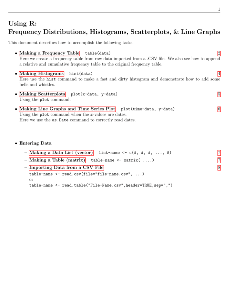
1 Using R: Frequency Distributions, Histograms, Scatterplots, & Line Graphs This document describes how to accomplish the following tasks. • Making a Frequency Table table(data) 2 Here we create a frequency table from raw data imported from a .CSV file. We also see how to append a relative and cumulative frequency table to the original frequency table. • Making Histograms hist(data) 4 Here use the hist command to make a fast and dirty histogram and demonstrate how to add some bells and whistles. • Making Scatterplots plot(x-data, y-data) Using the plot command. 5 • Making Line Graphs and Time Series Plot plot(time-data, y-data) Using the plot command when the x-values are dates. Here we use the as.Date command to correctly read dates. 6 • Entering Data – Making a Data List (vector) – Making a Table (matrix) list-name <- c(#, #, #, ..., #) table-name <- matrix( ....) – Importing Data from a CSV File table-name <- read.csv(file="file-name.csv", ...) or table-name <- read.table("File-Name.csv",header=TRUE,sep=",") 7 7 8 2 • Frequency Tables in R: In the textbook, we took 42 test scores for male students and put the results into a frequency table. Males Scores Frequency 30 - 39 1 84 51 Raw Data 40 - 49 3 93 93 → becomes → 50 - 59 5 64 97 Organized 60 - 69 9 37 67 70 - 79 6 72 62 80 - 89 10 69 69 90 - 99 8 Then we created a relative and cumulative frequency table from this. Scores on Test #2 - Males 42 Scores: Average = 73.5 88 76 44 80 83 69 78 49 55 78 84 54 92 96 72 97 67 83 93 95 67 86 76 80 58 64 82 48 54 80 Frequency Distribution: Males Scores 30 - 39 40 - 49 50 - 59 60 - 69 70 - 79 80 - 89 90 - 99 Frequency 1 3 5 9 6 10 8 Relative Frequency Distribution: Males Scores 30 - 39 40 - 49 50 - 59 60 - 69 70 - 79 80 - 89 90 - 99 Relative Frequency 2.4% 7.1% 11.9% 21.4% 14.3% 23.8% 19.0% Cumulative Frequency Distribution: Males Scores less than 40 less than 50 less than 60 less than 70 less than 80 less than 90 less than 100 Cumulative Frequency 1 4 9 18 24 34 42 Here we see how to do these tasks with R. We’ll start by importing the data into R. Suppose the data is in an Excel file saved as a .CSV file named Excel-Data.csv that looks like This is imported into R using the read.table command. > male female data <- read.table("Excel-Data.csv",header=TRUE,sep=",") > male scores <- male female data$Males 3 Here we have R create a frequency table and then append a relative and cumulative table to it. Everything in red is typed by the user. Everything in blue is output to the console. – The classes are defined by creating a list of class boundaries. You can create this list by hand or > bins <- seq(29.5,99.5,by=10) The seq function creates a list by starting at 29.5 and increasing by 10 until it hits 99.5. Now bins = [29.5, 39.5, 49.5, 59.5, 69.5, 79.5, 89.5, 99.5]. – The cut function organizes the data into the appropriate bins. – The transform function puts the tables into column format - which is nice. 4 • Histograms in R: In the text, we created a histogram from the raw data. 84 93 64 37 72 69 Scores on Test #2 - Males 42 Scores: Average = 73.5 88 76 44 80 83 69 78 49 55 78 84 54 92 96 72 97 67 83 93 95 67 86 76 80 58 64 82 48 54 80 51 93 97 67 62 69 Raw Data → becomes → Histogram Here, we’ll let R create the histogram using the hist command. You can define your own classes by creating a list of class boundaries and using the breaks = command. You can also add a title (main =), a label (xlab =), and color (col =). 5 • Scatterplots in R: Suppose we have data for cricket chirps per minute and temperature in degrees Fahrenheit in an Excel file saved in .CVS format that looks like We have R create a scatterplot with the plot(x,y) command and put in the line of best fit with the abline command. Simple scatterplot: Some customization and a line of best fit: 6 • Line Graphs and Time Series Graphs in R: A line graph is just a scatterplot where the points are connected moving left to right. Getting the points connected is done using the type command. > plot(x-data,y-data,type="o") This now puts a small circle at each point and then connects the points with a line. Any type will result in the points being connected with a line. A time series graph is a line graph where the x-axis represents time. If you are doing a time series with clock time (seconds, minutes, hours), you just create a line graph with the appropriate time units on the x-axis. The tricky part is handling dates. Suppose you have your dates in an Excel spreadsheet saved as a CSV file like the one below. In this example we look at the unemployment rates from July 2008 - July 2009 (the first 12 months after the financial collapse of 2007). The trick is to tell R how to read the date data by > data <- read.table("Unemployment-Data.csv",header=TRUE,sep=",") > month <- as.Date(data$Date, "%m/%d/%Y") We have R create a time series graph with the plot command. 7 • Making a Data List (vector): When entering data you must use the syntax below. > Mon <- c(68, 84, 93, 68, 70) – – – – Here, Mon is the name of the list (you get to choose this name). Then, you have the ’less than sign’ from the keyboard followed by the dash (’-’) symbol. All lists must be enclosed with c( #, #, #, ... ). I think the c stands for ’combine’. Don’t forget to separate the data values with commas. • Making a Table (matrix): Suppose you want to make a table of 5-numbers for each of the first three days of the work-week. Monday 68 84 93 68 70 Tuesday 59 72 78 91 90 Wednesday 55 66 77 88 99 You can combine lists like the one described above into a table using the matrix command. Setting this up takes a little effort and the usage is depicted in the screenshot on the next page. Everything in red is typed by the user. Everything in blue is output to the console. 8 • Importing Data: Since all of the other software packages will easily convert a data file into a CSV file, we will use this format to read the data into R. The screenshot below depicts how to read such a file and display the contents. The head=TRUE means the first row contains column headings (not data).
![[#DTC-130] Investigate db table structure for representing csv file](http://s3.studylib.net/store/data/005888493_1-028a0f5ab0a9cdc97bc7565960eacb0e-300x300.png)
