Composition: Dominance and Subordination: In composition, the
advertisement

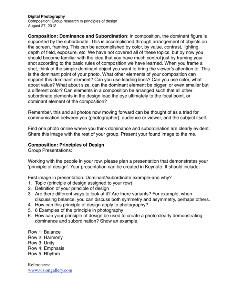
Digital Photography Composition: Group research in principles of design August 27, 2012 Composition: Dominance and Subordination: In composition, the dominant figure is supported by the subordinate. This is accomplished through arrangement of objects on the screen, framing. This can be accomplished by color, by value, contrast, lighting, depth of field, exposure, etc. We have not covered all of these topics, but by now you should become familiar with the idea that you have much control just by framing your shot according to the basic rules of composition we have learned. When you frame a shot, think of the simple dominant object you want to bring the viewerʼs attention to. This is the dominant point of your photo. What other elements of your composition can support this dominant element? Can you use leading lines? Can you use color, what about value? What about size, can the dominant element be bigger, or even smaller but a different color? Can elements in a composition be arranged such that all other subordinate elements in the design lead the eye ultimately to the focal point, or dominant element of the composition? Remember, this and all photos now moving forward can be thought of as a triad for communication between you (photographer), audience or viewer, and the subject itself. Find one photo online where you think dominance and subordination are clearly evident. Share this image with the rest of your group. Present your found image to the me. Composition: Principles of Design Group Presentations: Working with the people in your row, please plan a presentation that demonstrates your ʻprinciple of designʼ. Your presentation can be created in Keynote. It should include: First image in presentation: Dominant/subordinate example-and why? 1. Topic (principle of design assigned to your row) 2. Definition of your principle of design 3. Are there different ways to look at it? Are there variants? For example, when discussing balance, you can discuss both symmetry and asymmetry, perhaps others. 4. How can this principle of design apply to photography? 5. 6 Examples of the principle in photography 6. How can your principle of design be used to create a photo clearly demonstrating dominance and subordination? Show an example. Row 1: Balance Row 2: Harmony Row 3: Unity Row 4: Emphasis Row 5: Rhythm References: www.visiongallery.com Digital Photography Composition: Group research in principles of design August 27, 2012 http://photography-now.net/photographers/?p=1616 1. Josef Sudek 2. Hiroshi Sugimoto 3. Robt and Shana ParkeHarrison 4. Yousef Karsh http://www.fineartphotoblog.com/ http://art-support.com/photographers.htm#contemporary Photographers of note to check out: Stiglitz, Lange, Adams, Strand, Weton, Salgado Excellent photographer/artist: Lillian Bassman Elliott Erwitt Ansel Adams Andre Kertesz


