Full Data Sets and Bar Charts (References to Moore`s BPS, 5th
advertisement
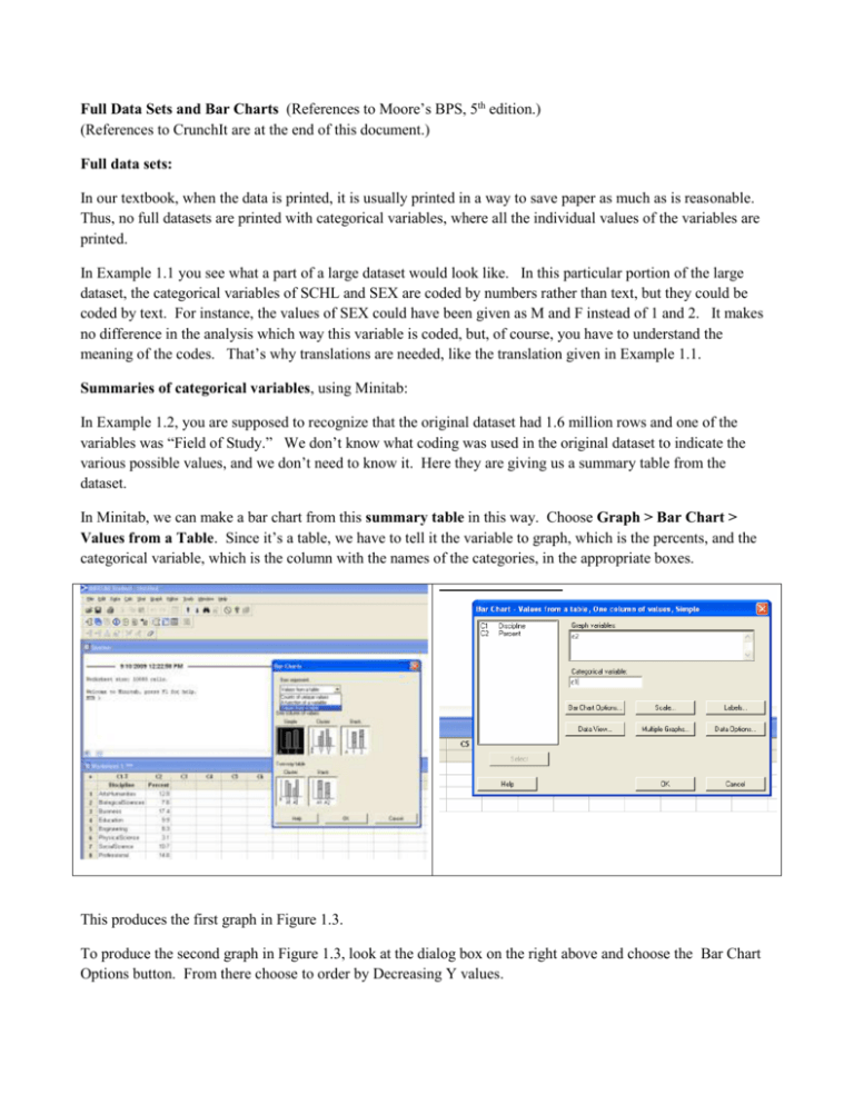
Full Data Sets and Bar Charts (References to Moore’s BPS, 5th edition.) (References to CrunchIt are at the end of this document.) Full data sets: In our textbook, when the data is printed, it is usually printed in a way to save paper as much as is reasonable. Thus, no full datasets are printed with categorical variables, where all the individual values of the variables are printed. In Example 1.1 you see what a part of a large dataset would look like. In this particular portion of the large dataset, the categorical variables of SCHL and SEX are coded by numbers rather than text, but they could be coded by text. For instance, the values of SEX could have been given as M and F instead of 1 and 2. It makes no difference in the analysis which way this variable is coded, but, of course, you have to understand the meaning of the codes. That’s why translations are needed, like the translation given in Example 1.1. Summaries of categorical variables, using Minitab: In Example 1.2, you are supposed to recognize that the original dataset had 1.6 million rows and one of the variables was “Field of Study.” We don’t know what coding was used in the original dataset to indicate the various possible values, and we don’t need to know it. Here they are giving us a summary table from the dataset. In Minitab, we can make a bar chart from this summary table in this way. Choose Graph > Bar Chart > Values from a Table. Since it’s a table, we have to tell it the variable to graph, which is the percents, and the categorical variable, which is the column with the names of the categories, in the appropriate boxes. This produces the first graph in Figure 1.3. To produce the second graph in Figure 1.3, look at the dialog box on the right above and choose the Bar Chart Options button. From there choose to order by Decreasing Y values. Making Bar Charts from a Full Data Set using Minitab: But, if the data had been given as the full dataset, instead of a summary table, we’d choose a different option: Counts of unique values . Graph > Bar Chart > Counts of unique values This is illustrated below with a dataset from the “Large datasets” portion of our textbook datasite called “reading.dat”. It identifies the sex of each individual as M or F and so we provide a bar chart of that variable here. Chart of Sex 35 30 Count 25 20 15 10 5 0 F M Sex Bar Charts using CrunchIt Choose Graphics > Bar Plot. At the top of the box, you will choose either “Get Frequencies” or “With Data”. Summarized data, as in Example 1.2 Full dataset, as in Large Datasets, reading.dat “With Data” In the two columns, make Labels to be the list of category names and Data to be the list of numbers. The numbers will be treated as counts, and percents computed from them. Both the original numbers and the computed percents will be shown. “Get Frequencies” In the one column, choose the column with the data about this variable. Here that is “Sex.”
