Design Principles & Elements in Architecture Activity
advertisement
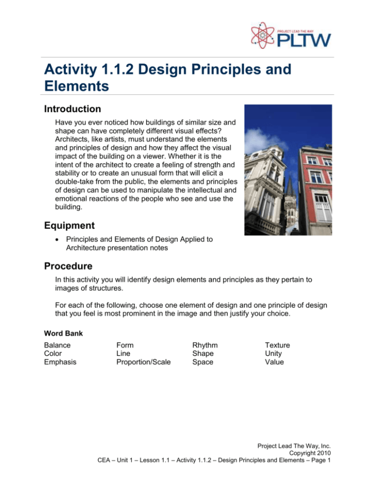
Activity 1.1.2 Design Principles and Elements Introduction Have you ever noticed how buildings of similar size and shape can have completely different visual effects? Architects, like artists, must understand the elements and principles of design and how they affect the visual impact of the building on a viewer. Whether it is the intent of the architect to create a feeling of strength and stability or to create an unusual form that will elicit a double-take from the public, the elements and principles of design can be used to manipulate the intellectual and emotional reactions of the people who see and use the building. Equipment Principles and Elements of Design Applied to Architecture presentation notes Procedure In this activity you will identify design elements and principles as they pertain to images of structures. For each of the following, choose one element of design and one principle of design that you feel is most prominent in the image and then justify your choice. Word Bank Balance Color Emphasis Form Line Proportion/Scale Rhythm Shape Space Texture Unity Value Project Lead The Way, Inc. Copyright 2010 CEA – Unit 1 – Lesson 1.1 – Activity 1.1.2 – Design Principles and Elements – Page 1 1. Principle of Design Random Rhythm and Unity Justification: The structure has a random rhythm because the arches seem to be at different sizes and there doesn’t seem to have a pattern. The structure has unity from the consistent use of gray. Element of Design Vertical Lines, Form and Shape, Texture Justification: The structure has vertical lines from the columns. It has a cylindrical form from its columns. The structure shows rough texture because the surface appears dark. Project Lead The Way, Inc. Copyright 2010 CEA – Unit 1 – Lesson 1.1 – Activity 1.1.2 – Design Principles and Elements – Page 2 2. Principle of Design Symmetrical Balance, Graduated Rhythm, Emphasis, Unity Justification: The structure has symmetrical balance because the left and right side of the building are identical. The structure has graduated rhythm from the reduction in size at each level. The top of the tower had emphasis because it’s shiny and pointy. The building has a consistent use of the light color Element of Design Vertical Lines, Smooth texture, Justification: The structure has vertical lines from the columns and has a serious environment. The texture of the building is smooth because of the light color. Project Lead The Way, Inc. Copyright 2010 CEA – Unit 1 – Lesson 1.1 – Activity 1.1.2 – Design Principles and Elements – Page 3 3. Principle of Design Asymmetrical Balance, Random Rhythm, Emphasis, Unity Justification: The structure has asymmetrical balance because one side appears to not be identical to the other but seems to have equal distance. The structure has random rhythm since it has irregular intervals. The structure seems to have Unity from the lines. Element of Design Vertical Lines, Shapes, Rough Texture, Justification: The structure has vertical lines and appears to have a serious environment. The structure has rectangular shapes. The structure has a rough structure because it is dark. Project Lead The Way, Inc. Copyright 2010 CEA – Unit 1 – Lesson 1.1 – Activity 1.1.2 – Design Principles and Elements – Page 4 4. Principle of Design Gradated Rhythm, emphasis, Proportion and scale, movement, Unity Justification: The structure repeats in pattern and gets smaller as it goes up. The building displays emphasis from the shape. The building has a good proportion to its size. The building feels like its movement from the curviness. The Building has consistent use of curved lines. ©Istockphoto.com City Hall and London Bridge Element of Design Curved lines, Color, Form, Smooth texture, Value Justification: The building has a soothing feeling. It has cool colors such as blue. The building has a circular form. The building has a smooth texture from the glass surface. The building has tinted colors. Project Lead The Way, Inc. Copyright 2010 CEA – Unit 1 – Lesson 1.1 – Activity 1.1.2 – Design Principles and Elements – Page 5 5. Principle of Design Symmetrical Balance, Regular Rhythm, Emphasis, Justification: The structure appears to be symmetrical from the man in blue. The structure has regular rhythm from the text and people in the image. The image has emphasis to the viewer. Element of Design: Value and form Justification: The image on the structure has a shaded color. The form is circular from being an arch. 6. Principle of Design Symmetrical Balance, Regular Rhythm, Contrast, unity, movement Justification: The building has the same dimensions. Every floor is similar to one another. The contrast is from the blue block. The lines give the structure unity. There is also an outward movement. Element of Design Horizontal lines, color, form, texture ©Istockphoto.com Justification: The horizontal lines make the Project Lead The Way, Inc. Copyright 2010 CEA – Unit 1 – Lesson 1.1 – Activity 1.1.2 – Design Principles and Elements – Page 6 structure appear calm. The building has cool colors. The building has triangular form. The building has smooth texture from its light color. 7. Principle of Design Horizontal Balance, random rhythm, emphasis, movement Justification: The building seems to have horizontal balance due to the even construction levels. The rhythm comes from the height of the roofs and contains movement though the curved parts. The emphasis is shown at the entrance. ©Istockphoto.com Element of Design Curved lines, space, texture Justification: The lines are curved from the arches. The building seems to be in a wide open space. The texture is smooth from the light color. Project Lead The Way, Inc. Copyright 2010 CEA – Unit 1 – Lesson 1.1 – Activity 1.1.2 – Design Principles and Elements – Page 7 8. Principle of Design Balance, regular rhythm, proportion and scale, and unity Justification: The aqueduct has a horizontal balance though the patterns. The aqueduct repeats in a regular pattern of arches. The arches and columns preserve the unity. Microsoft Office clipart Roman aqueduct Element of Design Horizontal lines, form and shape, rough texture Justification: The horizontal lines are present a lot. There seems to be rectangular shapes at the aqueduct. The texture is from the dark stones. 9. Principle of Design Symmetrical balance, regular rhythm, emphasis Justification: The columns on the left and right side of the image presents symmetrical balance and regular rhythm. The emphasis is shown at the golden wall with paintings. Element of Design Vertical lines, color, form, and space Justification: The vertical lines are shown in the columns, showing seriousness. The room displays Project Lead The Way, Inc. Copyright 2010 CEA – Unit 1 – Lesson 1.1 – Activity 1.1.2 – Design Principles and Elements – Page 8 gold and white colors. The area is very spacious to present the wall. 10. Principle of Design Regular rhythm, proportion and scale, movement, contrast Justification: Every house has a repeating pattern on its style and only changes its color. Each house seems proportionally even. The houses appear to be moving to the right. The color of the house and the window frame colors stand out. Element of Design Horizontal lines, color, value, form and shape Justification: The houses display a lot of horizontal lines on the houses. The color of each house is unique. Most of the colors are cool and warm colors. The colors of the houses seem different because some of the houses are using tinted or shaded colors. The houses all appear rectangular and triangular in many areas like the attic windows and the windows. Conclusion Project Lead The Way, Inc. Copyright 2010 CEA – Unit 1 – Lesson 1.1 – Activity 1.1.2 – Design Principles and Elements – Page 9 1. In what way do certain elements or principles identify the time period in which a structure was created? 2. What factors might account for an incorrect identification? 3. Describe an example of a way that design principles and elements could impact the function of a building. Project Lead The Way, Inc. Copyright 2010 CEA – Unit 1 – Lesson 1.1 – Activity 1.1.2 – Design Principles and Elements – Page 10
