Elements of Art & Principles of Design Presentation/Notes
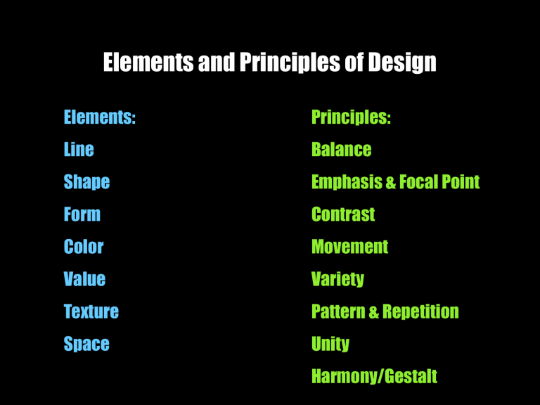
Elements and Principles of Design
Elements:
Line
Shape
Form
Color
Value
Texture
Space
Principles:
Balance
Emphasis & Focal Point
Contrast
Movement
Variety
Pattern & Repetition
Unity
Harmony/Gestalt
Line
A line is defined as a mark with length and direction, created by a point that moves across a surface. A line can vary in length, width, direction, curvature, and color.
Contour, Diagonal, Broken, Curved, Outline, Implied, Vertical, zigzag,
Horizontal, Wavy, Slanted, Continuous, Solid, Narrow, Bold
Jasper Johns, 0-9 (continuous line) Gesture drawing
line
Jackson Pollock, Autumn Rhythm
LINE
Andy Goldsworthy
Keith Haring
Shape
Shape is an enclosed space defined by other elements of art. Shape is 2-Dimensional
Shape can be:
Geometric: Angular, man-made concept
Organic: curvilinear - found in nature
Fernana Leger, The City
Matisse, from the series “Jazz”
Picasso, Three Musicians
FORM
3 Dimensional Shape. Volume
MC Escher, Self Portrait
Tamara de Lempicka
Portrait of Ira P. 1925
Vincent Van Gogh, Shoes
Value
An element of art that refers to luminance or luminosity – the lightness or darkness of a color.
Value is an especially important element in works of art when color is absent. This is particularly likely with drawings, printmaking, and photographs
Kathe Kollwitz,
Self portrait
Value
Chuck Close
(made w/ thumbprints!)
Edward Weston, Pepper
(photograph)
Texture
Texture refers to the surface quality or "feel" of an object, such as roughness, smoothness, or softness. Actual texture can be felt while simulated textures are implied by the way the artist renders the surface area
Oppenheim
Fur-lined cup
Actual
Texture and Implied
Golsdworthy
Albrecht Durer
Rhinocerus
Color
Is an element of art with three properties
1) Hue, the name of the color, e.g. red, yellow, etc. 2)
Intensity or the purity and strength of the color 3) Value, or the lightness or darkness of the color
Delauney
Jasper Johns, Target
(primary colors)
Primary Colors
Piet Mondrian
Wassily Kandinsky
Warm Colors
• Colors that are often described as being higher in temperature
• Reds, oranges, yellows
• Associated with fire and sun
• Optically, appear to advance
• Stimulating and passionate
Ex. Warm
Cool
• Colors that are often described as being lower in temperature
• Greens, Blues, and Violet
• Associated with water, sky, and spring
• Optically, they appear to recede
• Calming and depressing
Ex. Cool
Color and Mood
Picasso, the Old Guitarist
Van Gogh, the Night Cafe
Space
Space is the empty or open area between, around, above, below, or within objects. Shapes and forms are made by the space around and within them. Space is often called three-dimensional or two- dimensional.
MC Escher
Space
Positive space is filled by a shape or form. Negative space surrounds a shape or form.
Space/Depth
May be created by overlapping, change in scale, perspective placement, color theory, or projection toward the viewer.
David Hockney
Place Furstenberg, Paris, August 7,8,9, 1985 -#11985
Balance
Balance is a sense of stability in the body of work.
Balance can be symmetrical (formal) or assymmetrical (informal)
Wayne Thiebaud, Around the Cake (formal balance)
Symmetrical/Formal Balance
Diane Arbus, Twins
Symmetrical Balance
Leonardo da Vinci, The Last Supper 1495-1498
Asymmetrical Balance
Edgar Degas (informal balance)
Asymmetrical Balance
Variety
When elements are changed in scale, color, or form.
Andy Warhol
Stuart Davis
Movement
Movement adds excitement to your work by showing action and directing the viewers eye throughout the picture plane.
Edward Munch, the Scream
Movement
Umberto Boccioni,
Unique forms of continuity in space
Marcel Duchamp, Nude Descending Staircase
Dominance & Subordination
The part of a composition that is emphasized , has the greatest visual weight , the most important, powerful, or has the most influence.
Emphasis & Focal Point
Emphasis - Any forcefulness that gives importance to some feature or features of an artwork; something singled out, stressed, or drawn attention to by means of contrast, anomaly, or counterpoint
Focal Point = portion of an artwork's composition on which interest or attention centers
David Hockney
Emphasis & Focal Point
Barbara Kruger
Rene Magritte
Pattern & Repetition
Involves multiples of the same element. Repeated elements can vary in size, color, or axis placement. Repeated elements can create a pattern. The use of repetition may be applied to all Visual Elements. Motion can be created by repetition.
William Morris
Arts and Crafts Movement
Pattern & Repetition
Chuck Close, Self Portrait, detail
Contrast
A large difference between two things, such as light and shadow, color and black/white
Andy Warhol
Contrast
David, the Death of Marat
Economy
Unity & Harmony
The quality of wholeness or oneness (Gestalt) that is achieved through the effective use of the elements and principles of design .
Claude Monet
Haystacks
Unity
Cezanne
Wayne Theibaud
Unity
Van Gogh “Starry Night”
What Elements and Principles stand out?
What Elements and Principles stand out?
Goya, “The 5 th of May”
What Elements and Principles stand out?
Gauguin
What Elements and Principles stand out?

